Arsenic Lullaby- Tooth Fairy Madness
Did you miss me while I was away at MCBA Fall Comic-con? I missed you all (most of you, heh)
The conventions went...fine...it was fine. I used to be run by a fell named Nick Post. He was a larger than life personality. One of those people who is just a force of nature, y'know? You know the type. He took a really small con and turned it into really big con.
It was the first con I ever went to as an exhibitor/guest. I was a young punk with three or four issues under my belt and a big mouth. People will humor a young punk with a big mouth...unless he is always right and looks like he might pass them up in a hurry. Needless to say, a lot of the pros didn't particular care for me. Nick on the other hand...was always kind and enthusiastic and encouraging, AND he knew just what to do with me. He put me on discussion panels with those very same pros, and put my table right next to theirs. In essence saying " don't like him? try to shut him up? try to stop him...good f*cking luck!". It's no brilliant insight on my part to know he was entertained by the whole idea and knew the energy being generated by me ruffling feathers was good for the show, and good for me.
His show grew, and so did my career. It always felt a bit like a homecoming each year when I went to MCBA Fall-con, after whatever I went through during the year leading up to it. Like going into the locker room after a win and celebrating. He passed away a few years ago. The show hasn't been the same, not for me. It's fine....but it's not the recharging of the ego, and the comfort of consorting with a fellow traveler that I used to get. So...lately I leave the show a little bummed out. A little worn out. Feeling a little old, and a little lonely.
Instead of taking any break after the show this year, I'm going to try to accomplish something that I've been struggling with a Loooooong time. To jump-start my batteries myself.
It's just a single image for a print or maybe a cover.
Illustrating a story is more of a recipe, it’s building information into an interesting visual…illustrating a cover though, is catching lightning in a bottle (for me anyway). It’s all about interesting composition and that involves a lot more instinct than skill (for me anyway) You sketch until something jumps out at you. Sometimes something jumps out at you when you are drawing something else. I’ll be sketching and come back to it later and see it differently (forget what the hell the scribbles were supposed to be) and notice something that could be a great cover or poster.
Here’s the one in question. Kid asleep or unconscious, blood everywhere, tooth fairy fluttering off menacingly with two teeth…
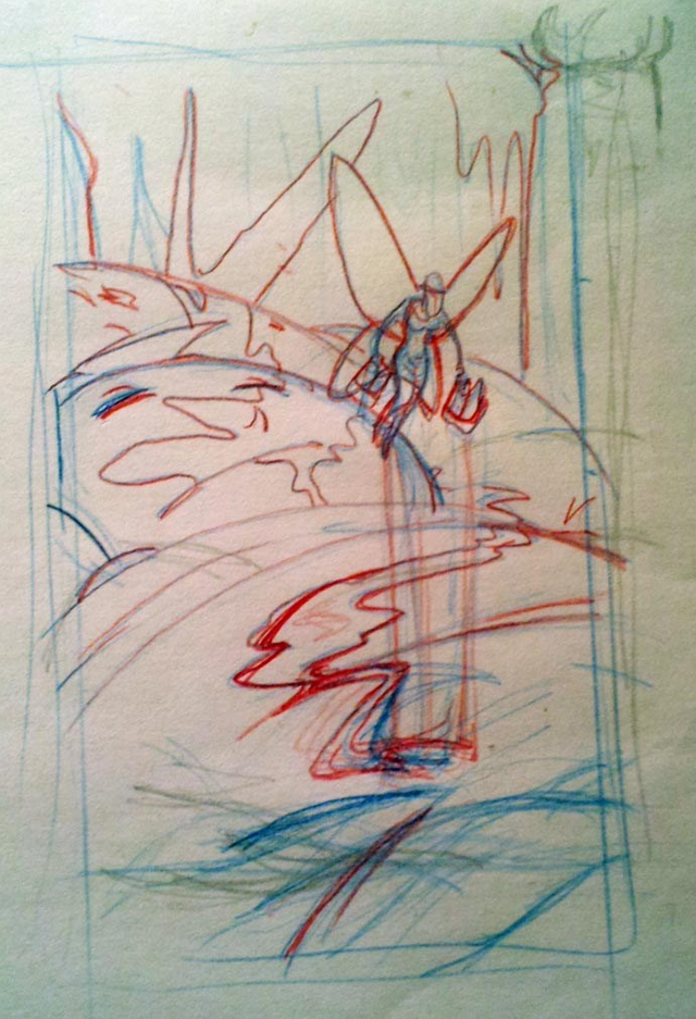
I LOVE this…love everything about it. But it’s a lose sketch, and there may be nothing more maddening than trying to refine a lose sketch into a final illustration without losing all the life and energy it has. Here in comes the madness. The Kid and the blood, I nailed spot on and that’s fine. But the fairy was b.s.’d She’s lose, she’s out of proportion. She needs to be done properly. and I have tried. I have been trying off and on for over a year and a half. It’s becoming my white whale.
The problem is two fold. I want her to look villainous, sleazy, scary. I envision her swinging her arms back and forth as she flies away, weighted down by the teeth. So this is a difficult posture to get in real life, what with the twisting and convening the weight of the teeth. That’s the first problem, it’s a tough posture to get in real life. The second problem is that this isn’t real life…this is a fantasy character who has wings and is hanging by those wings while they and her are moving. There is no way to get a model to pull that off…I tried.
Even if I put hooks in her back where the wings would be I still wouldn’t get the posture while the fairy would be moving/flying/twisting. and frankly…my cousins seemed like they were losing patience, and I can’t say I blame them.
Because how many of all those elements of movement, that I’m concerned about really even matter? Which of them matter? I don’t know…that much I am sure of – I don’t know. I have reworked that posed probably close to a hundred times? more? see this stack of paper?
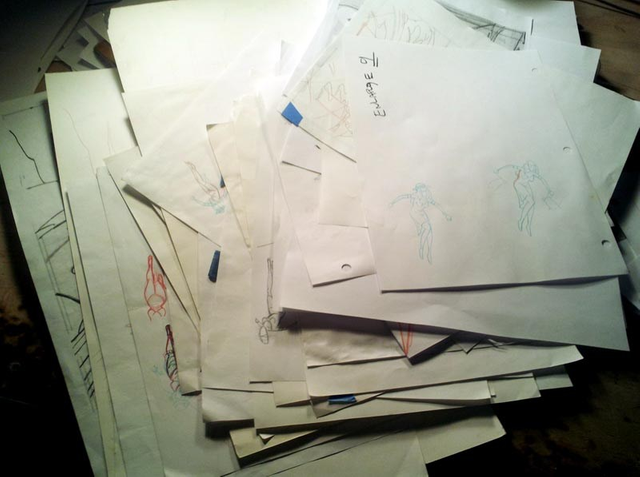
That’s a stack of various attempts. Every three months or so I sift through a stack that size and grab the best two or three and START OVER. I’ve thrown out stacks that size several times. That’s madness, right? This is madness
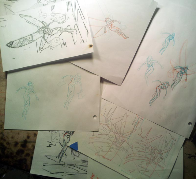
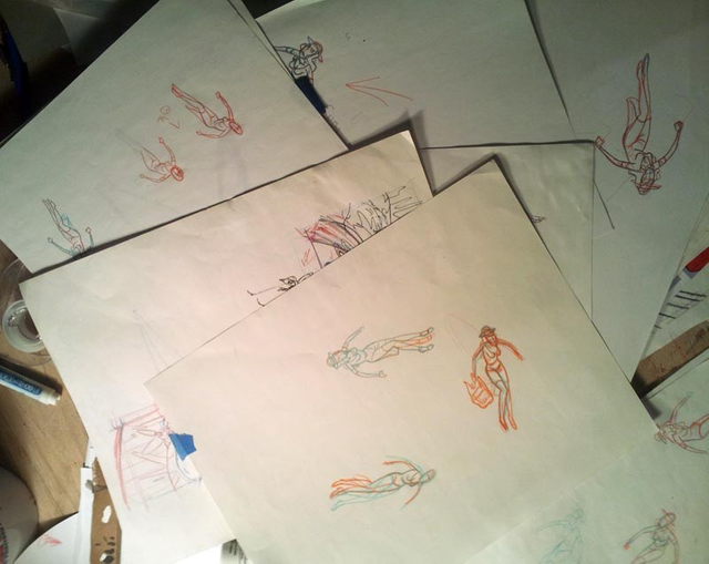
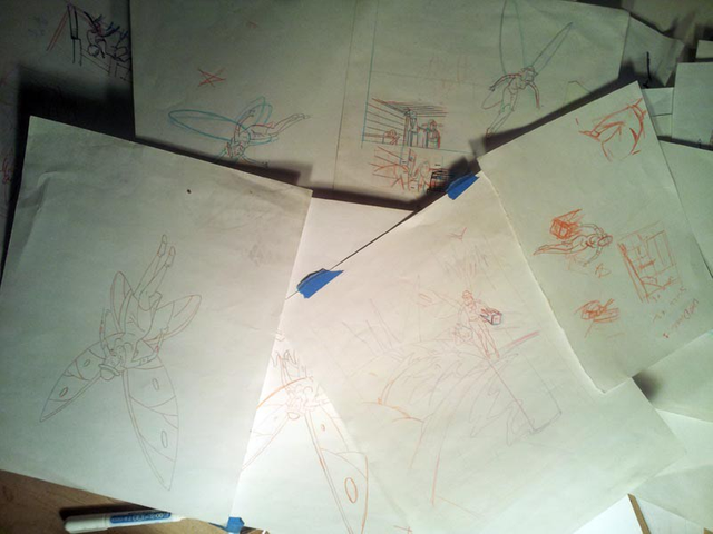
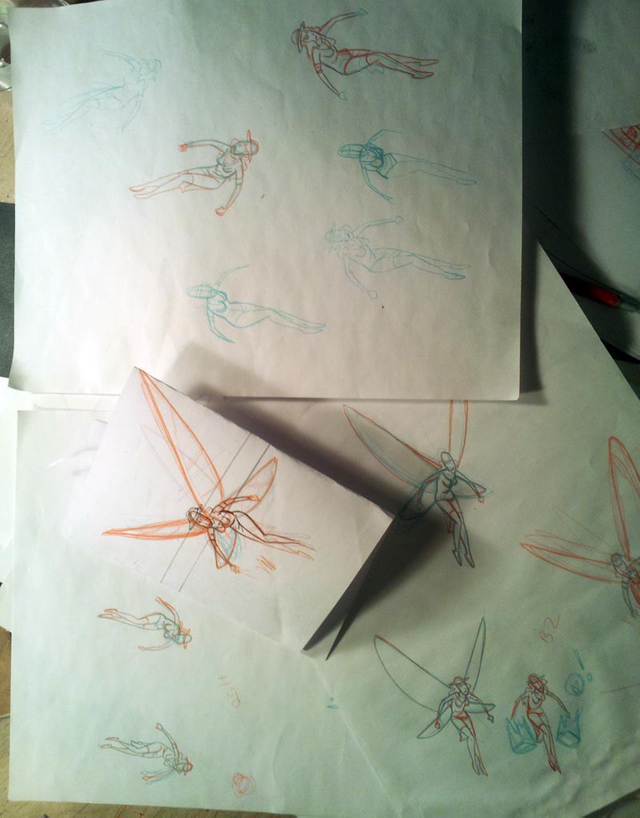
I’ll be working on something else..and pause to just take a few more cracks at it…
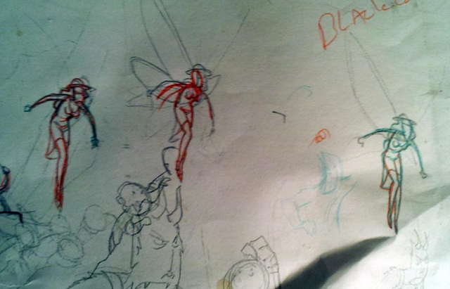
I’m not a psychiatrist…but this can’t be good, right? This is f*cking madness…most of these are a hairs worth of being different from each other. Currently…I’m half convinced one of these might work.
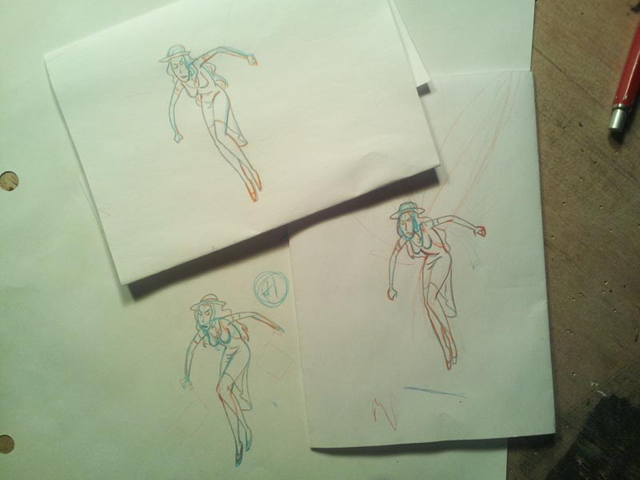
but not really…what sends me down this road, is that they’re all “almost”. When something really wrong, that’s easy to fix. When something’s just…not quite “it”, then I’m lost in the fog. What wrinkle is curved the wrong way? How much more of a fraction of an inch should the leg be?
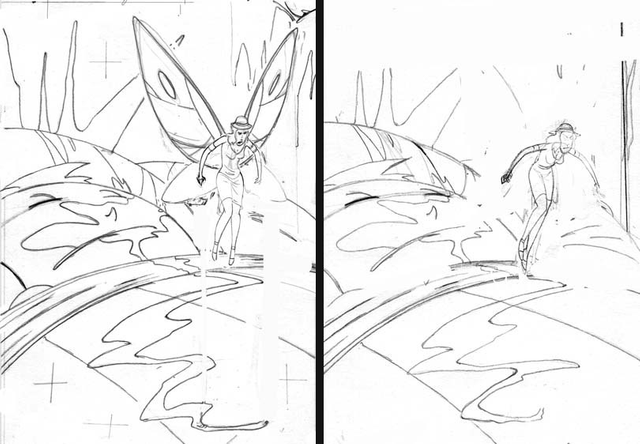
There isn’t much of a forced perspective element to this illustration, but it’s enough that I really shouldn’t be JUST drawing her by herself. What I mean by that is, you can draw a human standing or walking and it’s fine…on it’s own. BUT once you put that figure into a background it looks wrong because the background has unique vanishing points and the figure was not drawn using those vanishing points
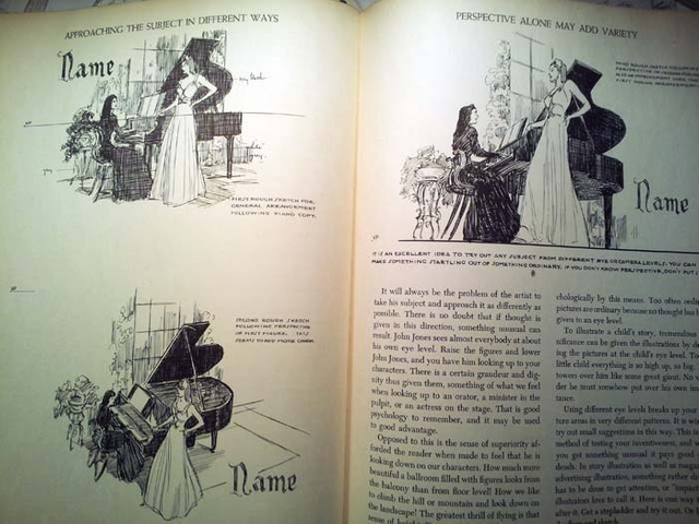
…I might be losing some people here ( if they haven’t already called 911 after seeing 48 pics of the same fairy). I really like the fairy on the lower left of the last pic, but it’s not right when I plug it into the composition.
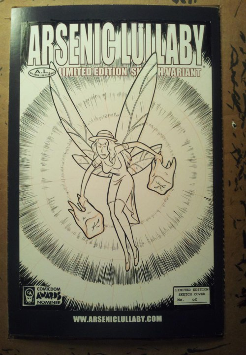
Anyhoo, I was going to do each one larger to see how they looked. Started one on a sketch cover and realized used the wrong ink. I used ink that won’t EVER dry to the shiny cover stock…I angrily smeared it around, swore and kicked it across the office. It was cathartic.
Tried again with the correct ink…
(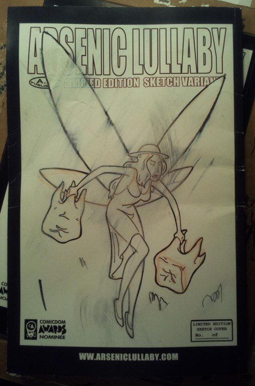
I dunno…it’s almost there. Maybe it’s not. Maybe it was fine six months ago. This fairy’s going to be like three inches tall…why can’t I let this go? Why can’t I get it right??? I’ve done harder illustrations that this. This was supposed to be easy. I figured it would take 10 hours tops. I hadn’t factored in going insane. That always bumps up the man hours.
Here’s the thing…this doesn’t happen to me on a hard deadline (which might be an argument for doing some freelance work…like soon…before I end up in a straightjacket) and it never happens in the summer. This leads me to think I do have some mental issue, some offshoot of seasonal affective disorder pared with artistic OCD/perfectionism.
“what is in his head, that I cannot find in my own?”
Al Swearengen Deadwood Season 3
I've decided...the hell with it. The big problem here, for me, is that it is too simple. For whatever reason...the less that is going on in an illustration...the more I over think it. About the time I came up with this idea, I also came up with this far more complicated take on it.
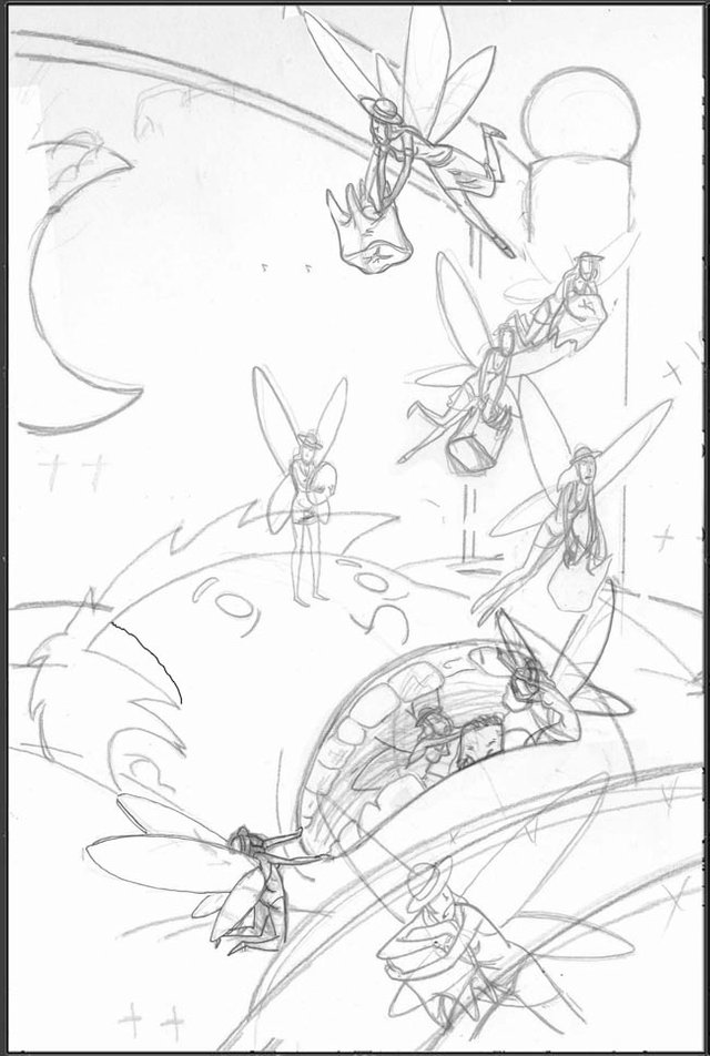
You would think this would be more difficult, and maybe for someone who is wired different than me it would be. But there is so much going on here that there is no one thing for my brain to latch onto and spin itself into a death spiral worrying about. I'll admit though, I have ground my gears a bit on that fairy pulling on his mouth. That would be easir with a model...who had wings.
anyhoo...
I'm going to do this one...come hell or high water I'm finishing this for Inktoker this year. Good, bad or so-so, it's getting done. Wish me Godspeed...and keep bugging me to get it done, would'ya?
Speaking of Inktober. The Arsenic Lullaby Inktober inking contest will begin later this week. We're just doing some maintenance to the website, and once that's done the contest will start.
Here is a link to PREVIOUS year's contest...this IS NOT THE PAGE FOR THIS YEARS CONTEST...but it's the same format as this years. The prizes will be different...they'll be original art and some Steem up for grabs this year. Once again...this link below is A PREVIOUS YEARS CONTEST PAGE. Only posted to give you an idea of what you'll be getting into
http://arseniclullabies.com/inktober16.html
Later...

!!!!the tags list on Steemit is generated by code...which puts tags up there based on ONLY popularity of use. You will notice that as of yet #comics does not exist there. So what we have been doing is using the hashtag #comics every single time we comment on my posts ( or any other posts if you like). It doesn't matter if it doesn't make sense to use it...the code doesn't know the difference!!!!
LOL you keep fighting with her and in the end you feel a lot better if you have to draw multiple version of the tooth fairy? Gehehehe.
I'm not going to call 911 because I want you to finish that cover =).
#comics
...enabler. #comics
I don't care if you go insane, but ...
keep drawing >:D.
Edit: #comics
Hahahah! I love it. The obsession and madness is refreshing.
It was good to see you at MCBA! I'm always just a little awkward at shows... god knows why. I always kinda feel like a lurker when hanging around a table. Regardless, hanging and talking with you was the highlight for me!
Good seeing you too! I was there overnight, I should have thought to see if you wanted to hang out after. #comics
No worries! I will take you up on that next time :)
Dear Artzonian, thanks for using the #ArtzOne hashtag. Your work is valuable to the @ArtzOne community. Quote of the week: Art, freedom and creativity will change society faster than politics. -Victor Pinchuk
oh I like the shape of the winged fairy very cool, would love to see one of them on a black night sky!
hey, "a black night sky"...that sounds way easier than what I had planned! #comics
Hi arseniclullaby,
Visit curiesteem.com or join the Curie Discord community to learn more.
Thanks! I appreciate that!
Haha! Perhaps your brain is too chaotic for simple sinister. Blood thirsty, panic seems more the go with that last one!
I actually rather like the top left black fairy in the third picture from the top. However, I'll admit she looks more like she's rushing than sinister.
Maybe her solo appearance is for a different appearance. Either way, I love them all and therefore your crazed mind to boot, so never change!
Posted using Partiko Android
Perhaps it is...like a baseball pitcher trying to play hockey, two different kinds of skills even though they are both athletic feats. Or maybe I'm just high strung, haha, #comics
The illustrations are really good, I like the action, the fairy looks great, correct proportion of body and I love those two teeth she is trying to fly with. The large images are also good you can see the details wonderfully. You have a great imagination and wonderful skills!
Well, thank you! That's very kind. I'll post the finished thing later this month...we'll see how it turns out #comics
Just a thought, but maybe if you put the teeth in totes or grocery bags (show the stress pulling down on the bags) it'll help add weight to the image. Then again i normally don't know what I'm talking about. Just trying to help. 😁
Oh sure, give me another element to try to get right. #comics
throw them all up in the air and draw whichever one lands firts #comics
That's as good an idea as any #comics