The Power of Colours: More Than Just Visuals
Colour is more than just a visual element; it is a powerful communication tool that influences emotions, perceptions, and even behaviours. From the warm reds that evoke passion to the calming blues that instil trust, every hue has an impact. Whether you are a designer, marketer, or artist, understanding colour theory is essential in creating visuals that leave a lasting impression. This knowledge is not just for creative professionals - brands strategically use colours to shape consumer behaviour, from the bright yellows in fast food chains that stimulate appetite to the luxurious purples that exude sophistication. By mastering the fundamentals of colour theory, you can make informed choices that strengthen your message and enhance your audience's experience.
Breaking Down the Colour Wheel: Primary, Secondary, and Tertiary Colours
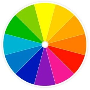
The foundation of colour theory lies in the colour wheel, a tool that helps in understanding the relationships between colours. At its core, we have primary colours - red, blue, and yellow - which are pure hues that cannot be created by mixing others. Secondary colours, like green, orange, and purple, emerge when two primary colours blend. Further refining the spectrum are tertiary colours, formed by mixing a primary with a neighbouring secondary colour. Understanding this hierarchy is crucial when designing balanced and harmonious compositions. A well-planned colour scheme, whether complementary (opposites on the wheel), analogous (adjacent hues), or monochromatic (variations of a single hue), can significantly impact visual aesthetics and message clarity.
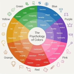
Colour Psychology: How Hues Shape Emotions and Perceptions
Colours are deeply tied to human psychology, influencing emotions and subconscious decision-making. Red, associated with energy and urgency, is often used in sales promotions and warnings. Blue, a symbol of trust and reliability, is a favourite in corporate branding. Yellow evokes warmth and optimism, making it ideal for brands that want to appear friendly and inviting. Meanwhile, green represents growth and nature, often used in eco-friendly branding. Purple, a colour of royalty and luxury, is frequently seen in beauty and high-end product packaging. Understanding these associations allows businesses to choose colours that resonate with their target audience, reinforcing their message and identity.
Practical Applications of Colour Theory in Design and Marketing
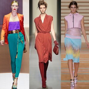
Colour selection is not just about aesthetics - it is a strategic decision that affects engagement and conversions. In marketing, call-to-action buttons in high-contrast colours like red or orange can drive more clicks. In interior design, cool colours like blue and green create a calming atmosphere, while warm tones like red and orange add energy. Fashion designers use colours to set trends and create moods, with neutral palettes exuding timeless elegance and bold hues making statement pieces stand out. Even in photography and cinematography, colour grading is used to convey specific emotions, from warm nostalgic tones to cold, eerie settings. The key is to align colour choices with the intended message, ensuring coherence across visuals.

Mastering Colour for Maximum Impact
To make the most of colour theory, start by experimenting with different combinations and observing their impact. Use tools like colour wheels and digital palettes to test complementary or analogous schemes. Pay attention to cultural perceptions - while white signifies purity in the West, it is associated with mourning in some Asian cultures. Whether you are creating a brand logo, designing a website, or curating an outfit, thoughtful colour choices can make all the difference in how your work is perceived. By harnessing the psychological power of colours, you can craft visuals that captivate, influence, and inspire.

Regards,
Fashion Articles by Waves Fashion Institute
#colourtheory #colourpsychology #designinspiration #brandingstrategy #marketingtips #visualcommunication #graphicdesign #colourschemes #creativeprocess #designthinking