The Beginner's Guide to Color Theory: Using the Color Wheel for Perfect Designs
🎨 Understanding and Using the Color Wheel
This guide will take you through the basics of the color wheel, color harmonies, and practical applications to help you design effectively. Learn how colors work together and how to choose the right color combinations for your projects.
1️⃣ What is the Color Wheel?
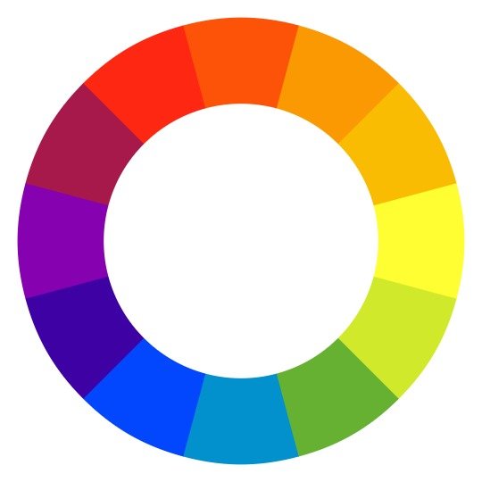
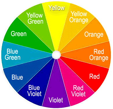
The color wheel is a circular diagram that shows the relationships between colors. It’s designed to help you understand how colors work together, and it's divided into primary, secondary, and tertiary colors.

2️⃣ Understanding the Basics: Primary, Secondary, and Tertiary Colors
- Primary Colors: The base colors—red, blue, and yellow. They can’t be created by mixing other colors.
- Secondary Colors: Created by mixing two primary colors.
- Red + Yellow = Orange
- Blue + Yellow = Green
- Red + Blue = Purple
- Tertiary Colors: Made by mixing a primary color with a secondary color (e.g., red-orange or yellow-green).
3️⃣ Color Harmonies (How Colors Work Together)
When creating designs, choosing the right colors is key. The color wheel helps by showing color harmonies—colors that look good together.
Important Color Harmonies:
- Complementary Colors: Colors opposite each other on the wheel, like blue and orange. This creates high contrast and can make elements stand out.
- Analogous Colors: Colors next to each other, like blue, blue-green, and green. They’re harmonious and gentle on the eyes.
- Triadic Colors: Three colors evenly spaced around the wheel, like red, yellow, and blue. This combo is vibrant and balanced.
- Monochromatic Colors: Different shades, tints, and tones of a single color (like various shades of blue). It’s subtle and professional.

4️⃣ Practical Example: Using the Color Wheel in Design
Let’s say you’re designing a flyer for a tropical beach event. 🌴 You want it to feel vibrant and inviting, so we’ll use complementary colors for contrast and analogous colors for harmony.
Step-by-Step Guide:
- Pick a Base Color: Choose blue (to represent the ocean).
- Add a Complementary Color: Find the color opposite blue on the wheel, which is orange. This contrast will make important details stand out, like the event name or a call to action.
- Choose Analogous Colors for Extra Harmony: Since blue is our base, choose colors next to it, like blue-green and green, to add variety while keeping harmony. These can be background elements or subtle accents.
Applying These Colors:
- Background: Use a soft blue or blue-green.
- Headings and Important Info: Use orange to make them pop.
- Accents and Small Details: Use green or yellow-green for added depth.
This combination brings a sense of calm (blue tones) while adding excitement and energy (orange accents).
📝 Quick Summary:
- Learn the color wheel basics: primary, secondary, tertiary colors.
- Understand color harmonies: complementary, analogous, triadic, monochromatic.
- Choose colors based on the wheel to match the mood of your project.
- Apply them practically in your designs with thought-out placements.
🎨 Additional Tips for Using the Color Wheel Effectively
Consider Color Psychology:
Each color can evoke different emotions:
- Red: Passion, energy, urgency.
- Blue: Calmness, trust, professionalism.
- Green: Nature, growth, harmony.
- Yellow: Happiness, optimism, caution.
- Purple: Creativity, luxury, spirituality.
Think About Contrast for Readability:
- High contrast (like dark text on a light background) improves readability, especially from a distance.
Warm vs. Cool Colors:
- Warm Colors (like red, orange, and yellow) grab attention and create a sense of warmth.
- Cool Colors (like blue, green, and purple) are calming and relaxing.
Experiment with Shades, Tints, and Tones:
- Shade: Add black to darken a color.
- Tint: Add white to lighten a color.
- Tone: Add gray to soften a color.
Use Online Tools for Inspiration:
Platforms like Adobe Color, Coolors, or Canva’s color palette generator allow you to experiment with color palettes.
Adapt for Digital and Print:
- RGB (Red, Green, Blue) for screens.
- CMYK (Cyan, Magenta, Yellow, Black) for print, as colors can look different in print than on screen.
Step-by-Step Guide to Using the AI Color Combination Generator on Muzli Colors
1️⃣ Visit the Website
Open the AI Color Combination Generator by Muzli.
2️⃣ Choose a Starting Color
Begin by selecting a color that you’d like to base your color scheme around.
- You can pick a color by clicking on the color field, where a color picker will appear.
- Alternatively, you can enter a specific HEX color code if you already have one in mind.
3️⃣ Explore AI-Generated Combinations
Once your base color is selected, Muzli's AI will automatically generate color combinations that match it.
- Scroll through the suggested color palettes. Each option provides colors that are designed to harmonize with your base color.
4️⃣ Customizing the Palette
- Click on any suggested color combination to see a larger view and more customization options.
- You can tweak the colors within the combination by selecting each color individually and adjusting them to suit your design needs.
5️⃣ Save or Export Your Palette
When you find a color combination you like, you can save it for future reference.
- Look for options to export the color palette as a HEX or RGB color code list, making it easy to transfer to design software like CorelDRAW, Photoshop, or Illustrator.
6️⃣ Inspiration for Projects
Muzli Colors also provides trending color schemes and inspirations. You can explore these to see what other designers are using and gain fresh ideas for your projects.
- This tool is especially helpful for finding quick, aesthetically pleasing color combinations that suit any design need.