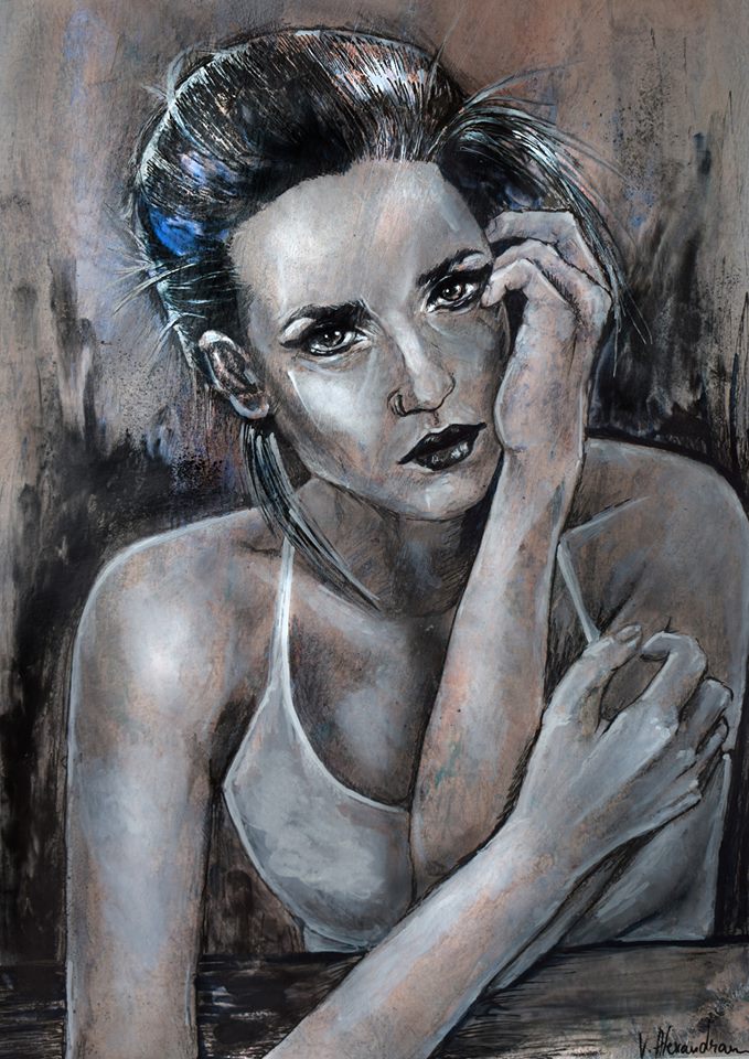
Mistrust - CC mix media drawing
I choose to share today this mix media drawing because it was one of my first posts on steemit and at the time it had a total reward of 0.19 cents :)
And I think I had maximum 10 friends here to share it with :P
So here she is again


I used an iridescent purple powder pigment for the highlights, so it shines purple .
This was an experiment ( not even a study-)as I wanted to layer different drawing mediums on the same surface. I used graphite pencil , inkmarkers,acrylic paint marker, chalk and powder pigments. In between layers I used a fixative spray to be able to continue adding different mediums on top.
I am very pleased of the final result because I had no reference photo or a life model and it has both texture and sheen.
I name it Mistrust
This work is licensed under a Creative Commons Attribution 4.0 International License.
That means: you can copy, share, print, edit, re-interpret, remix and use freely even for commercial purposes
^^^^^^^^^^^^^^^^^^^^^^^^^^^^^^^^^^^^^^^^^^^^^^^^^^^^^^^^^^^^^^
ps.
check the latest contests I am hosting @ccommons.art :
character design contest 4 days remaining until deadline
concept art for SFEOS game Contest 13 days remaining until deadline
gorgeous pic! Great idea to repost it to get it some more exposure, it deserves it! nicely done =]
thank you :)
Wow your style is so sketchy! It works really nicely ☺
Thank you 😊
Love your style too , but I could not upvote and resteem, check the sfeos contest, you would have a great chance to win
waw good info ni for us all. hope can share always. if there is a chance visit to my block ea @ ahmadrozam
Wow!! Just an experiment and without reference? This is so great, so amazing and catchy. Mistrust indeed, no one could expect such a beautiful result of art from such experiment. Good one
called it mistrust because she seems to be listening to someone that is lieing to her, wanting to hear the entire lie before she shouts an insult
No blogs yet , was curious what you do
So we all follow the "no upvote" process here. Im glad your sharing it again so we can see. Beautiful artwork.
thank you for appreciating my work :)
"no upvote" process here? don't know what you mean by that, because I hope for more upvotes than the first time :P
I mean, as a starter, we get very low upvotes. I just started december 2017. I only get very low upvotes from people. But thats okay, i see my self growing here.
Yes , it takes a while , but it is surprising when the ball starts rolling:)
Amazing drawing <3
Thank you 😊
And if you are interested in art, look on my page and follow :)
@jeremyarts
Beautiful artwork, @alexandravart
Love your drawing! :)
Thanks 🙏 ❤️
thanks for posting I congratulate you. Your illustration is fine. Remember that if I tell you, it is with all the humility and respect you deserve. I do not mean to offend you, on the contrary, to help you is my duty as a draftsman. the perpective is very good, you have to make some hand anatomy sketches because there are some details in the finger this disproportionate hya to look for the understanding of the hands, in the nose a cone is bigger than the other this does not find symmetry in the face. the part of the white top lacked shadow in the right breast so you would give more contrast and highlight better. the ear is very exposed and it has the effect of coming out, it lacks more sombray and it is more attached to the hair that would give it the image inclusion effect. if the right arm you stretched it would have the arm very long and not the visibly normal. human anatomy. in this case, sketching first to achieve the symmetries of the body, thus achieving better perspective to the eye of the spectator. the rest is great. I really like your style reminds me of the style I once used that is called "the three chalk" I hope you keep improving and see more progress in your work you are very good at what you do greetings and success.
I know the anatomy is off , sometimes I just start something without any plan or sketch, I painted the entire background to serve as mid-tones too , than went in with black ink marker , every mark was permanent wit no sketch or reference photo , and than I added the highlights.
this was an experiment on the materials to see how many type of pigment powders, inks and fixative layers , the paper can hold, not trying to make excuses for myself but the subject was my last concern :))
please do come back with critiques I miss that so much, in highscool I used to hear a lot of critique and it was so good for me.
that kind of environment is so good for artistic development, and lately is so scares :)