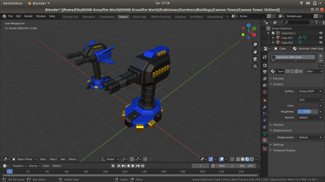
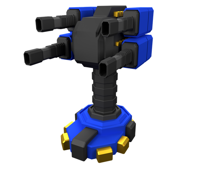
A little Redesign

The Cannon Tower and Sentry Tower were poorly received by the KKND community. So I thought I would try the tips and suggestions. Now the Cannon Tower looks much better and fits better into the happening. You can also see very well which roots the design has. KKND connoisseurs understand what I mean.


Of course, this is not the finished model. Of course I continue to work on refining it.

The old concept has expanded and will be replaced by what I think is a more suitable model.
Hello kkndworld!
Congratulations! This post has been randomly Resteemed! For a chance to get more of your content resteemed join the Steem Engine Team
This post has been upvoted by @opgaming. We like what you're posting, and we want to reward our members who produce quality content. Keep up the good work!
If this sounds like the sort of group you want to be a part of, click the image below! We're too OP to be put down!
Are these the redone ones or the poorly received ones? Because they look pretty all right to me but I'm only nominally a 3d artist and definitely not a KKND connoiseur XD
That's 5 minutes of work. Try something and test it around. Basically, it is the finished model without details.
Thank you for your interest and that you like the look