Bitshares New Website — Exciting New Changes!
Hello Everyone!
Due to the many awesome suggestions from the Bitshares community, we have revised several sections of the website once again before it goes live. I think that you will like the new version even better. Thanks for all your valued suggestions. It’s never too late to send more suggestions and constructive criticism.
YOU MIGHT NEED TO REFRESH YOUR BROWSER (CTRL-F5)
TO MAKE SURE THE NEW CHANGES GET LOADED
TO MAKE SURE THE NEW CHANGES GET LOADED
Here are the latest changes and improvements:
- We have redone for the fourth time the menu system for desktops, tablets, and mobile devices. Please check it on all your devices.
- We have added two new sections to the home page, a comparison chart and a press/articles section to feature some great posts and write-ups about Bitshares.
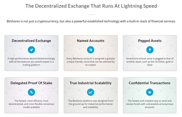
- We have improved the look of the flip boxes and the wording below it on the home page.
Here are a couple of things left to do as time permits:
- Redoing the infographic. Making it more up-to-date with a more modern look and feel.
- Work on a the multilingual buttons, featuring English, and Spanish for the meantime.
Again, thanks for your support. Don't forget to follow me so that you can be notified when new changes are submitted.
Cheers!

If you like what we are doing don’t forget to UPVOTE, COMMENT and RESTEEM.
It would be greatly appreciated. :-)

I also noticed the infographic is out of date. It refers to "delegates" not witnesses and uses the BitShares 0.9x era info (pre graphene, which went live 2 years ago, almost to the day).
I did very much like the overall aesthetics of it, and of the website generally, tho not a fan of the rather plain panels (if that is intended UI design)
We will be recreating the infographic soon. :)
Just a few things. I think the font for "The freedom to trade assets in a decentralized global exchange means greater opportunities" could be something more futuristic feeling. It just feels really basic right now. Not sure why you have to hover the mouse over the comparison chart to make it brighter. I like the new video background a lot!
Thanks skyeg3, I have made changes according to your suggestions.
Can I redo the background image? I don't like the colors in the upper part. Too muddy.
@richcg great to know bitshares is in continuous improvement. Thanks for sharing this with the STEEMIT.community. Just upvoted. @gold84
Thank you!
Great post, I appreciate your work, I'm a 20 years experienced trader from Italy, I leave you my upvote and follow, it would be an honor to have you among my own followers!
the comparison chart you've recently added to the test site is not accurate
Bravo @richcg the extra work definitely paid off! Very well done =)
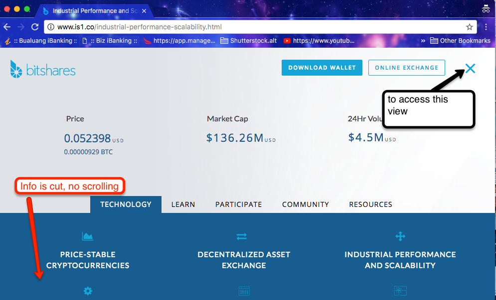
Starting to look a lot more slick especially the new sticky header and when you select the hamburger menu. however for some reason I can't scroll under this section 'technology', the bottom it cut off.
It is ok in fullscreen desktop resolution because it fits. but resize window it is cut without scrollbars
Bitshares is a Solid Project , Don't know why it's getting deslisted from many exchanges , I have Faith In BTS !!! HODL :)
Great Article !
not many. 1, maybe.
it was added to a ton this year in china & they were doing 80% of volume
china closing down exchanges wasn't bts specific.
Some of the numbers still seemed off to me on the blockchain comparison chart
and it seemed to be too different in style from the rest
I tried giving a shot to correcting numbers and making it a bit cleaner, see if you like it. Feel free to ask for sources
https://i.imgur.com/22ujJOe.png
Thank you! Good job.
Thank you, I will update.