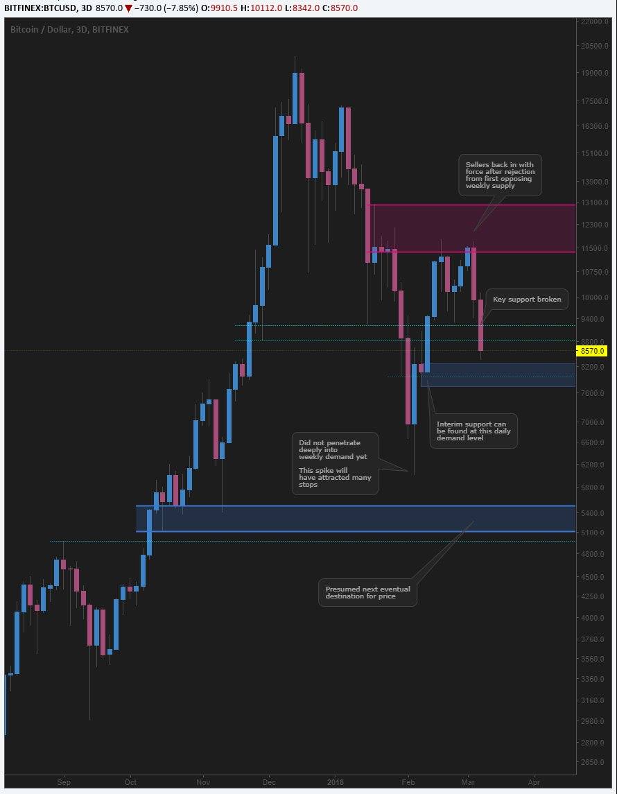
Where is the bottom for Bitcoin?
I posted this chart on some social media the other week, so will be using it at my reference:

My target to buy up a load of Bitcoin is down at that ~$5000 range, because of the huge weekly demand level still being in play.
As you can see from the picture above, we had a big spike into the weekly demand (I've shortened the actual flag where the top is $5500 and the bottom is $5100 so as to keep the chart looking nicer, when the top of the level is $7378). More on that later.
My main focus I want to show you is the "interim support" level which has most people fooled, believing that we are reversing here - coupled with the news coming out of G20 about no agenda for regulation any time soon, people are expecting us to go big from here.
Sadly, this isn't how it works. If you want a big reversal, you need some big orders, and they are found at big demand levels.
Let's have a look at that interim support on the 15M.
From left to right:
First circle is showing us that the bottom of the demand zone was respected perfectly, but there wasn't much meat to the move. Hence "interim". We look to trade at the bottom of demand zones as that's where we get the biggest reactions, and if we're wrong and price continues south, we don't have as much of a loss. On the flipside, if we are correct, we get bigger gains.
The second circle shows where that demand zone has been engulfed. When this happens, it usually means price wants to continue in that direction.
The third circle shows roughly where price started moving thanks to the news announcement.
However, the arrow shows that this mini parabolic move is unsustainable due to the fact that there's nothing holding it up. I'll be making a separate article about this phenomenon, and we have something similar in forex called "gapping".
So, back to the first picture. That weekly demand level that I mentioned is still in play. If I make a nice marking for you on the weekly chart as below, you'll see a bit clearer what I mean.
The white lines indicate the zone I have marked from the first picture. But this is the weekly demand level.
Notice also how when we touched the top of the weekly demand zone, we got a bounce? And this was at the time that the G20 news came out? Funny, that. :)
Thanks for sharing. Upvoted! Nice colors btw. I will experiment with similar ones on my TradingView when I get the time.
Yeah, always nice to have a bit of customisation!
Nice to see someone actually include some fundamental reasoning into the chart, unlike most people who just wave a finger in the air and wishful think. The G20 news is a good call, nice !
Haha, thanks! I'm showing a different side to TA to most in crypto, so gotta explain it!
You mean you don't just put your fingers in your ears and shout 'LA LA LA LA' as loud as you can while watching your investment drop to zero ?
You must be doing it all wrong, that's what everyone in crypto does lol.
Haha, I actually have a holding pot in Vechain and a separate trading pot for day to day trading. So I'm half there ;-)
well... at least you'll be able to keep day trading then :-)