Cryptocurrency News | Market Analysis, Equities Correlations, Mithril, Crypto Tip
Hy #Steemit family you know markets are down today he seems to be happening all the time that seems to be this resistance point around the four
hundred billion dollars mark.
so today we're gonna have a little bit of a look
at what's actually going on. what might be behind this by looking at some different perspectives and checking out some traditional markets in addition to
examining some interesting statistics based out of Google Trends searches all right so let's get straight into it.
so firstly take a look at the seven-day charts we can see there are losses
across the board indicating selling is going on really across all crypto assets. Although if we do look at Bitcoin Bitcoin is actually holding pretty strong over the past seven days with only a reduction of around three percent along with the Mexico holding on that around a 3% loss neo having a loss of around seven percent and Monaro having a loss of around six percent so take a look at the global charts for total market capitalization what I've done.
Am I've set this to exactly one year ago
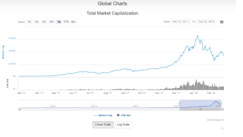
so today being the 23rd of
February 2018 so one year ago today back in 2017 what I want to do is just put some perspective on how far the market has come even though the last or a week last few days it's been pretty rough. So last few days it's been pretty rough so the total market capital one year ago today it was 21 billion dollars right. So today we have a market cap of around 420 billion odd so when we compare that to one year ago today that's actually a percent in just one year.
Pretty incredible stuff but if we actually take a look at the market peak. which was around sort of late December early January you can see here January the 7th peaked at around eight hundred and thirty billion dollars.
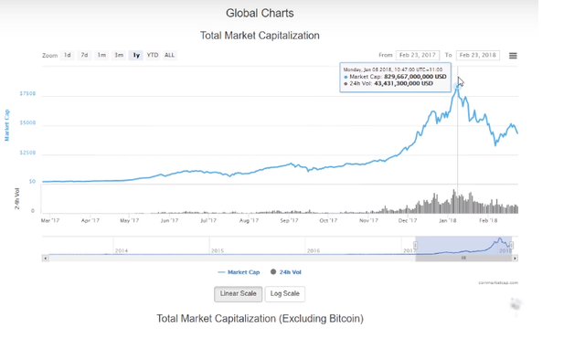
That was an increase of 40 times the market capitalization.
If we go back to live the starter last year around the market cap is around a twenty billion mark now this was an increase of around 40 times around 4000 percent from that twenty billion mark in just shy of one year.
So when you look at it from that perspective you can see just how far the market has come in such a short amount
time even though these parts kind of week or a few days we're kind of in this holding point around this four hundred billion dollar mark.
So you know we've looked at that perspective. I want to have a look at some other perspectives and kind of see if we can see some correlations with how the market is behaving to more traditional markets so let's go check that out so over here on
Yahoo Finance what we can see is we can see I've plotted a few different graphs.
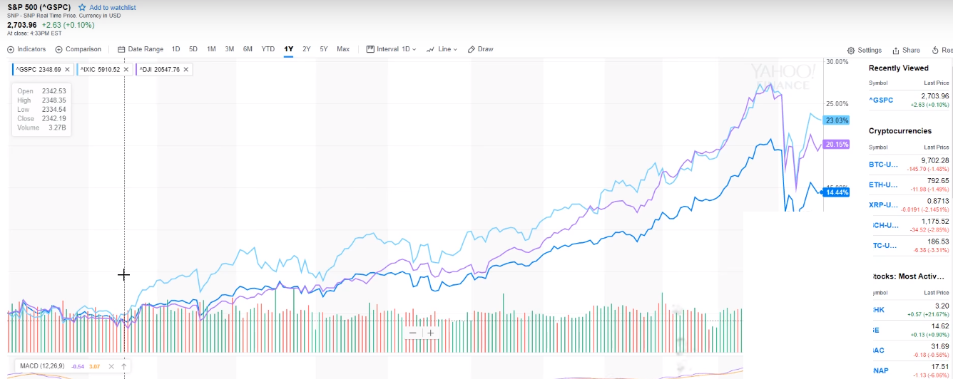
Here now the first one if we look at the dark blue line is the S&P; 500 index now. The S&P; 500 shows the accumulative market capital for around 505 of the top US companies now this shows the equities or shares in the companies and the SMP. Is kind of seen as a representation of the US stock market's performance is quite another one number one go to for the kind of like the economic health of the United States and how the economy is actually performing. Because it represents so many companies. No other data I have added is the Nasdaq.
Pic of Nasdaq Data.
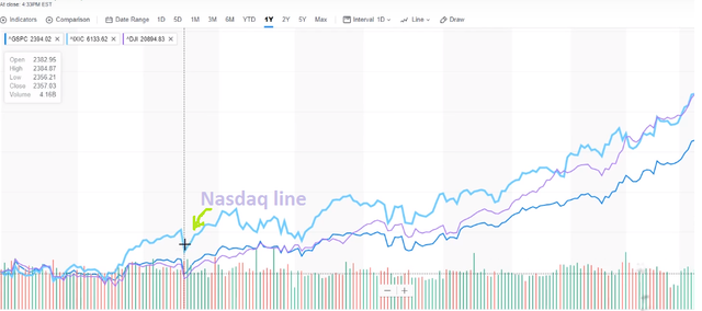
Nasdaq is represented by this light blue line.
And the Nasdaq is a listing of some
of the biggest technology companies so companies such as Tesla Science companies such as Intel so these technology-related companies are listed by the Nasdaq. And the last one which is the Purple Line is the Dow Jones.
Dow Jones line
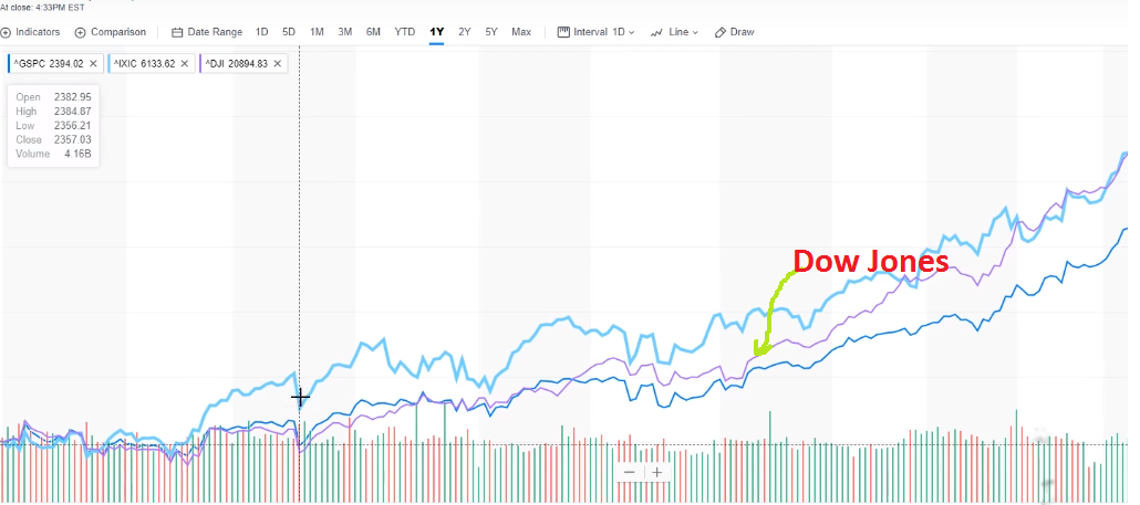
Industrial Average now although the Dow Jones Industrial Average is not calculated using my capital.
it's actually calculated something called the price-weighted index and it kind of represents 30 of the major stocks so the reason.
Why I've done this is to show and how closely correlated these different markets are even though they kind of represent different sectors of the economy so if we look at the graph. We can see here just how closely these are actually aligned we can see that over time now.
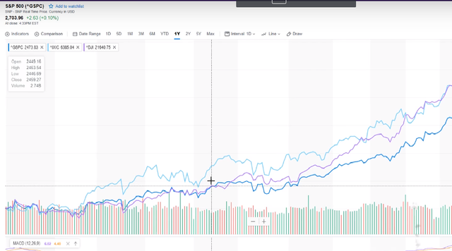
by the way, this graph represents one year ago today just the same as the cryptocurrency market.
We can see the growth from the start of last.
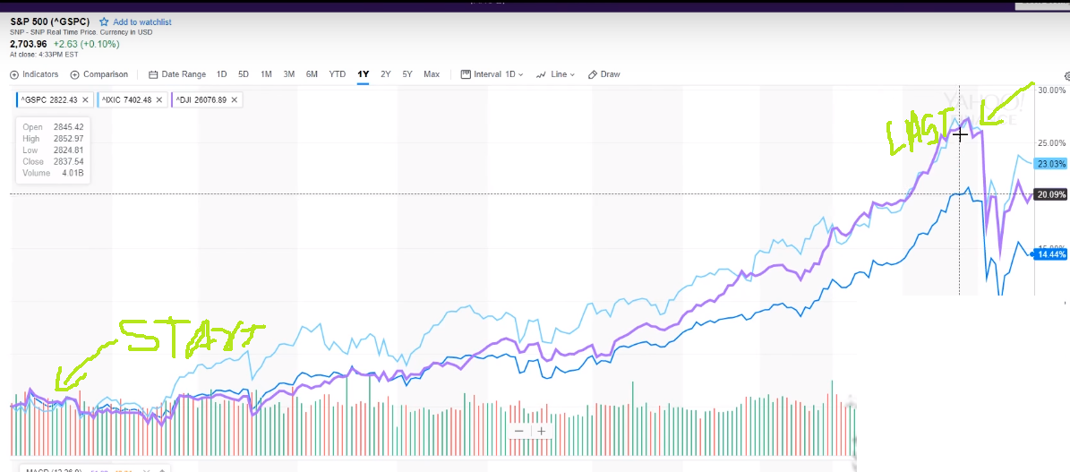
year up until this point here which is around sort of mid to late January
before there was quite a big correction.
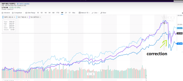
and then a sort of slow recovery sort of over the past couple of weeks so quite interesting that you can see these markets are very very very closely correlated so let's go and check out the cryptocurrency market and see if we can see any kind of similarities in the shape of these graphs and thus the correlations between these two completely different.
it's so back here over on coin market cap so again this is a 12-month period.
we can see this steady growth during the last year up until the peaky which was the first sort of just past the first week of January before started correctly.
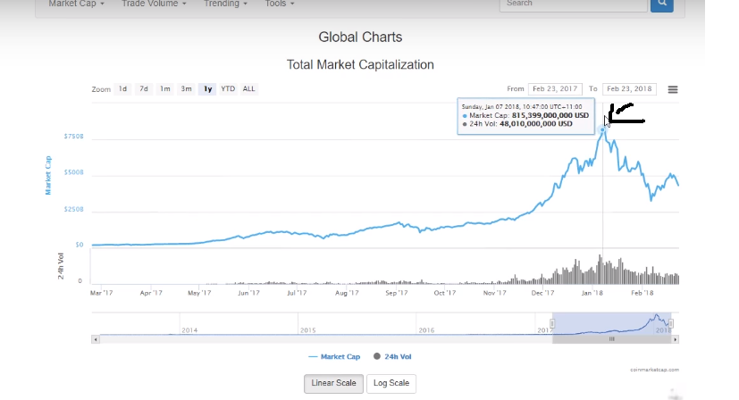
so just take a mental picture of the shape of this graph ignore the market capitals what we're looking at is the shape over time that's the most important thing again because we're trying to see if there's any correlation to existing more traditional markets.
Coming back Yahoo market we can see that there's a very there's a close correlation now it's absolutely not.
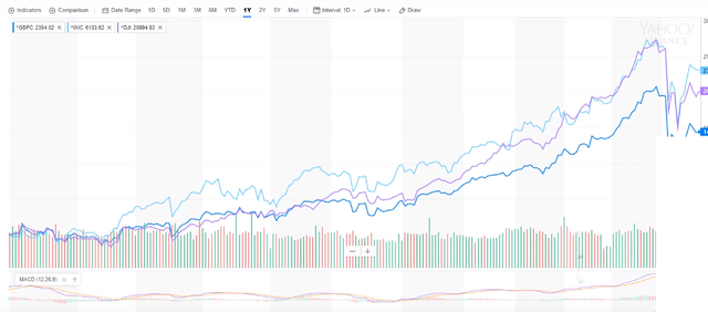
one-to-one and I'm not saying it's 1:1 but we can see there are similarities in terms of the shape of the pattern cows grown over time and then that subsequent correction so we can I believe actually start to see some correlations between those traditional assets and the cryptocurrency market so the whole reason I've got I guess I'm showing this is to show that there are similarities between the market psychology or the human behavior behind how these markets react but to sort of enforce that a little bit more let's go and check out some of Google's wrens.
Here we are over on Google Trends now.
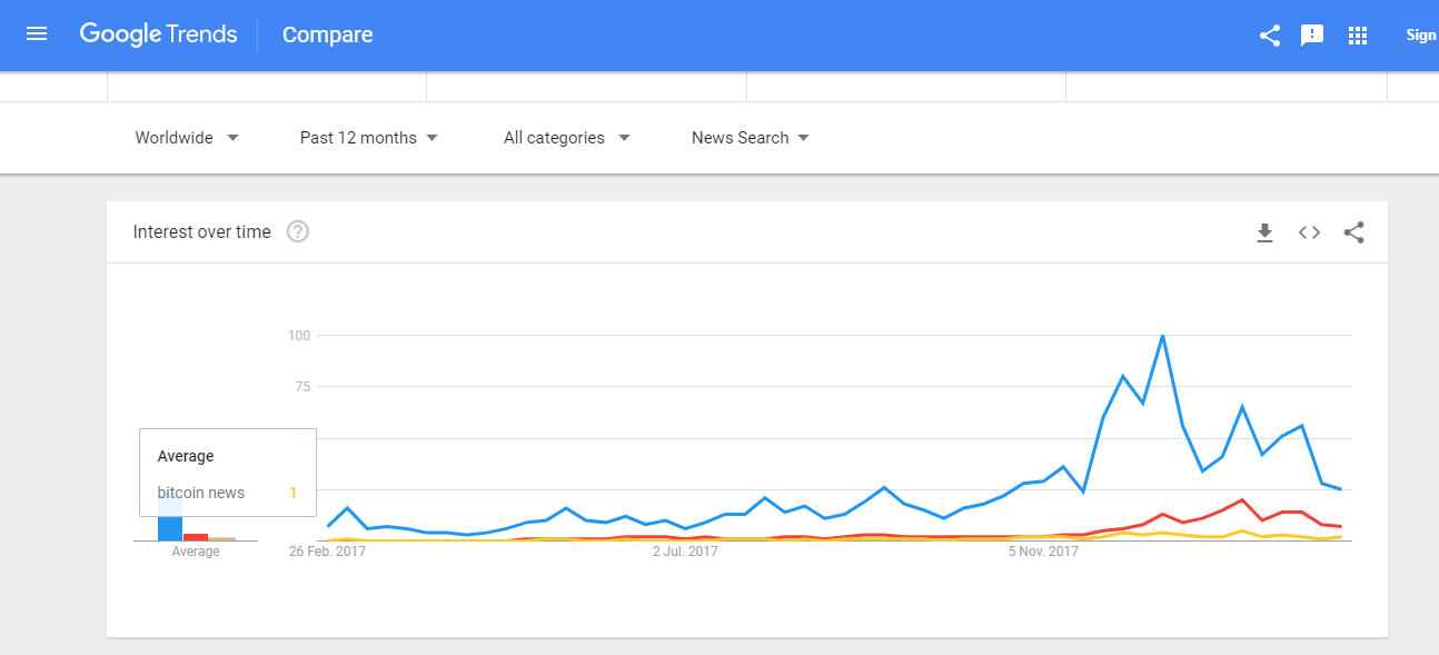
For those of you who don't know Google Trends is an amazing feature within Google where you can search for different terms that people have actually searched for and you can basically track the volume of those searches over time which gives you an amazing insight into really how people are thinking at any given time based upon a particular subject it's incredible and it gives you these tools. where you can kind of analyze behavior behavioral patterns out there in the public conscience so it's really incredible so what I've done here is I've searched for three terms.
Bitcoin cryptocurrency and Bitcoin news now.
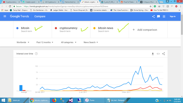
now I've actually narrowed down this search to news so these are like people searching for these terms for news on these topics.
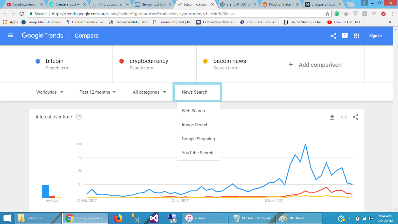
now the same as the coin market cap and the same as the Yahoo Finance this has been taken over the past twelve months so we can see some similarities in the shape of these terms.
now if we have a look here we can see Bitcoin peaked
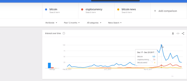
around December and then started to correct really leading into January the same with cryptocurrency and the same with Bitcoin news take a mental image of this let's go and see how similar the patterns are to the cryptocurrency market.
so back over here on coin market cap taking a look at. the shape we can see just how similar those shapes are now what does this tell us.


well it tells us that when the market is going up the valuation is going up the news increases right because there's more hype there's new more euphoria there's more groupthink where people are doing what everyone else is doing the markets going out we better jump in we've been why more cryptocurrencies there's more news and more people are being made aware of it and thus it's kind of like a self-fulfilling prophecy as more people find out about Bitcoin more people jump in the problem with it at this time is as many new investors that have never invested before much of the money coming in is purely speculative and it's also based not a lot of it's not based on research so people are buying things that they might not fully understand and they're speculating on the price to go up what happens is things become overvalued right which then you have a risk of a speculative bubble you know so really what this kind of tells us looking at it from this kind of perspective is it the price of Bitcoin and crypto currencies correlates with an increase in search terms and thus an increase in news coverage so when Bitcoin and crypto booms so does the news so there are more people looking at the news and then more people get into crypto currencies but there's a bit more data let's go and check out some previous data on the S&P; 500 and see what we can extract out of that and apply to cryptocurrencies .
so what we're looking at here is data
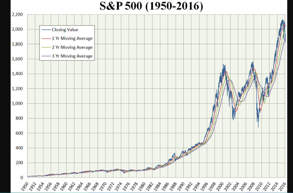
from the S&P; 500 again we cover the S 500 a little bit earlier over the past sixty-six years now what it is is the market capitalization over time now what we can
see is over time it grows it corrects it grows it corrects it grows so basically what happens is as the economy grows industry grows the population grows the demand for goods and services grows and thus the whole economy continues to grow as well and these more industries come out and then the market starts to grow of the economy so if we kind of have a look each of these bars is or each of these columns is basically two two-year columns we can see these small Corrections the time and as it sucks to sort of boom.
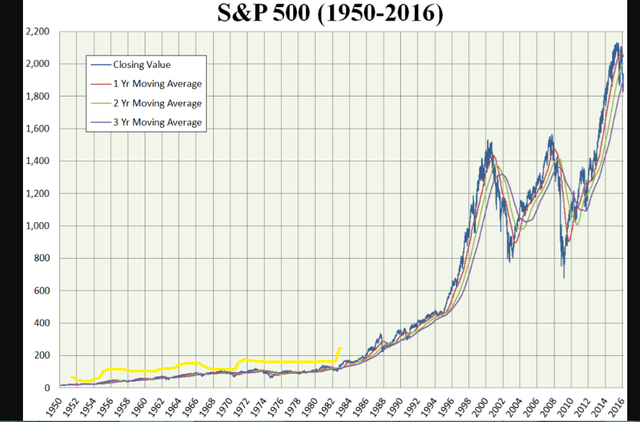
here we can see these massive Corrections.
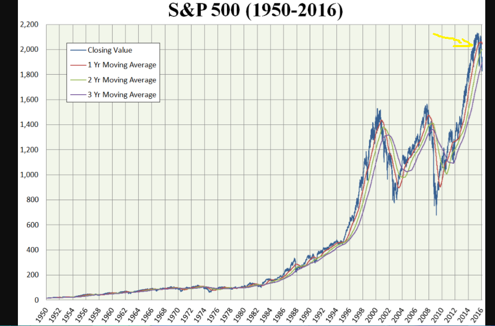
but overall the market continues to grow now again this is 66 s worth of data this is a lot of data but what can we take from this and apply to cryptocurrencies well here we are looking at kryptos over basically.
since they started recording a data right so back from in sort of May 2013 and there's a market cap of just one and there's a market cap of just one point 1.3 billion.
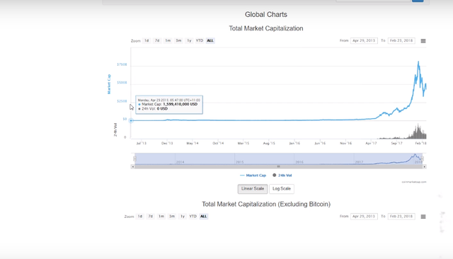
we can see over Ptolemaic gradually grew had Corrections and graduated there it's hard to see here because we're zoomed out so far.
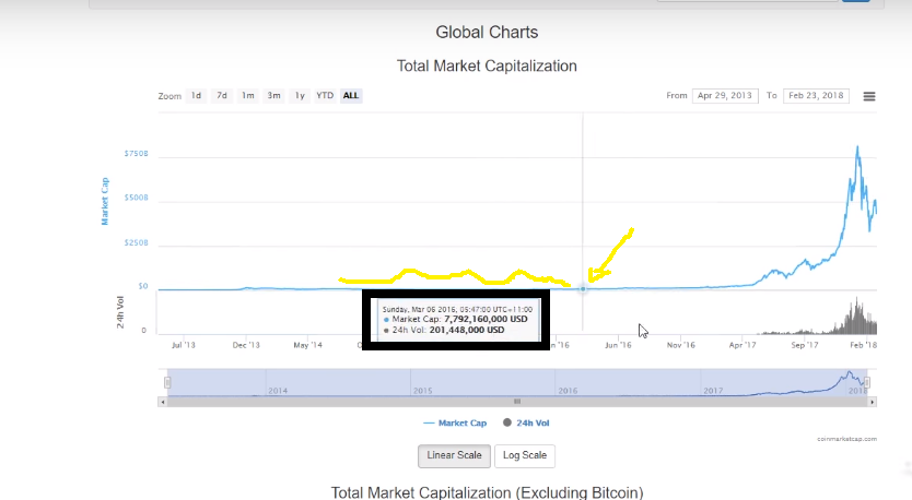
But we can see this really steep growth here but we can see corrections along the way.
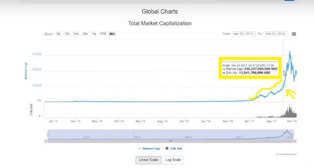
now whether you apply that same methodology is the SMP growing over time of correlates with the growth in the economy to cryptocurrencies really depends on I guess your definition of cryptocurrencies and whether how you see it as an asset class how you see it as a technology I personally see it as a completely different asset class script our assets and I think that the assets are going to grow with the technology as well but either way doesn't matter how you think it's an interesting insight when you look at traditional assets and how they're performed over time trying to apply that to try and give us I guess some chronic insight as to how cryptos are going to go in the future and also explain a little bit of you know occurring over the past sort of a few days a few weeks.
one thing that does stay the same no matter if it's cryptocurrencies or stocks or equities is the that's where the market hype cycles come in and the FOMO drove buying comes in and a speculative nature of people jumping in comes in as well and then you have those kinds of bubble territory periods where things become overvalued I also say that no one can ever want to ever see 100% predict the market and I completely stand by that you know that's why I stand clear of predictions and one thing I person confident in is that cryptocurrencies are they're not going anywhere this technology is here to stay blockchain is here to stay we can see government's starting to embrace blockchain tech allaround the world and I believe that cryptocurrencies coming from very strong platforms that have high token utility.
Hope you all are like my post if you like my post then.
