Bitcoin: the graphics explain the current moment.

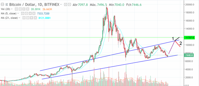
For those who are accompanying Bitcoin (BTC) saw that the price of the last 24 hours had a slight improvement, but all this was within the expected. When looking at the one-day chart as shown in the figure above, the last candlestick formed on the one-day chart was of utmost importance to the digital currency market, because if the candlestick had formed by drilling the bottom blue line, Bitcoin going to get very low values like we had about a month ago and a greater instability would be started in the market.
But now we are starting a tertiary trend where the price of Bitcoin will grow towards the top blue line of the chart above, that is, Bitcoin will fetch around US $ 10,500.00. After that, we will have two possible directions for Bitcoin:
1º The bulls continued strength in the market and the blue top line will be pierced causing prices to move towards the US $ 12,000.00;
2º Investors were worried that the price was too high and began to discard their position. With this, the bears have taken over the market and the blue upper line when touched will push the price down, starting a new fall.
In addition, we can use the MACD to confirm what I said above, as you can see on the MACD chart below, the MACD is inside a triangle formation and its variables have touched the bottom blue line. With this, your direction will be modified by going toward the top blue line. From there, we have two scenarios:

1° The BTC will break the $ 10,500.00 barrier going towards $ 12,000.00;
2 º The BTC will begin to retract causing the trend of the MACD chart to go towards the bottom blue line.
Note: Your vote is of great importance to me, so I can see if my posts are having any reach to the public. I count on your collaboration for me to have feedback if it is for me to continue with the posts or not.