RE: Race and Evidence
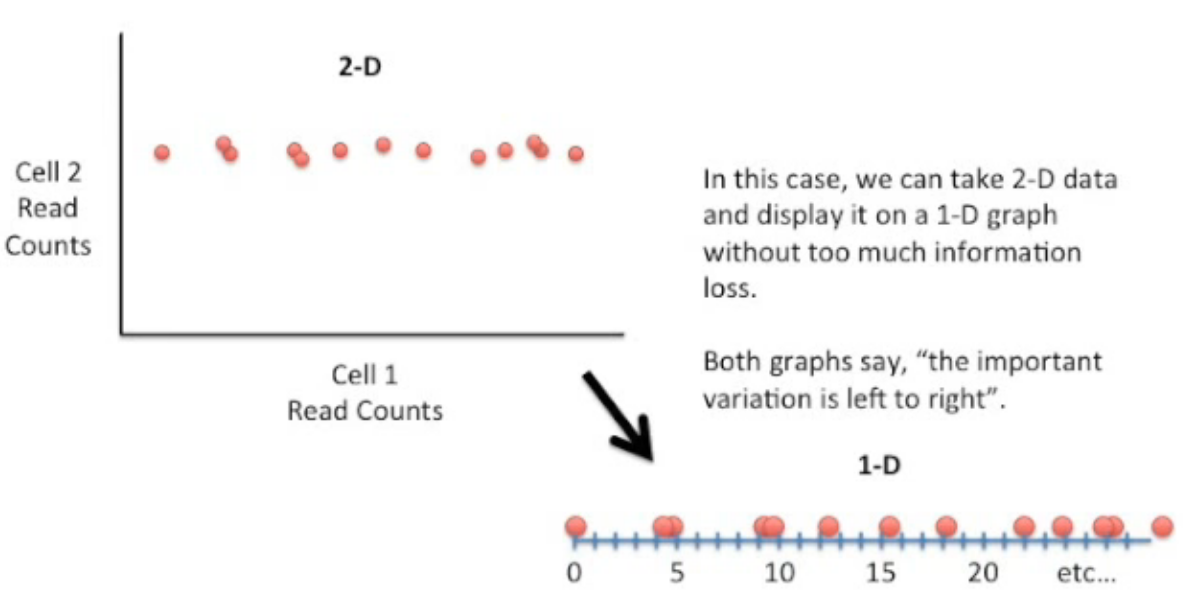
One must remember is not properly a statistical analysis tool but a data visualization tool. Is biased. (although you can do further PC regression and even partial least squares regressions, but that's just for completition) In this case, since the information I wanted to represent and the point I try to make, a cline and how is a linear continuum of change across geography. PCA's represent linearly changes in a continuum of a set, it sounds like dimensional reduction is a match made in heaven for us in this case.
If you want to represent a lot of information from several variables, with probable correlations analysis, in a single graph while conserving most of the variance of the data. The first advantage is you can represent it in two dimensions (draw it, I mean try to draw 7 variables and their axis), the second is that the clustering or redundancy hints at the information that was lost in the flattening or reduction of the dimensions.

Video on the intuition of PCA 1, 2
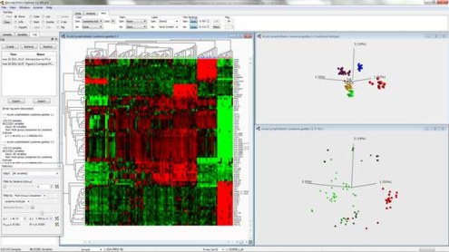
The two more common options are either PCA or Heatmaps with hierarchical clustering.

Article comparing their differences
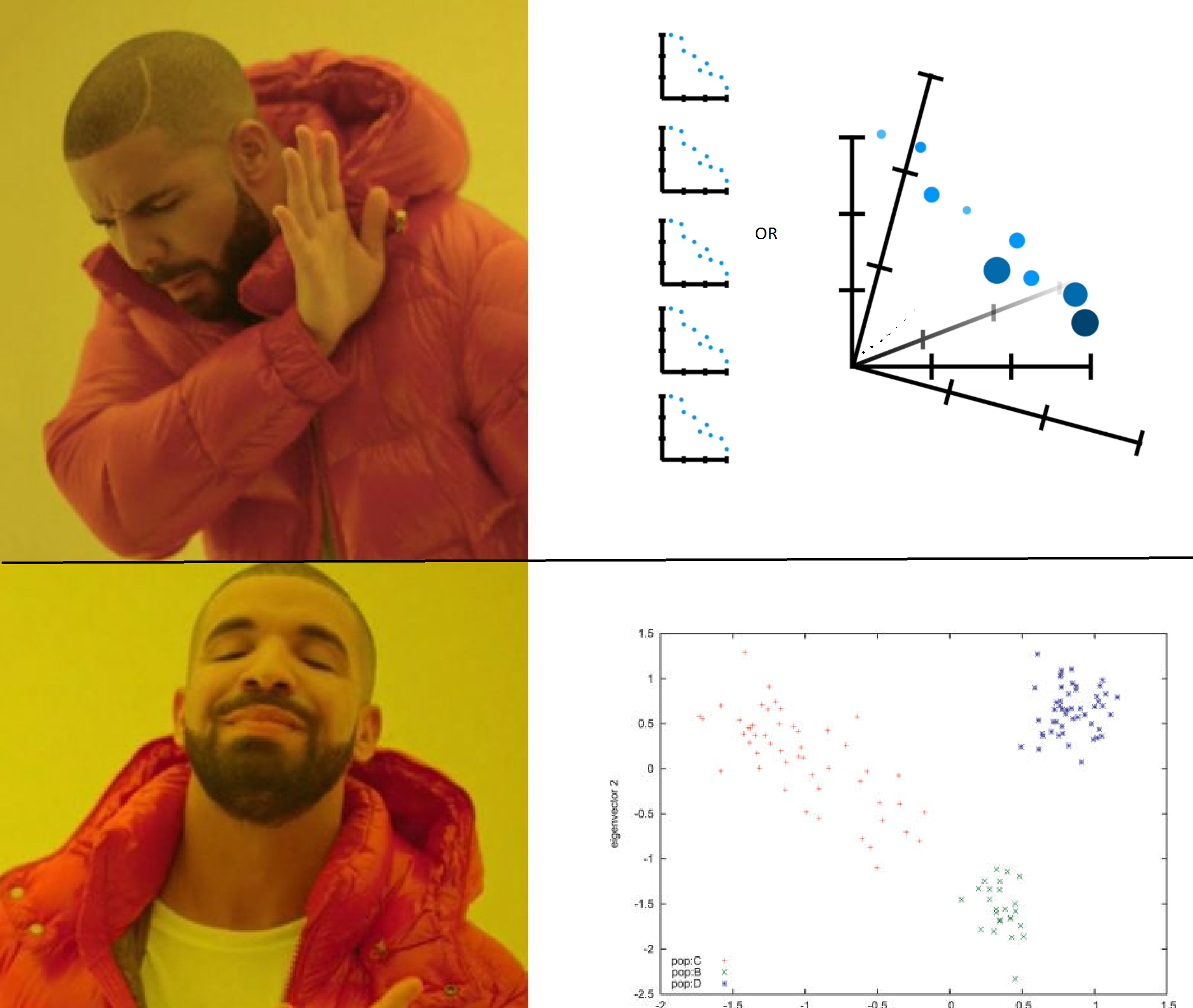
Those clusters are methods to group the shared redundancies of the data of those variables. It saves a lot of computational and graphical costs instead of doing this:

ps: Sorry if you get lots of notifications on the edits. I'm doing this from a phone and I have OCD.
This is lovely. A lot of information at once. I will take my time to digest them in bits. thanks!