Bad Design #74 — it’s not their fault
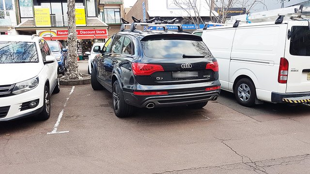
Most of you would have come across this situation, where a “careless” driver has inconsiderately parked his vehicle across two spaces. And I am sure many of you would have let fly a few expletives at the time too. But if you remembered what you learnt back in Mindfulness class, you would have paused and taken a moment to ponder the situation…before losing your sh#!
When confronted by a situation like this, most people’s reaction is a negative one, whereby their immediate response is dictated by the immediate information presented to them. In this case, you drove up, you saw a vehicle taking up two spaces (which just so happened to be an Audi Q7 which made you even angrier for no substantiated reason), and you decided right there and then, in that split second…”what a dick!”.
Tsk tsk tsk, how quick we are to judge, and without any evidence at all.
So let me just get straight to the point here…
IT’S NOT THEIR FAULT!
This particular parking area is a busy area, it is surrounded by shops and of course shoppers with bags and trolleys, there are lots of cars coming and going, as well as delivery trucks of all sorts of sizes, even semi-trailers manage to squeeze in here to make their deliveries at times. And yes, I hear you, that is no reason to park like an idiot, and you are correct.
The real reason this driver has parked like an idiot, is because he was forced to,
forced to by bad design.
Let’s take a closer look at this particular parking lot.
90° parking spots
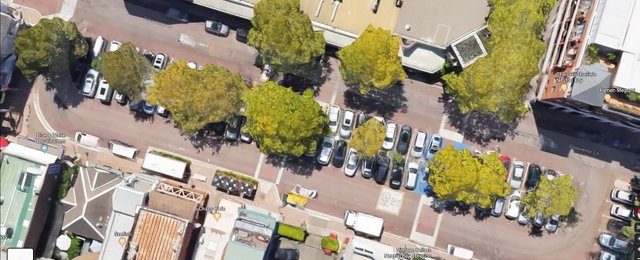
In the satellite image below we can see the parking lot in question. It has been designed with 90° parking spots. This means vehicles must be parked at 90° to the aisle, ie. perpendicular.
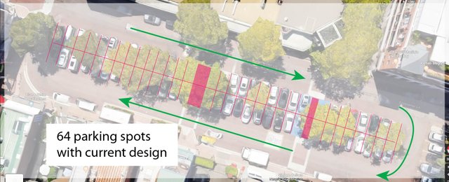
In the next image I have overlaid the car spaces, in pink, so you can see them all despite the trees. I have also shown, in green, the allowed traffic flow direction. All up there are 64 spots. The pink blocks are pedestrian pathways.
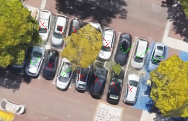
In the next image below, we zoom in and take a closer look, we see that the Audi driver is not the only idiot in this parking lot. In fact, just within this one snapshot, 9 out of the visible 14 vehicles are parked like “idiots”,
that’s 64%!!
Is it possible the world is full of idiots?
(Actually yes, it is very possible, in fact I think the percentage is higher, hahaha, but that’s for another discussion at another time.)
Ok, let’s make the human-hopeful assumption that there are not that many idiots in the world. So then it must be asked…
Why are so many people parking like idiots?
The problem here, is that the aisle space, the space indicated by the green arrows in the above image, is too small to allow for comfortable and easy maneuverability into the 90° parking spaces. Hence drivers are finding it challenging to park 100% perpendicular to the aisle and within the white lines.
I am sure the council has met their obligations and followed the “AS2890.1–1993 Parking facilities” Australian Standards when constructing this parking lot. But with so many drivers unable to park correctly, it must be said that the standard just isn’t adequate in this situation. Well, perhaps not that standard is inadequate, but rather that the minimums should not be the council’s benchmark. We all know what happens when we do that, don’t we Boeing (read what happens here).
The parking lot needs a redesign…Here’s an idea!
Less than 90° parking
Yep, you know what I’m talking about. Here is an image where on one side of the street they have used 45° parking spots. Compared to parallel parking, 45° parking can fit plenty more vehicles, so it’s a nice use of space on this occasion.
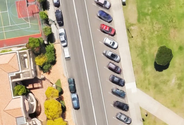
Seems like a logical option…lets try give it a go…
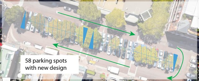
Ok, we lost some spots, 6 to be exact. And sure, if the designer’s primary goal was to maximise space for spots, then well done, goal achieved.
But by losing 6 spots what else have we lost:
- frustration, anger, internal and external
- expletives, stress, tension
- scratched doors, insurance claims, missed work
- undesirable experience, bad UX
- the challenges of maneuvering within limited space
- the difficulty in reversing out of a parking space (we can finally see what is behind us)
I’m sure there are no complaints about losing those things.
And by losing 6 spots, what have we gained?
- the opposite of all the above
- comfort, ease of use, security, confidence
- increased turn around times, faster ins and outs
- pleasurable experience, UX
- more motorbike/scooter/bicycle parking
- or green spaces
- the range of drivers prepared to park here increases due the reduced challengers, think elderly and less mobile
Yes we lose some parking spaces, but the list of things we lose, and the list of things we gain, surely makes up for this. The overall experience is a positive one. People enjoy shopping here because the parking is not an anxiety brewing minefield.
Standards are great as they ensure everybody works within the same rules and they ensure safe minimums are defined clear as day. But there is more to design than maxima minima, we are not sardines, we are not cans of beans…we are human!
CitizenRod
CitizenRod, multipotentialite, renaissance man. Follow me on Medium, Twitter, Instagram, & LinkedIn, check out my artwork here, and my apps Maate.it and CryptoFlip.me.
The world is full of subpar solutions. It is likely the design was chosen due to... being standard design. Like we now choose qwerty keyboard which is not optimal in any way... With parking spaces at least they can theoretically pack more cars.
Congratulations @citizenrod! You received a personal award!
You can view your badges on your Steem Board and compare to others on the Steem Ranking
Vote for @Steemitboard as a witness to get one more award and increased upvotes!