Bad Design #71 — when every user, is a new user

On my recent trip to Europe I was fortunate enough to stay in 22 different lodgings, from hotels to hostels. We stayed in a different town every single night. 22 lodgings = 22 different bathrooms… what an experience!
Ah the bathroom… the infinite giver of bad designs
Now I could have written an article about each and every bathroom I encountered on my trip, believe me there were plenty of doozies, but that would get boring pretty quickly (though if I’m ever stuck for material…you know what I’m writing about, hehehe).
So yes, there were lots of design issues in these bathrooms, like pan height, toilet roll location, confusing flush buttons, tiny spouts, those damn shower curtains, etc etc etc (by the way I’m also a product developer or inventor, whichever tickles your fancy, and I intend on creating the ultimate shower curtain one of these days so help me God!!). So yes, plenty of bad designs.
But instead of writing about those particular aspects, this article is about my experience as a user…
as a user of 22 different bathrooms.
As a user of 22 different bathrooms, I got to experience entering a new bathroom 22 times.
So what does this mean?
It means that 22 times, I had to:
- orientate myself and understand the space
- find the light switch; if there were multiple switches, I had to work out how they worked, usually through trial and error
- determine if there was a ventilator; did it turn on automatically with the lights or was there a separate switch somewhere else, where?
- identify which towels were for the body and which were for the floor; as well as identifying if there were sufficient towels or if I needed to request more; and also decipher if towels in the bath or the floor meant replace or use again
- at the basin, determine which tap was hot and which was cold, if not obvious then trial and error it is…ouch
- figure out the flush buttons, the last toilet used a full moon and half moon, this one the buttons are the same shape but they have different patterns printed on them, what do they mean?
- is there cupboard space for my toiletries or do I have to leave them on the counter; is this mirror fixed or is there a hidden cupboard behind it, and will it break if I try to open it and there isn’t?
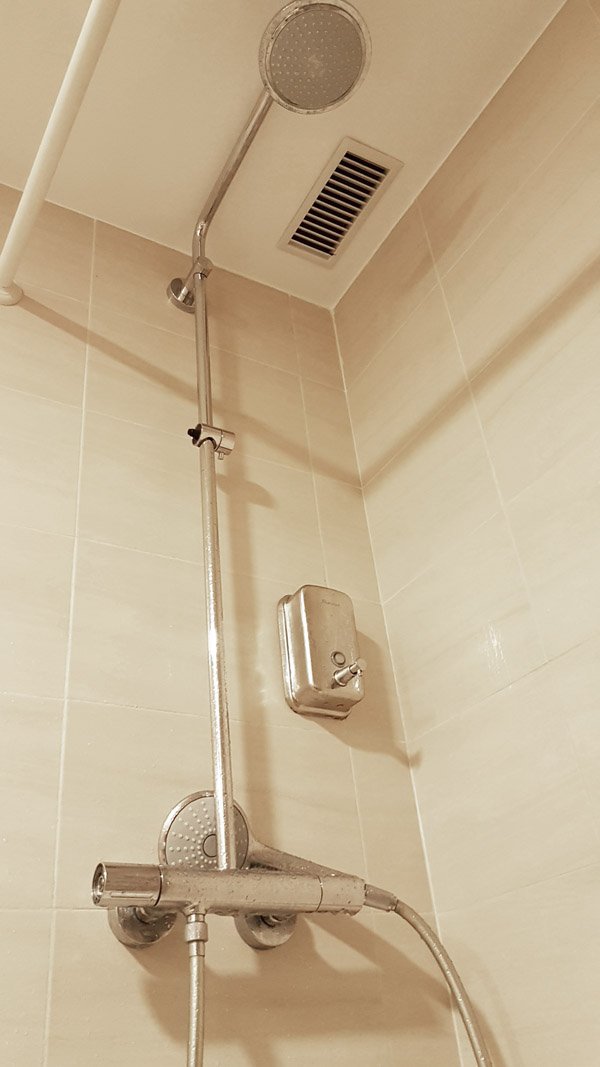
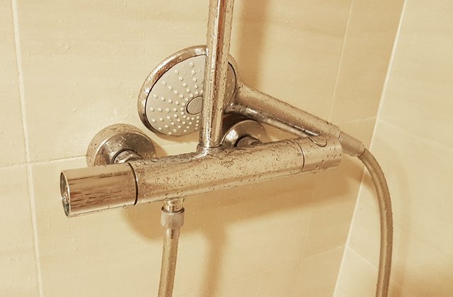
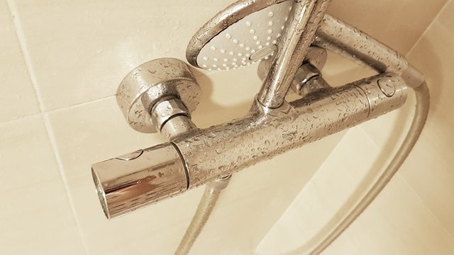
- figure out how the shower worked; which knob controlled the shower head; which knob controlled the bath spout; what was a knob and what just looked like a know but wasn’t; will the water come out the hand-held or the fixed head or the bath spout; which knob was hot which was cold; can I stand outside and prepare the water or do I need to be standing in the shower; is the vent on?
- how sound proof is this toilet, how much can others hear me; how discreet should I be?
- where is the extra toilet paper kept; is it reachable from a sitting position or should I prepare?
- how do I lock the door; how do I unlock the door?
- how do I prevent water from splashing everywhere; should the curtain be inside the bath; if I close the glass door, can I still hang my towel on it; where are the towel hooks?
- is that where I bath my baby? no, that’s a bidet!…CRIKEY!

You may think I am over exaggerating, but this is the process you go through when you encounter a new environment, in this case a new bathroom. You go through a process of discovery and learning so as to understand how you will interact with that environment. And the bathroom is a little more complex than learning a new bedroom environment, so there are a lot things to understand.
So what’s the insight?
Listen up Architects and Interior Designers, this is for you.
The insight is:
Designer’s decisions need to take into consideration the “knowledge levels” of their users.
Now by knowledge level I don’t mean their intelligence level. By “knowledge level” I mean their familiarity, their previous exposure, their gained knowledge, of the space and of the products within that space.
To do this designers need to
categorise the “knowledge levels” of their expected users,
and thus design accordingly. Let’s stick with the bathroom example to explain.
A user in their own home, which they have lived in for 5 years, has “expert” knowledge of that bathroom. They know how everything works and they know where everything is. They don’t need to figure anything out, they did that the first week they moved in.
Now take a user visiting a hotel they have never stayed at, in a city they have never been in. They have never entered into any of the hotel’s bathrooms. This user could be categorised a “beginner”. We could then assume this user has used a bathroom before, so it may be more appropriate to categorise this user as an “intermediate” user, because they know ofbathrooms. But they don’t know the intricacies of the hotel’s bathrooms, so perhaps a better category could be “beginner-to-intermediate”.
The better you define this, the better your ability to design accordingly.
So as a hotel designer, now knowing that your bathroom users are “beginner-to-intermediate”, you must design according to that level.
- Your user is not an “expert”, therefore they will need to learn the bathroom environment when they arrive
- Your user may only stay 1 night, therefore they don’t have time to learn the environment over several days
- Even if your user will stay for several nights, you want them to be comfortable with the space as soon as possible, if not immediately, some of them just got off a 30hr flight!
So what do you need to do?
Minimise the learning gap.
And how do you do this?
By keeping it simple stupid!
Isn’t that always the answer?
The latest wiz-bang shower controls may look fantastic, and they may give your ego a boost... “Look at what I have designed, it is out of this world, gosh, I am so fantastic”. But you have to realise,
some products are made for the home, and some are not.
also, a very important insight in the case of the hotel, and other places you have visitors, is:
every user, is in essence, a new user, so must be on-boarded every time.
Every time!
You may want your user to “feel at home” during their stay, while at the same time elevating the opulence of that experience, and that’s great, that’s why we love staying in hotels, they make us feel like movie stars. But at home I don’t fumble over the light switches, at home I don’t mess the floor with water, at home I don’t need to solve a puzzle when flushing the toilet, and at home I never get drenched or burnt trying to figure out how the shower works.

In the shower example, you need to find controls that make sense, controls that are intuitive, controls that don’t need 5 minutes to “figure out”. As always, you need to find a balance, as always you will need to compromise. Budget, theme, style, space, user, aesthetic, knowledge level, location, time…it all matters.
As a designer, your job is to make it mesh, in the most elegant possible way.
If you take the time to truly understand your users, you will be better positioned to provide the ultimate experience. Don’t just implement the latest gadget because you want to appear cutting edge, there are a plethora of bathroom accessories out there, don’t worry, you will find the perfect fit.

And please… don’t even think about supplying instructions in any written form…oh please no.
- - -
CitizenRod is a designer, artist, entrepreneur, and thinker. Follow him on Medium, Steemit, Twitter, Instagram, LinkedIn, his artwork here, and his startup at Maate.itNote: This article was originally posted on Medium by CitizenRod.
Hello @citizenrod, thank you for sharing this creative work! We just stopped by to say that you've been upvoted by the @creativecrypto magazine. The Creative Crypto is all about art on the blockchain and learning from creatives like you. Looking forward to crossing paths again soon. Steem on!
Congratulations @citizenrod! You have completed the following achievement on the Steem blockchain and have been rewarded with new badge(s) :
You can view your badges on your Steem Board and compare to others on the Steem Ranking
If you no longer want to receive notifications, reply to this comment with the word
STOPVote for @Steemitboard as a witness to get one more award and increased upvotes!