Bad Design #13 — that’s beauti… uhh what’s that?

Lamps, there are thousands of them. Whatever tickles your fancy. Sizes, shapes, colours, materials, price, you name it, there’s a variation out there for you.
But even with all the differences between them, they all have one thing in common…
a power cable.

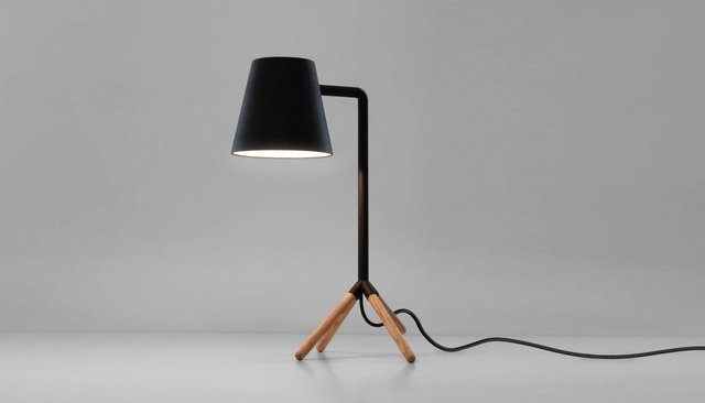
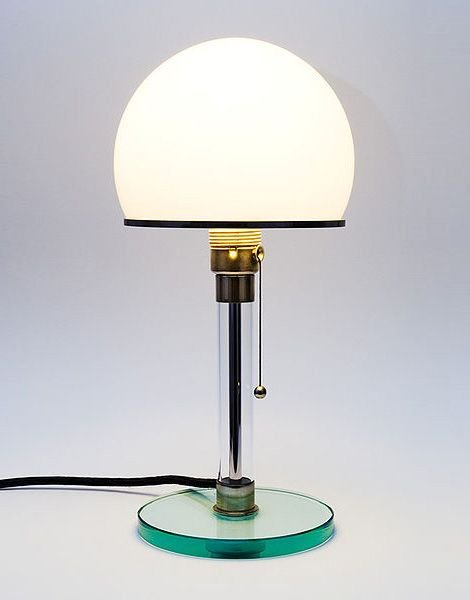
Now some designers take this into account and try their best to involve the cable within the design, great. But for the majority of lamp designers, it seems the power cable was never even a thought. It’s like they designed a beautiful piece of art and then said “Oh, now where should we stick this?”
And you can see this in the way lamps are presented on websites and catalogues. They hide the cable as best they can, maybe even Photoshop it out, tsk tsk tsk.
Look Ma, no cables…
So yes, there are constraints, and power is a big big constraint, but this is what designers are trained to work with, constraints. They’re not supposed to neglect them.
It’s always sad to see a great lamp design “ruined” by an ill-thought power cable.
Challenge to the techies. Here is a problem, with plenty of opportunity. What can you come up with? Rechargeable? Microwave? Did somebody say Nikola Tesla?
Show us what you got!
CitizenRod is an entrepreneur, industrial designer, artist, and thinker. Follow him on Steemit, Twitter, Insta, his artwork at rodrigoantoniomunoz, and his startup at Maate.it.
Note: This article was originally posted on Medium by CitizenRod.
nothing like a good lamp to create mood in a room, versus the normal lights
lamps can also be a good way to save power :)
Congratulations @citizenrod! You have completed the following achievement on the Steem blockchain and have been rewarded with new badge(s) :
Click here to view your Board
If you no longer want to receive notifications, reply to this comment with the word
STOPTo support your work, I also upvoted your post!