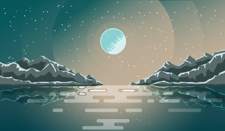
ALIEN LANDSCAPE - FLAT COLOR DESIGN (Episode 2)

Hello guys. This is the second day of my experimenting with flat color design, and I dare say, I've made some improvement compared to the landscape I did in Episode 1
I was able to gain new understanding when it comes to flat color theme and color highlights and shadows.
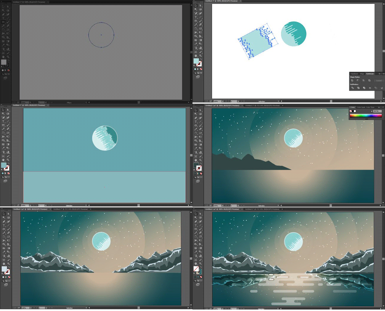
Today, I decided to do some alien landscape, I will be sharing some tutorials and how I drew various elements such as the Ice sun, mountain, and the river. In the coming episode.
I will also be adding various elements to this design, I think this is not the final form yet, I would love to add some other planetary bodies. and even alien characters on a space looking boat.
My main goal is to branch into flat design animation from this template, maybe a passing comet, the reflecting sunlight and the moving river.
PROCESS GIF VIDEO

THOUGHTS
What inspired this design is my fascination with extraterrestrial and space in general. I remember watching one documentary where the narrator talked about relativity in reference to life forms on another planet.Assuming a life form evolved in a very cold climate, that is, relatively cold to us, but to such life form, the climate is just normal.
That is why I illustrated an Icy sun beaming out yellowish warm rays, It looks cold to us but to the life forms living there, Its just a sunny day.
LESSONS FROM FLAT DESIGN
It all starts very simple: Almost all flat designs are composed of simple shapes overlapped on each other. the most common shape I used here is circle and rectangle. Flat design also helps the artist to understand geometry a bit more.
Work with what you have: The brush tool is almost non-existent in Flat designs, so there is no straight way of applying color temperatures, this forces the artist to make use of different shades of flat color and gradients.
Thanks for passing by friends.


DISCLAIMER: dropahead Curation Team does not necessarily share opinions expressed in this article, but find author's effort and/or contribution deserves better reward and visibility.
to maximize your curation rewards!
with SteemConnect
12.5SP, 25SP, 50SP, 100SP, 250SP, 500SP, 1000SP
Do the above and we'll have more STEEM POWER to give YOU bigger rewards next time!
News from dropahead: How to give back to the dropahead Project in 15 seconds or less
I like digital art more and more. I want to learn to do the same! It's WOW! =)
Wow, I'm so honored that a traditional artist loves digital art. am glad you enjoyed it. thanks :-)
i agree with you.it,s amazing just ooowwww.
wow! This is amazing. You're really a talented artist. Keep up the good work, bro! 👍🏽
Thanks for your support fam.
Dear friend! Next time also use #artzone and follow @artzone to get an upvote on your quality posts!
good post, I follow you, I'll pay attention to the way you post.
Thanks, :-)
This is so amazing! love the animation so much
Thanks. am happy you enjoyed it.
I really like how it looks both modern and retro at the same time, it's a pretty cool look! I work with some graphic design, but can't draw at all. Wish I had your skills!
Thanks for the compliment. It does take some getting used to. Once you get the hang of it, the rest becomes easy. You can start with some simple shapes and advance to complex ones. Have a nice day friend
first time but properly finished this work.welldone bro.
thanks :-)
cool! I like this photo.
Thanks :-)
Wow i love it so much
Thanks for your kind words friend
Youre welcome bro :)