Not that exciting week
Hey everyone! For the last few days I was thinking what should I upload? Do I even have anything exciting to show? Not really ahahaha :D
I have developed a shoulder pain and I wasn't able to do my artsy stuff. I only worked on stuff I REALLY have to :D And that is school work and work. I have been working on a really fun character concept desings for a guy, but I can't show that and it's sad, because I'm really proud of what I made there :D
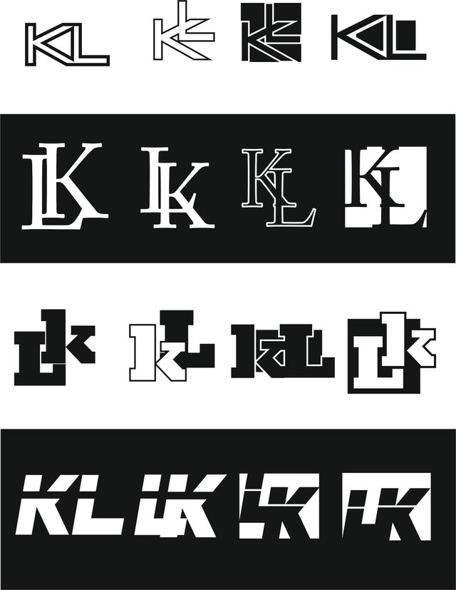
This might not be very exciting (or maybe it is) but I'm going to show you monograms design :D

So these are my first time at making monograms. At first I got the idea that this will not be difficult to make, but just as I started I realized I was very wrong :D It is really difficult to create a monogram that hasn't been done before. Dinamic between letters is also hard to create.
By making these I learned that there are a few things that can show you from the start if the monogram will be succesfull or not.
First of all it is very important to take a look and think if the letters you choose are compatible together. For example let's take letter I and V. No matter how you put the letter together or what font you use, you are going to end up with the roman letters IV or VI and there isn't very much you can do about it.
Just for fun you can try to search up monograms with these two letters, you will find almost no designs.
The letters I chose are my name and surname letters, those two are way more compatable than VI, but there is another problem with them. Every desing you can think of is already done. Not literally of course, it is always possible to think of something new, but there is chance that 90% of what you will make will be alrady done.
I speak from experiance with this one, I have made at least 100 different designs with LK latters. Then I went onto the internet to gather some more design ideas including these letters. And what I found out that 90% of the designs that I made were already done by someone else and if they weren't the design didin't look any good anyways.
There aren't endless possibilities of how you can put two letter together, if you think of something cool, there is a big change that someone alrady done it before you. I learned that the best bet is to go looking for exciting new fonts. That way even if the design is already done before, the new font will give it a unique fresh look :)
Not really a exciting post, but here it is haha :D Thanks for checking this out, have a nice day!
Exciting enough for me to comment.
Hahah glad to hear it :D
I like it that you show us different artistic stuff in your blog! Design is an area of art that is usually overlooked and unappreciated, so I really like to read your thoughts about the aspects that you have to consider when you are making these monograms. I think they are exciting :D.
I used to overlook design too, but that was before I started studying it. I think a lot of this underappreciation comes from really really simple designs, people see it and go like " oh I can totaly do this too". It is "easy" to put two letter together yea, but it is hard to put them together so it look's good :D
Thanks for your comment really appreciate it! ^^