Blocktrades Logo Challenge
This is my entry and the thinking behind the design for the Blocktrades Logo Challenge.

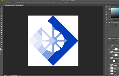
I used square ‘blocks’ rotated to make diamonds and allow space for a transparent background, and I was thinking of an arrow to represent speed.
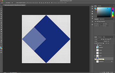
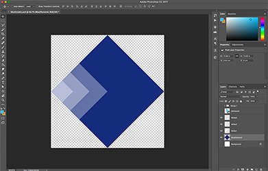
Over the blue diamond is increasingly smaller white diamonds that are semi transparent, all aligned to the left hand side to create an illusion of an arrow moving forward with a motion blur. The effect is more prominent when the size is reduced.
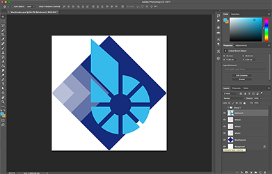
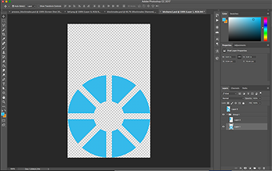
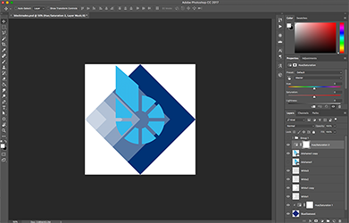
The bitshares logo I found online was not sharp enough so I quickly remade it. I used a combination of circle and square selection tools before erasing the inner circle and the lines to get as close to the existing logo as possible and create a smoother edge. This was done on two layers, the 3rd layer in the image is the original I had found on google.
I added another square and re positioned them, and moved the bitshares logo so the squares create an arrow point in the middle and to the right of the bitshares symbol.
I then made the bitshares logo white and added a drop shadow to make it stand out and to allow the top corner of the b to be seen if its placed on a white background.
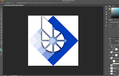
I try to keep my designs simple and bold and take consideration into the resizing of logos for use on different platforms. Below is the full size 1000 x 1000 px .png image.

Thanks to @officialfuzzy for hosting this challenge and giving me another reason to have a play in Photoshop. I have always enjoyed logo design and I appreciate the opportunity to create a logo for @blocktrades.
My design was created using Photoshop CC.