Aesthetic Essences #15
Diving through the pools of artistry that laps along the trails of digital landscapes I’ve come across the following works of art. Appreciate them and admire the aesthetic essences found within. If you’re confused about the sources, the Artist name goes to the gallery where each image comes from.
Artist: Bob Giadrosich
Upon first seeing one of Bobs’ works, I knew I had stumbled across something wonderful. Expressing a vibe akin to Moebius himself, I love the mastery of Giadrosichs’ lineart and colour-sense. Top notch compositions, labyrinth’s of lines and immaculate female subjects. Bob really does the craft justice with the extensive gallery he has available for all to enjoy. Please give your thoughts and appreciation to Bob and checkout more of his works.
Art Card Editions & Originals: Knight
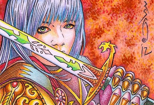
While this piece is small and the composition covers a limited area, this really caught my eye for it use of colour and shape. Shape is so important in creating artworks and is often overlooked or undervalued, which often leads to new artists have a hard time developing their skills. Understanding shape will allow you to better build and define a subject, especially with sketch studies you can practice how to manipulate the overall form of some object. When you look at it, this art work is almost entirely just shapes that are composed in a manner that reflects our base understanding of a larger form: a woman wielding an ornate sword, encapsulated in intricate armor of various colourful metals. Careful utilization of shape will add an extra layer of nuance to your composition, which will instantly draw the viewer in and have them staring for hours.
Xiangbala
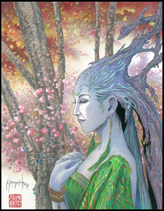
Duuude, I love headpieces like this, which you often might see on demon’s and land animals like elk and deer. Bending and molding the headpiece into such a manner really gives a surreal vibe that is highly evocative; I love following the flowing shapes and lines that trace along the headpiece as it drapes down her back and up into the top right of the canvas. Anatomically this is wonderful, as are much of Bobs’ works, which lends a lot of grace to the expression of the woman and how dainty her total visage is with respect to the position of her hands and the dress hanging off her shoulders. Look at the green in the cloth, combined with the medium-gold, with bits of orange; this single piece develops a strong contrast in the work, which goes well with the blue-teal in her headpiece and a few of the flowers in the background. Contrasting between the fore and middle-grounds really makes one stand out above the other, without really giving a huge amount of depth, along with the trees themselves practically framing the woman as it surrounds her overall form. A magnificent piece for sure.
Twins: Plate 5
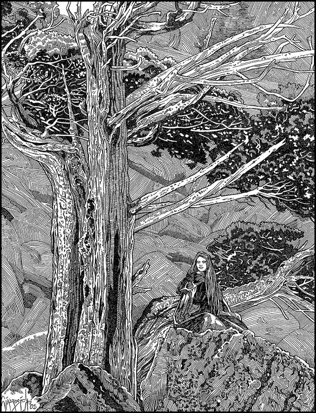
Getting lost in the labyrinth of lines that flows throughout this piece, I’m really in awe at Bobs’ technique and efficient use of line. Every line is consistent and placed with purpose; especially with how the dark shadows and bright highlights are handled to make them apparent and significant enough. The woman’s face is reminisce of moebius, with those European facial features. There’s a serious sense of strength emanating from the tree, which comes from the use of line and lack of soft-gradation you might otherwise see with other styles; scale, promixity and line thiccness will highly determine a realistic and prominent vibe within the composition.
Undying Lands
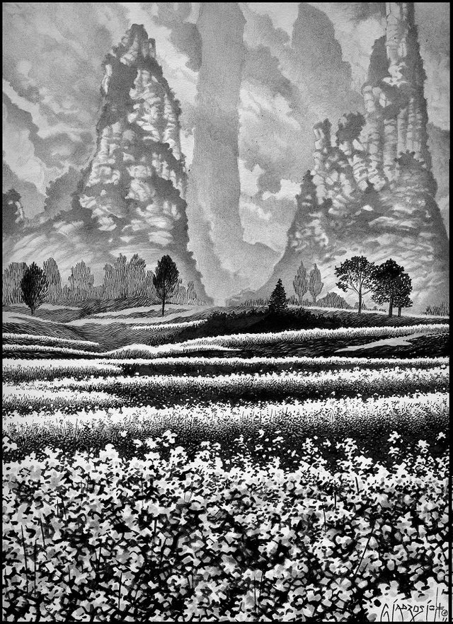
Wow, so impressive to see something like this. Perfect utilization of vertical canvas, going from a low area, up to a hill that is ensconced by the soft mountains. The way bob developed each layer from the bottom to the middle, the mountains essentially start in the middle you can see, is fantastic with the use of implied shape to build those flower fields. While the sharp lines that make up the hills behind the flower fields feel out of place from all the soft shapes that make up most of the composition, it lends itself well to showing the angle and flow of the land. I wasn’t expecting to comment on this piece but when I found it I couldn’t help but do so, it’s beautiful.
Artist: Mei
Mei is at a great point as an artist, being able to confidently create a variety of works while still experimenting and challenging one-self. Wholesomely cute, I enjoy a lot of the characters Mei has created of which many are commissioned works. Commissions are a great way to expand your artistic talent and become known. There is a lot of potential in this artist and I’m excited to see how her future unfolds! Please give Mei your thoughts and appreciation.
Tythius
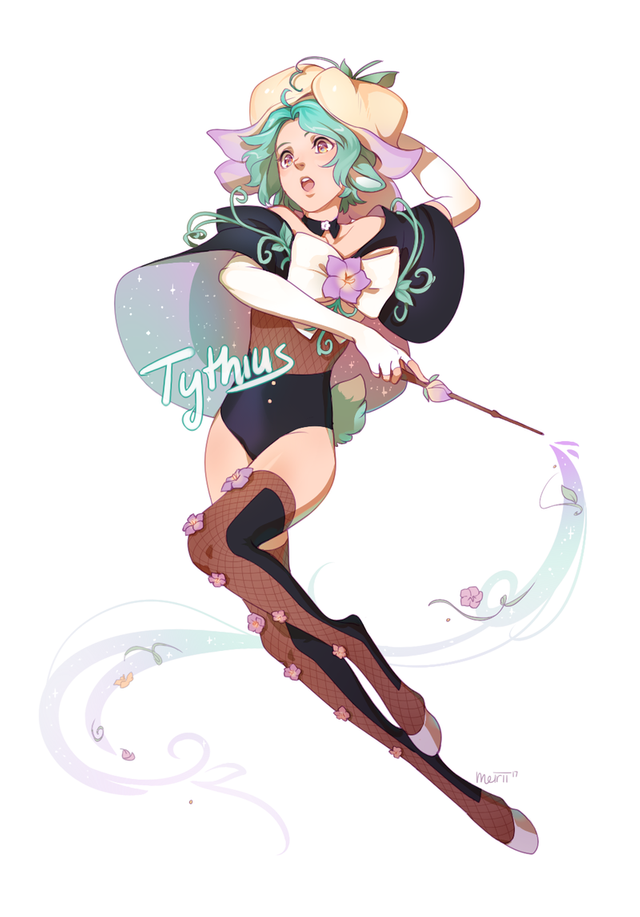
Meirii has a large selection and intended focus on character designs like this one; Focusing on creating characters, full body, portrait and eventually in a scene with three levels of depth, is an eventually step all artists should attempt. To do well with character design lots of anatomical study is required, along with understanding texture, how light interacts with different materials, and how various objects bend or move such as clothing. There’s something about this piece in particular that makes everything some soft and cushion-like, as if the cloth was puffed with air underneath and you see how it stretches and envelops the body. Cute characters, wholesome or otherwise, are always enjoyable to view and tend to be welcoming to all viewers. While there is not an immense amount of contrast, there is a poignant attention to light which givves the design enough dimensionality to stand out, along with her pose, clothing and accessories giving a more nuanced sense of proximal space for the eye to wander around in.
Vanessa
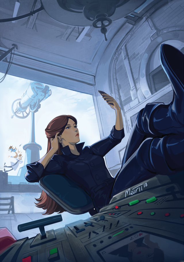
I really appreciate artist’ who attempt odd angles and variants of perspective like this piece here. Lovers of photography understand the flavor you can add to a composition by framing a photograph so the closest object within the lens is practically touching the camera; an example might be placing the camera on a surface and seeing the surface move out from under the camera into the distance, like a road or table. The perspective begins on the dashboard console here, which is slightly curved with the characters feet up on it. This generation a nice bit of pulled perspective that draws you into it. A cheeky scene with some humorous antics going on in the background develops an observed feel, as if you’re stepping onto something not often seen like some voyeur; this is of course a general idea with art itself, but some compositions give more of a voyeuristic feel than others and this has to do with the perspective and story being told.
Mermaid Festa
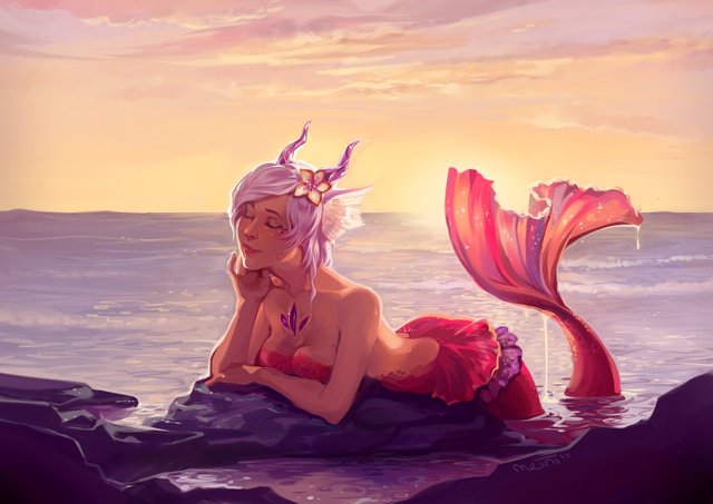
Her expression reminds me of the feeling you get when you’re relishing in the serene moment you find yourself in regardless of where you are; whether you’re on a warm beach enjoying the sea breeze, watching tv from the couch, out at lunch getting a delicious meal.(mmmm, dang now I’m hungry for some greek gyro. There’s some amazing greek food in Ohio yo!). Warming colours and scenery build up this sense of calm and peace, along with having the mermaid posed to express tender harmony. It’s important for us to display the idea of serenity, the beauty of harmony and maintaining an equal state of body and mind.
Madame of the leap
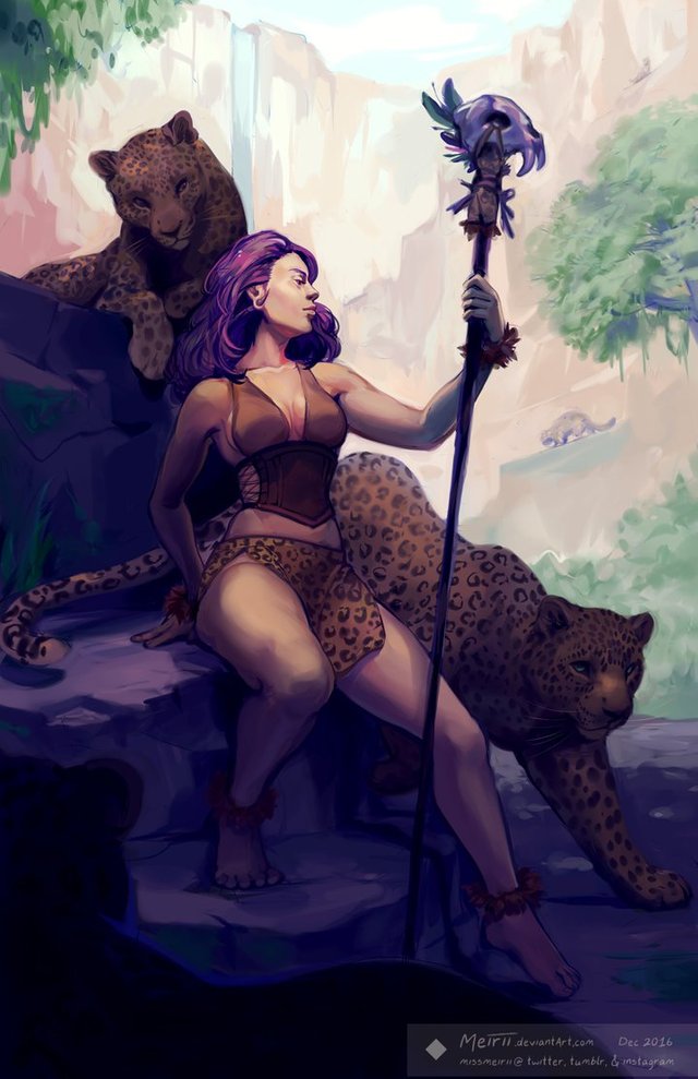
Such pretty leopards! Haha, I’m a sucker for bit cats. Big cats need love too ya know :) Even so, Mei displays her consistency in this piece with respect to lighting, anatomy and composition. The contrast of the foreground to background is key in this and really amps it up; the piece is cut almost diagonally from top left to bottom right, which separates the subject matter in an interesting way. While this is a bit of sketch, you can see the potential it has for more detail and nuanced to be added if the artist feels and we must remember that the artist has the final say if the work is ‘complete’ or not, so we can only assume that its complete unless otherwise stated. Understanding more styles and aesthetics of art helps one better see the stages of art and how something that might look incomplete is in-fact no less a piece of art than a completed work, especially regarding what stage you first see the artwork as.
If you wish to support me further, check out my Patreon. I'm doing all of this to educate people and spread the knowledge I've acquired. If you're looking for some tutoring on Art, Writing, Philosophy and methods to handle the inner Ego then sign up through Patreon :) Thank you very much for your support.
I have a Discord server setup where you can easily chat to me during stream, plus I have some interesting links and chat-rooms you can dive into :)
Discord: https://discord.gg/e6WJ2tp
Try out Mannabase, a blockchain effort to create universal basic income. Use my referal to get bonus Mana! Join Here
Check me out on Sola I’m active on Sola and would love to share some upvotes to you Sola users!
I also use Minds and Gab. Both places are alternatives to Tumblr and Twitter and have growing communities.
Further reading and references for developing Art techniques.
the /ic/ Wiki. Lots of info to get started with. https://sites.google.com/site/ourwici/
This is a download containing more resources. https://www.mediafire.com/?i44dwzkf9j9n8
Nice collection of art and it speaks volume of the post therein. Thanks for sharing this knowledge.
you bet dude! glad you enjoyed it :)
Congratulations! Your post has been selected as a daily Steemit truffle! It is listed on rank 20 of all contributions awarded today. You can find the TOP DAILY TRUFFLE PICKS HERE.
I upvoted your contribution because to my mind your post is at least 15 SBD worth and should receive 108 votes. It's now up to the lovely Steemit community to make this come true.
I am
TrufflePig, an Artificial Intelligence Bot that helps minnows and content curators using Machine Learning. If you are curious how I select content, you can find an explanation here!Have a nice day and sincerely yours,

TrufflePigsalutations sir machine intelligence! thanks :)
@supernal in my opinion.your posting is very cool and good, besides tu useful for me and for all steemit.dan colleagues and hopefully your post will be good semakon again amiin thanks for postingannya.
much appreciated, i'm glad you enjoy the art.
Congratulations! This post has been upvoted from the communal account, @minnowsupport, by Supernal from the Minnow Support Project. It's a witness project run by aggroed, ausbitbank, teamsteem, theprophet0, someguy123, neoxian, followbtcnews, and netuoso. The goal is to help Steemit grow by supporting Minnows. Please find us at the Peace, Abundance, and Liberty Network (PALnet) Discord Channel. It's a completely public and open space to all members of the Steemit community who voluntarily choose to be there.
If you would like to delegate to the Minnow Support Project you can do so by clicking on the following links: 50SP, 100SP, 250SP, 500SP, 1000SP, 5000SP.
Be sure to leave at least 50SP undelegated on your account.
Nice collection of photos ma'am
glad you enjoyed them :)
You didn't specify where you got the images though. I was hoping you drew them.
The artist name is a link that goes to their gallery.