Aesthetic Essences #14
Diving through the pools of artistry that laps along the trails of digital landscapes I’ve come across the following works of art. Appreciate them and admire the aesthetic essences found within. If you’re confused about the sources, the Artist name goes to the gallery where each image comes from.
Artist: Lente Scura
I really enjoy Lente’s style and penchant focus towards the vibe of the old masters, giving such a beautiful aesthetic to their works. Much of Lente’s work involves poses, digitally crafted illustrations of characters in a variety of attire and value. I try to include several works to really show off the artist, but in this case there was so much cross over that one piece really sums it all up quite well. I’m curious to see how grandiose Lente will get with respect to larger compositions with a bevy of motifs and subjects. Lente has loads of potential and serious technique, check out their gallery and pass your appreciation thusly.
La Regina Della Fenice Rossa
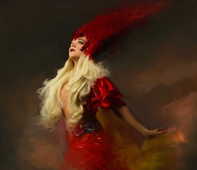
I’m choosing just one artwork from Lente’s gallery to express the totality of their body of work. If you feel that a background is unnecessary it’s strong to build a whispy, atmospheric foamy fog to envelop and add some extra depth to the composition, as Lente has done here. Such a graceful pose, don’t you think? Poses often fit well within an environment, which there is none here, but, I could see this lady in a garden enjoying the summer breeze. A painterly vestige such as this really builds up the aesthetic of classical artworks of the old masters; very Italian. As it let the subject matter envelop me the smooth gradient of light and overall acumen of dimensional render becomes obvious and makes this work shine. Her hair flows majestically, giving the eyes some path of to move across, going from the face down to the jeweled belt, back upwards to her fluffy shoulder garment and ending on the intricate headpiece; the ethereal zenith of hair that juts backwards bends to the surreal, adding a more fantastical flavor to the piece.
Artist: Ruben
Ruben has really impressed me with the wide swathes of designs and works he’s developing within his gallery. The pieces I’ve shown today encapsulate much of his technical acumen, aesthetic feel and general choice of subject matter. I’m happy to have found this guy’s work and hope you enjoy it as much as I did. Please give him your thoughts and appreciation.
Edward Wong Hau Pepulu Tivrusky IV
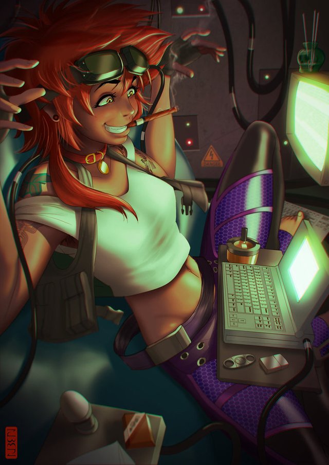
This is the only adult Ed fan art I’ve seen, and man it fits perfectly. I can totally see Ed being like this when she’s older, and this adds a twist to the fan art concept; take a character and age them, providing some further creative freedom and input so devise their persona and aesthetic. Ruben did well to invoke Ed’s seemingly maniacal attitude towards technology, showing those wiggly fingers and shit-eating grin. There’s a lot of minute details in this, which amplifies the character design and portrait. It’s important to input a character into en environment that expresses their traits and persona, especially if you have them interact with other characters. How awesome would it be to have a series focused on adult Ed and her antics as a hacker, maybe with some romance and the usual bebop shenanigans? Well rendered and composed, an overall fantastic work!
Haruhara Haruko
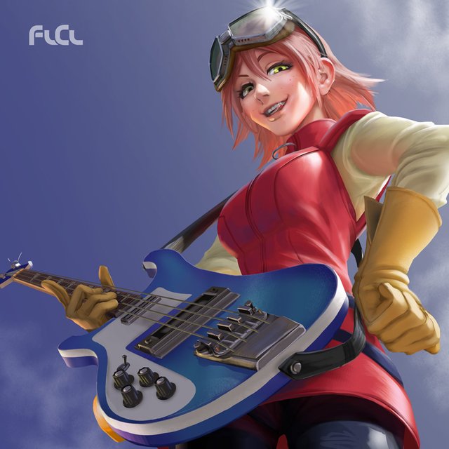
Just realized both Ed and Haruko wear goggles, hmmm; maybe Haruko is some alternate variant of Ed, as Ed gets lost in space and becomes a wild space pirate? I’m down for that, haha! I really vibe with the expression Haruko has in this, as it fits so well with her personality and expresses it fully; she’s raunchy and aggressive and wants you to know it. Adding dimensionality to her figure with the multiple cloth folds on her left arm does well for her design, along with seeing slightly under her dress. Placing the perception along the angle of the guitar makes up look up to haruko as she looks down at us, developing a unique interaction from the viewers perspective; this is an important aspect to take note of when composing a scene.
The Burning Invocation
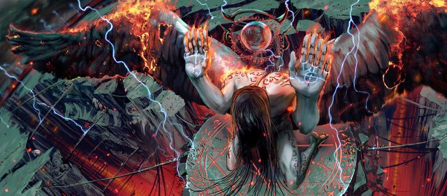
Such ferocious occultist energy bursts out of this scene, whoa yea. The pose is an interesting one, reminisce of prostration or some deep bow. What’s really mind bending about this is how the environment pulls itself outward showing the curvature of the world; I’ve always found this technique to be evocative and highly intriguing, so I’m glad to see it used here. Combining the pose and the curved environment, with all the bridges and added verticality of the deep trenches, the scene come together in a unique facet that I don’t often see. While you may think there’s too much going on, I believe there’s just enough happening as the entire proximal space has been used to its fullest as it should be.
Artist: Firat Solhan
Not often do I find art like this, something so fantastical and on-point with respect to every aspect of artistry. First really gets it, as is self-evident in his works. Invoking these ancient and symbolically important ideas in a freshly modern way hits home to me, and I hope many artists can take away some inspiration from this. Firat has immense potential and I’m excited to see what more he can show us in the future! Please give him your thoughts and appreciation.
Meditation
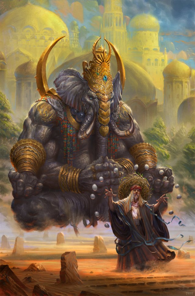
Hot damn this is good! Starting off strong here, Meditation really brings out the tour de force aesthetic acumen of Firat. Starting from bottom to top, we have a man in a sparsely dim field of stone which seems to be exacting some trace-state. This trance meditation then emerges forth the above imagery, a Ganesha-esque god-being, stoic in meditative pose, a brief spat of trees and a majestic skyline of arabian towers. Semblances of Picture-In-Picture (PIP) technique pop out to me, and really this composition almost has two horizon lines, which is often what you need and see in the PIP technique, which really enhances the vertical aspect and imaginative subject of the Ganesha figure. I love the ornate detail and immaculate vibe that is given to the elephant-headed god here, as well as the rest of the work; the towers in the sky are less detailed as they are likely farther away and not the focus of the work, which is further expressed by the proximal location of the two primary subjects. Fantastic work.
Shepherds
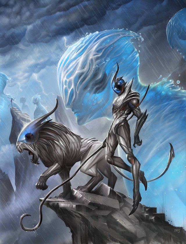
You thought that first work was good, whoa boy this one is honestly a step above. Personally, Elementals and various surreal entities are some of my favorite subjects to use and vibe with; there is so much you can do with elementals and the ideas that envelop them seem endless. Elementals are meant to be living expressions of their environments, which creates a unique challenge for an artist to render forward some exacted form that the elemental can take; the challenging stride to develop various elementals within fantasy artwork has given rise to many cannonical forms, yet I am still surprised with what people come up with. We get a great taste of perspective here with the giant elementals walk from right to left, some partly off canvas and the others farther out. It’s highly poignant to include a thunder storm, as it creates a unique atmosphere for light to dance around in. As the title states, these metallic entities standing on the rock pillars are shepherding the elementals forward; I adore this allegorical expression and love how it’s all composed in this work. The shepherd’s pose bring about a sense of confidence and combat readiness, taut and ready for the day ahead.
Goblin Engineer
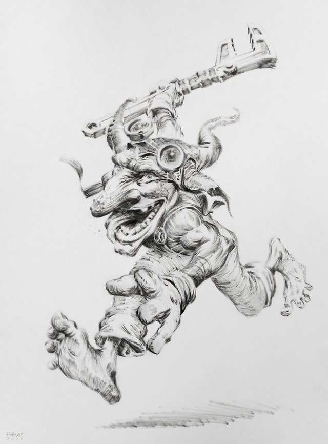
I will always point out some line-art the artist has, if they have any, to showcase the steps of developing a fully realized artwork and how art looks within its stages. Line-art is an aesthetic style in-and-of-itself, so while it may be step one to build a larger composition, it can remain as a completed artwork; Comics are often the best examples of line-art being the focal aesthetic and completed stage. This work in particular has a wonderful juxtaposition of forms, which goblin’s often feature, and brings about a lot of character to this guy. An active pose is something I recommend to focus on, as it build movement in the composition, as well as forcing some depth which is evident here with the position we see. Such efficacy and grace in these lines, along with an impressionistic vibe going on with the shading and value structure. Goblin’s are fun :D
Sun Orb
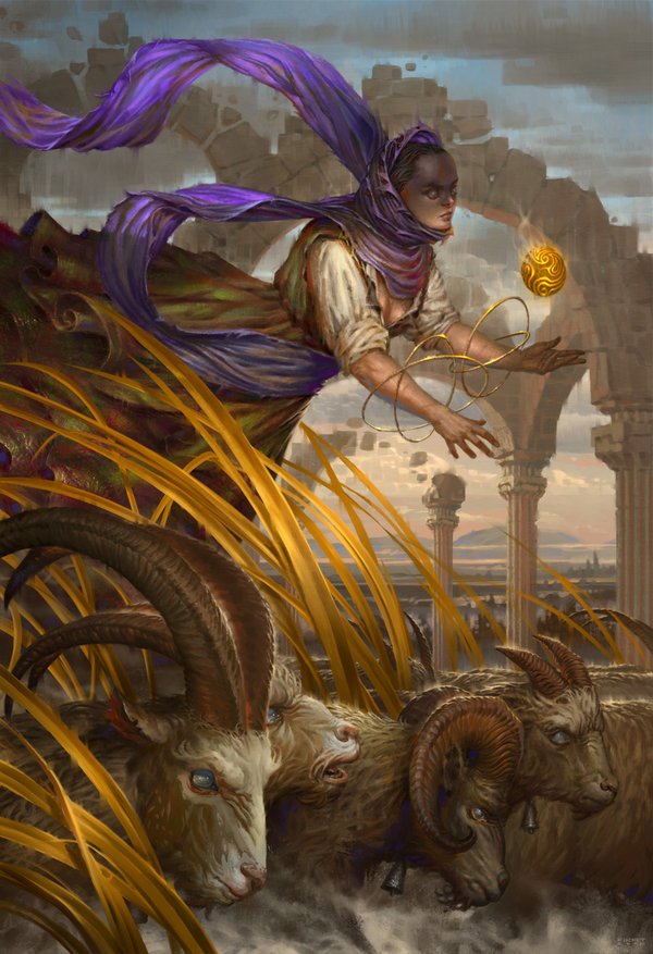
Similar to Shepherd, we have some nice perspective going on here although this is a bit more layered and more of the depth is confined to the foreground; creating complete perspective you need three primary grounds to build to show absolute depth, although a smooth gradient shift from front-to-back is the ultimate method. This caught my eye for its composition, choice of motif and subject matter, along with the use of geometrical structures in the mid-ground. Having the structures move in multiple directions gives many more surfaces for light to dance on, giving a rich platter of value to develop and enhance the work. Firat enjoys a fantasy vibe in much of his work, this comes through with the floating orb; orbs and magical artefacts are a very nuanced motif to utilize in artwork as they enhance the overall compositional vibrancy and add in some nice symbolism.
If you wish to support me further, check out my Patreon. I'm doing all of this to educate people and spread the knowledge I've acquired. If you're looking for some tutoring on Art, Writing, Philosophy and methods to handle the inner Ego then sign up through Patreon :) Thank you very much for your support.
I have a Discord server setup where you can easily chat to me during stream, plus I have some interesting links and chat-rooms you can dive into :)
Discord: https://discord.gg/e6WJ2tp
Try out Mannabase, a blockchain effort to create universal basic income. Use my referal to get bonus Mana! Join Here
Check me out on Sola I’m active on Sola and would love to share some upvotes to you Sola users!
I also use Minds and Gab. Both places are alternatives to Tumblr and Twitter and have growing communities.
Further reading and references for developing Art techniques.
the /ic/ Wiki. Lots of info to get started with. https://sites.google.com/site/ourwici/
This is a download containing more resources. https://www.mediafire.com/?i44dwzkf9j9n8
xD i will retain that as my mental image of yourself lolol.
These artworks make me want to write something, create something weird, spiritual, beautiful, broken.
Are all the pictures from meditation downwards made by one artist? If yes, it is incredible. Good collection @supernal
Yup, same guy man. have you heard of the creative method the surrealists use to generate creativity? Dali called it the Paranoic Methoid, others identified it as invoking the Surrealist Spirit. Essentially you utilize a form of day-dreaming to allow you mind to be free and open, letting in any and all imagery and writing down everything that comes through in a raw unedited form; it has many names, such as: automatic writing, trance writing, and psychography! I've utilized this to great success, and the act of doing so is very enjoyable.