Aesthetic Essences #13
Diving through the pools of artistry that laps along the trails of digital landscapes I’ve come across the following works of art. Appreciate them and admire the aesthetic essences found within. If you’re confused about the sources, the Artist name goes to the gallery where each image comes from.
{Artist}: Hela
I’m really impressed with this artist, especially considering her age and where she’s at already with composition, illustration and attempting some mixed media. The examples I provide of her work feature some of the best mixed media I’ve seen; I’ve not seen much mixed media, and it generally tends to be too abstract and messy. I adore the mythology theme Hela uses and hope to see more works soon! Please give her your thoughts and appreciation :)
Deep in the woods
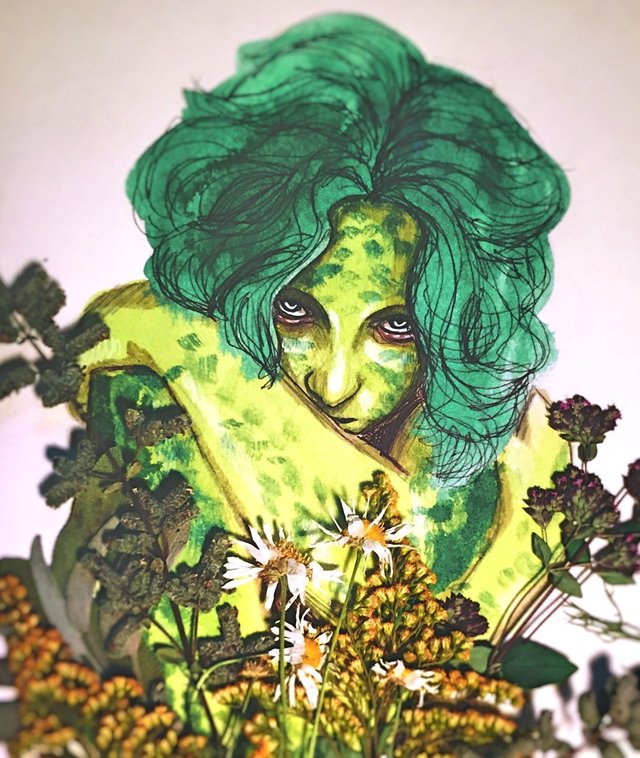
The more I look at this, the better it gets; that brooding and edgy stare provides a lasting impression the more you look into her eyes. Truly, I’ve not seen mixed media done so perfectly. I wont go off about how difficult it is to utilize mixed media, but in this case it works perfectly. Raw flowers, flattened, provide a fore-ground that frames the portrait and provides some ground; It’s almost as if she’s laying down and the flowers are in-front of her, as they are both literally and metaphorically. As this is primarily a portrait, you don’t want to cover the subject, and boy what a subject this is. Her hair, while not as seemingly dimensional as the face, adds an interesting aesthetic to the total composition as it lacks geometrical shape and high value marks. As this was taken with a camera, you can see some slight blur which enhances the composition, while the slight shadows of the real flowers provide minute depth. Would love a print of this, for sure!
Sleeping Meadow
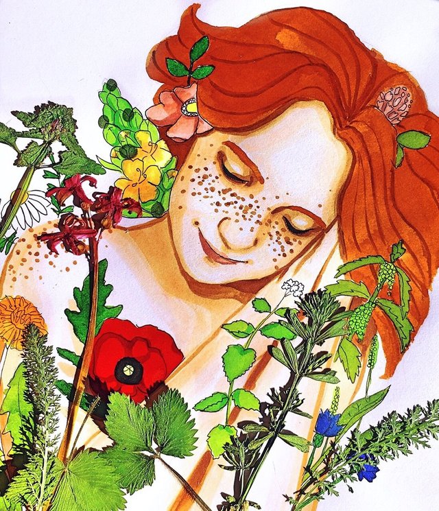
Alike the one before, this is how you want to use mixed media. The use of real flowers accents the illustrated flowers, while providing some contrast to the overall composition without making it feel as if the composition is too messy or flattened. The colour and proportions are well done, quite bright and lovely. Straight forward simplicity, such as this, really goes a long way when done like so. Feelings of joyous calm and nostalgic days emanate from the totality of this composition. Love it.
Freyja
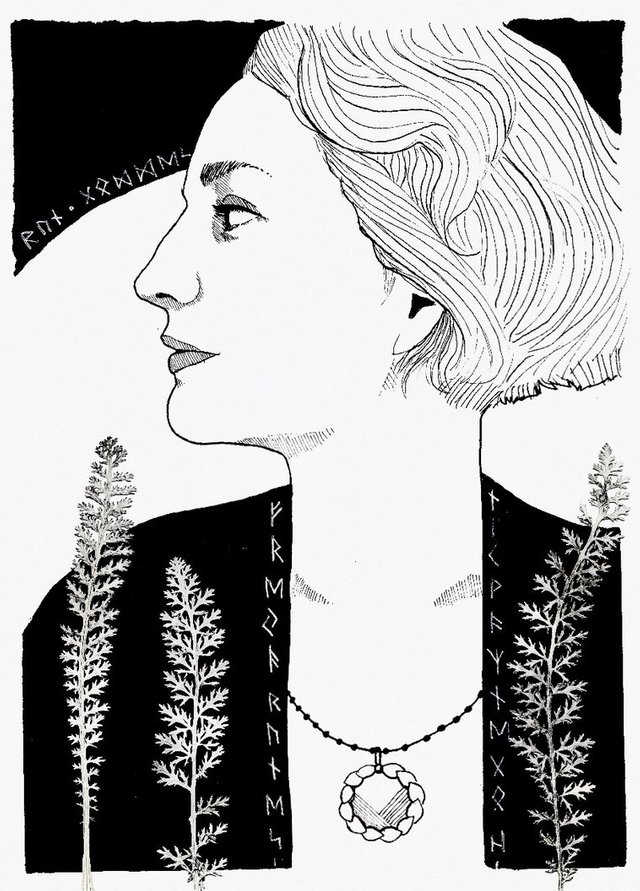
Hela’s line art is quite good, and this piece illustrates that perfectly. When doing portraits, you’ll for sure want to have these profile shots, amongst others, in order to get a full grasp on the shape of the head and how light reflects. While not going too deep into the values, the minimal expression works well and could do some good in a comic/manga book. This being Freyja, from norse mythology, accuracy is really a point of contention and not that important; I can imagine that the runes are significant, but all it does for an outsider like myself is provide thematic flavor. In fact, this would be one method to utilize 2D symbols in a meaningful way, which does really add greater semblance to the piece.
Voluspa
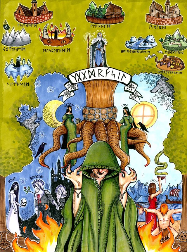
As the description the artist has, this is a depiction of the first book in the Poetic Edda known as Voluspa. Allegorical depictions such as this often involve picture-in-picture expressions and a wide range of compositional puzzle-piecing; there are many pieces and the idea may not be well expressed unless the pieces are fit in a certain way. Often times an artist will focus on one part of an allegory at a time, but in many cases, such as this, the totality of a story is shown. I know of the Poetic Edda and its importance in art history, so I respect this work and think the artist did well composing the images together to build a provocative artwork that arouses my curiosity and desire to know more.
{Artist}: Marcel Mercado
Upon seeing some of marcels’ works, I was astonished at his masterful skill. Diving deeper into his gallery and history, I’m amazed to have found such a wonderful artist brimming with technique and artistic knowledge. His knack for evocative compositions, facial expressions, story telling, menageries of minute details, efficient brush-stroke usage, rendering of light and utilizing contrast to evoke boldness. Not often do I find an artist who really ‘gets it’ and is on a good path. I’m excited to see what else Marcel brings into this world for us to enjoy. Please give him your thoughts and appreciation!
The Compass Never Settles
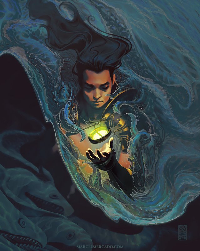
Compositions such as this are what I love: smooth flowing forms, strong contrast with deep layers of colour. The man’s hair, disposition and entracing pose brings a tranquil spirit to the piece; See how the hair is formed? Forming the hair in such a way is embracing the movement while maintaining its dimensionality. Placing the light through the compass radiates the entire piece, allowing for stark contrasts to emerge; having some aspect of high contrast develops a striking vibe to the work. Marcel enjoys using obfuscated forms, which he does here with the fish at the bottom left and the wave cutting off the rest of the mans’ body. Such a graceful and beautiful work of art, I enjoy it very much.
New Paths

I find artworks like this to be a brilliant way to display a cast/host of characters. Placing each character within close proximity develops the space and depth to the specific section of the work, allowing then the surroundings to frame the vibe of each character. From closest to farthest, we have the Pugilist woman with some cool tattoo’s, the hunter and his wolf companion, the druidic spirit conjurer in a low stance readying an eagle to scout the area, the chief warrior in the middle giving a haughty shout, and what seems to be a spell readying in his right hand, so maybe a Spellsword he is, a Musketeer in front of the tree to the right with an elven archer directly behind a few meters, the Archmage summoning some wispy elemental in thsoe deep crimson robes; a bevy of foliage from the top of a forest stretching out behind leads the eyes up to a radiant castle and its mountain companion to the right. The entire flow and layering of forms creates an immensely dimensional artwork that speaks of comradery and adventure.
War Chief
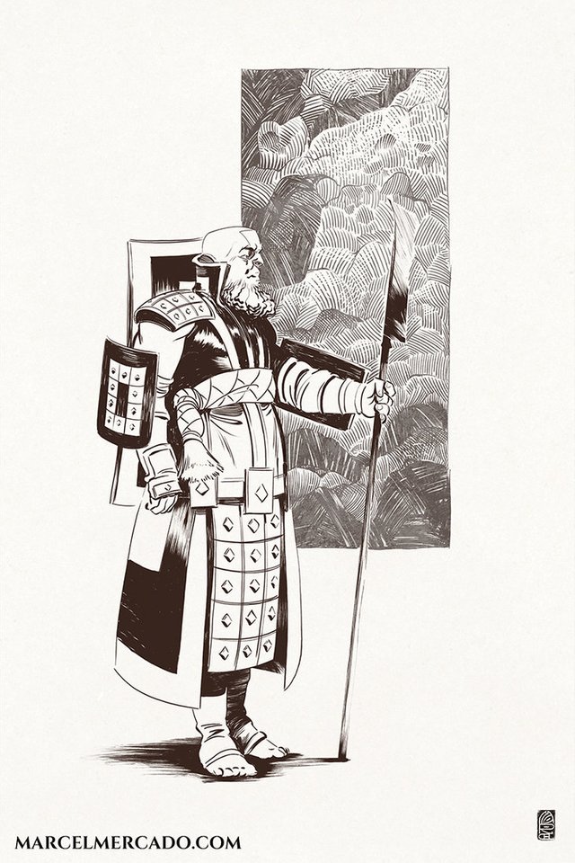
It’s important to highlight line-art and its role in developing an artwork. Line-art in-and-of-itself can stand on its own within its own league, along with it being the first step most artists take and learn from. Marcel has a wonderful style shown here in War Chief; focus intensely on the minute lines and how the shapes merge together: the cloth marks, ruffles on the shoes, creating the planes of the face with a few lines, the connective swirls giving a fluffy feel to his beard. That painterly image behind the chief displays a style of marking that I’ve come across before, and I’m sure there’s a name for it that I’m unaware of, but, it is a method that utilizes mostly straight lines in various angles, sometimes curved lines, to create a menagerie of shape that fills a space in a seemingly unified manner. take this piece in and learn from it.
The Horned One
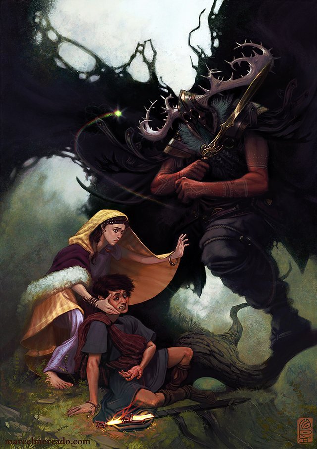
What a unique allegory we have here. The giant swordsman causes the young man’s sword to beam hot, scalding his hand and disarming him. You can see the pain and dire emotion in his face, along with the woman to his side who’s expression incites worry, stupefaction and fear. The magnitude of the giant swordsman consumes the two humans, with his cloak covering much of the canvas and his boisterous visage casting impending doom. These mischievously small aspects develop a rich story in an otherwise ostensibly regular artwork. Another great vertical artwork from Marcel!
If you wish to support me further, check out my Patreon. I'm doing all of this to educate people and spread the knowledge I've acquired. If you're looking for some tutoring on Art, Writing, Philosophy and methods to handle the inner Ego then sign up through Patreon :) Thank you very much for your support.
I have a Discord server setup where you can easily chat to me during stream, plus I have some interesting links and chat-rooms you can dive into :)
Discord: https://discord.gg/e6WJ2tp
Try out Mannabase, a blockchain effort to create universal basic income. Use my referal to get bonus Mana! Join Here
Check me out on Sola I’m active on Sola and would love to share some upvotes to you Sola users!
I also use Minds and Gab. Both places are alternatives to Tumblr and Twitter and have growing communities.
Further reading and references for developing Art techniques.
the /ic/ Wiki. Lots of info to get started with. https://sites.google.com/site/ourwici/
This is a download containing more resources. https://www.mediafire.com/?i44dwzkf9j9n8
Art is one of the way of life and its a wonderful thing to be part of our everyday life
With art, every thing on earth can be modelled in drawing. although it is not easy
You show great artistic promise.