The Girl Who Saw Upside Down: A Drawing with Digital color
I learned to draw with real pencils on real paper. So it has taken me some time to get used to incorporating digital elements in my work. Though I'll always love paint on paper, there are advantages to digital color. Clients often want revisions, and digital colors can be changed with a click - in lieu of hours of traditional work. Digital color allows me to try out several schemes before having to choose. And it allows me to add saturation and color contrast instantly.
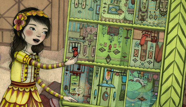
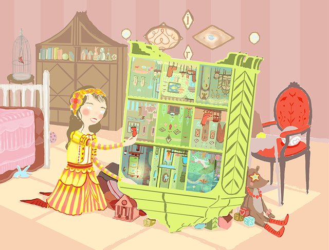
In certain situations, digital color can work even better than traditional pigment. In the case of the image above, its flat, bright hues bring a bit of modern to a sweet and traditional drawing.
This is a concept image for a film/app project. I was paid (along with a few other artists) to come up with my interpretation of a story about a girl who sees things upside-down. It wasn't ultimately chosen for the project, but I wanted to share the result with you. I have never posted this image before, as it was my first real attempt at combining drawing with digital color, and I learned a lot from the process.
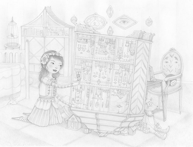
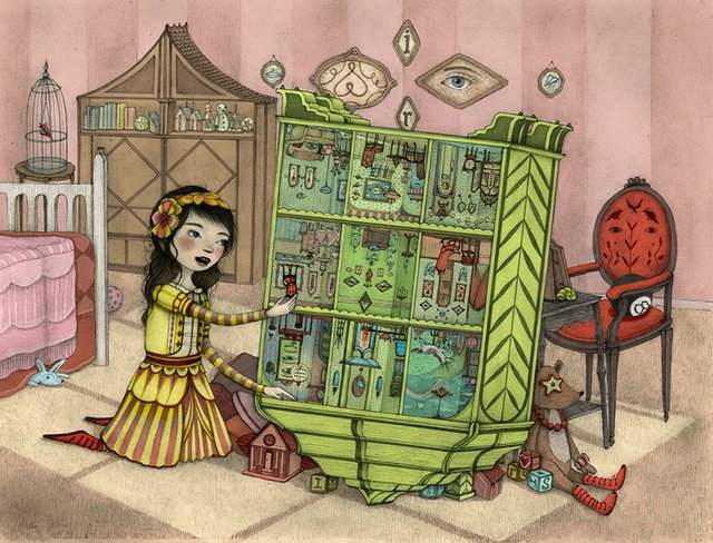
My original drawing (with a detail view) was produced on 8.5"x11" paper using a lead holder with 4H lead. The "H" after the 4 on my pencil stands for "hard". It means the pencil point will be very hard (the larger the number in front of the letter "H" the harder the lead). I can get tons of detail in my image with a hard lead. The downside is that the color will be light grey (instead of black) and the contrast will be low, like in the drawings above. Because I want a lot of detail in my images and I like to draw small, I prefer hard lead. I know that I can scan my drawing into Photoshop and bring out the contrast when I'm through.
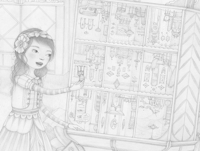
This is the same drawing with the contrast boosted considerably using Levels in Photoshop. I then use the layers palette and "multiply" the image, which makes all of the white areas transparent. I can then add color behind my image.
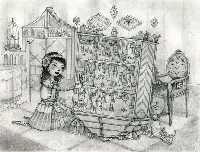
I wanted to show this piece because I wanted to show how easy it is to try coloring behind a drawn image. While I do not have it perfected myself, I've learned that if your drawing is finished, the color behind it can be flat and imperfect. Here is a peek at the color layer behind this drawing:
You can see that the color is pretty loose. I usually color on a bunch of separate layers so that if I want to change the color of a certain section, I can isolate it and just shift those colors. The drawing is crisp, so the color does not need as much care.
This is what the final image looks like with the drawing image on top of the color layer. The overall image appears a bit dusty and grey because of the pencil layer. While I could colorize the drawing in Photoshop to brighten up the piece (and I have done so for the right assignments), in this case I like the vintage quality it gives the piece, similar to a modern version of a colorized photograph.
Since producing this piece, I've experimented more with marrying digital and traditional methods to achieve the results I need. Every assignment seems to warrant a new combination, and I learn something every time.
I'd love to see the work of others who combine digital and traditional techniques!
Images © Jaime Zollars 2016
Awesome drawing! Thanks for sharing.
You definitely have a talent ;D
Thanks so much @richman ! I appreciate the nice words!
How fascinating to see the color layers behind the drawing! Wow - that requires its own set of talent! I so much love your drawings, Jaime. And dare I say it - the little girl resembles you. Not in an exact way, but in the kind of way that happens to artists. :)
Thanks :) I've been accused of drawing tons of self-portraits overs the years even when they don't actually look like me in a straight forward way, so there may be something to it. Your drawings would work very well colored this way (though your paintings are wonderful as is). Have you ever played with digital color?
Amazing work @storyseeker
I'm trying to improve my skills in this area, so your posts are really informative. I have done some purely digital drawing with my graphic tablet, but I still prefer the look of hand drawn images. I usually scan and then fill with colour, but i think your layering process is the way to go.
Hi! yes, I have worked that way as well and this way works much much better for me. It preserves the drawing, which is important in my work! I'd love to see you try this with your work. It would be cool to see :)
Great work. I'm gonna follow you.
Thanks so much! I appreciate it!
Such an interesting subject, the digital drawing. I am happy to see how it done. Upvote for you, Jaime.
thanks! I have tried SO many different techniques over the years because I become bored easily, so you'll see more here :)
@storyseeker Another wow work from you!
I love the details on your work - simply unique.
thanks so much! I fear I sometimes spend a bit too much times on unimportant details, but I'm glad some folks like that aspect of the work !
Beautiful post and beautiful art innit... I'm also an artist (concept artist and digital illustrator) and I really enjoyed the process aswell! I qould also love you take a look about what I do and tell me what you think! :3
very nice work! I followed you to see more !
Hi, lovely lady. Needles to say that I adore your work and would be honoured to have you participate in my competition. Your work is breathtaking. xo xo J.
Hi Jamie! I've been crazy busy the past two weeks (both good stuff like artwork and bad stuff like a car that des on my while out of town), but if I can sneak it in I'd love to participate. I know I have a couple of days left. If I can manage it, I'll definitely throw my hat in the ring :)
Exciting!!! And I hope you only experience good stuff from now on :)