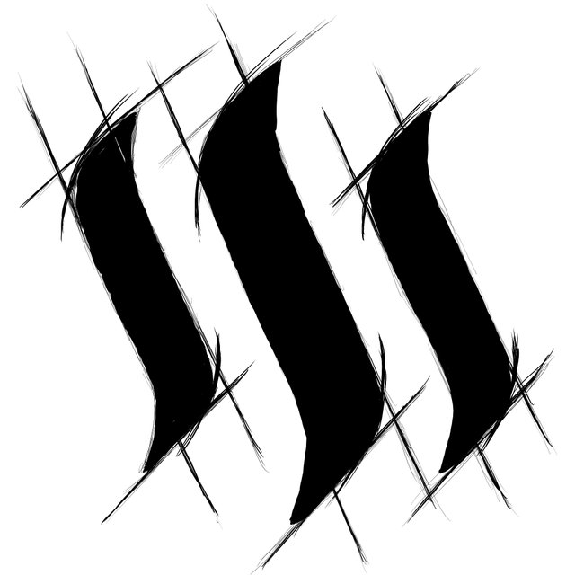
Steem Logo sketch
I cant tell if I like this idea at all. So thats where you come in! The line work would have to get cleaned up etc but i think you get the point almost like a "draftsman" type view of it. Dumb? not dumb? you decide!
May just get it printed on something for myself but have to decide if its worth finishing.
I am waiting on your coming book!!!
I like the concept... but not the execution just yet... maybe if the draft lines where much lighter or in greylead maybe? I mean, I shouldn't really say anything since I have no drawing skill whatsoever... but I definitely think this has potential!
You should say something :) exactly type of thing I was looking to hear. I think there are too many sketchy type lines so that would get edited down so I think we are on same page. Thanks for taking the time!
You're very welcome! Excited to see the next version!
I actually like where your going on this... you thinking about cleaning up the curves, etc... cause i really like the loose flow of the straight lines. and you gonna keep it black like this.. or go steem colors? cause i think either way would work.. i vote for continue!
Good feedback thanks. I was thinking Black so I could get it printed on a mug for morning coffee lol but I also like the idea of almost making it look like a architect sorta drawing...well maybe i can sorta make it look both.
I think if you put it into grey scale... and gave the logo some texture..be it like the chalk brush, or the spray brush but mad turned down.. give it that real physical drafting feel
It's like if steem logo made slasher movie.
Looks good. Didn't steem change the logo? Do you just miss the old one?
Steemit.com did but not the crypto Steem. If that makes sense lol
The sketchy lines look cool, think they need to be a lot lighter (like you've drawn over a construction sketch) or a bit lighter or different colour and a lot neater (like you've hit up a drafting table wit rulers and protractors and compasses and stuff). It doesn't look too bad at all.
I don't think it' a dumb idea, you're probably the only one that can decide if it's worrth finishing or not ;D
Thanks for the feedback! It for sure will be cleaner but you bring up some good points and some sort of how I was thinking about it. I am thinking perhaps keep the lines more black but thats based on wanting to print it on a mug or something for my morning coffee :)
I think the version you described would actually be super cool for like framed print on wall or something. Thanks again for input it actually really helps. After hearing others in this thread it makes me know I want to finish it. I sometimes get stuck in my own head and lose all objectivity lol so its nice to get feedback.
I do like it!
very nice art and good post.
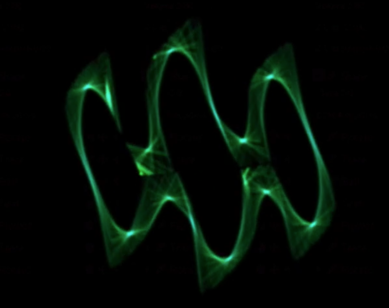
This reminds me of something I was just working on yesterday. It is sound that produces an animated logo. https://steemit.com/steemit/@bardionson/steemit-icon-on-oscilloscope
This is a better frame that looks more like what you have.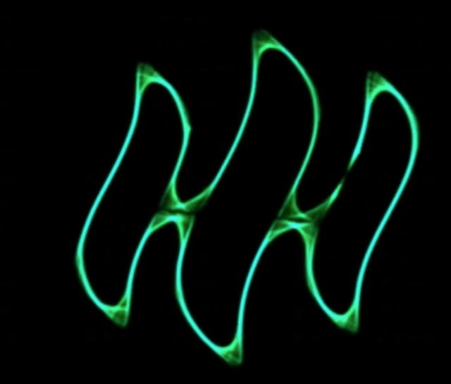
I like it, I just wish that was still really the logo :/