Tip Tuesday!

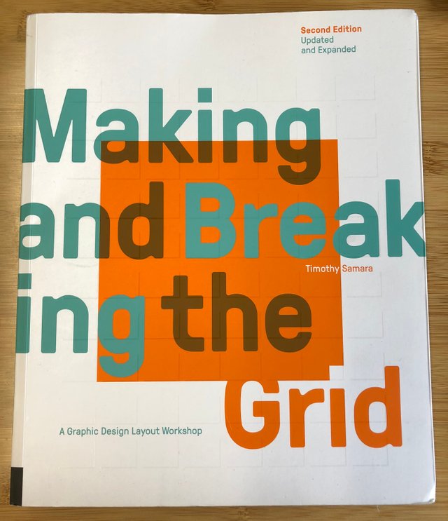
Every now and then you come across a book that changes everything for you. "Making and Breaking the Grid" is one of those books. I can't stress enough how great this book is and how much it will help you level up as a designer!
A lot of times I would look at a page, poster, or book cover and fall in love with it but not necessarily understand WHY I liked it so much. This book explains the reasons why we like the way one set of info is laid out over another and how that can help develop our personal taste or style.
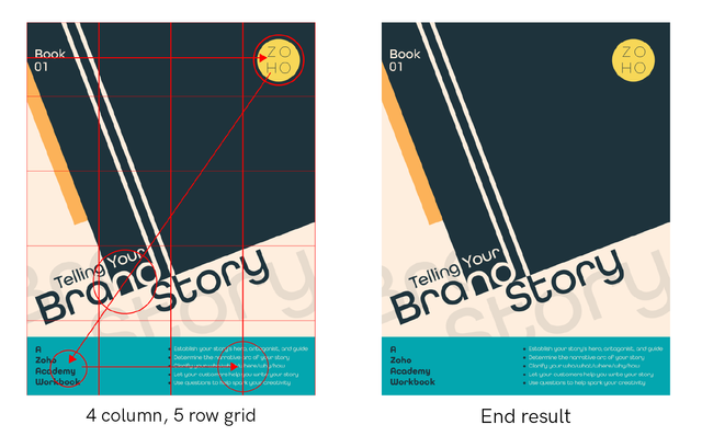
The information can be a little intimidating but once you give it a try, you'll start to see how much it can help you. For example, I've been working on a series of ebook covers for work and decided I wanted to try coming up with something different. Here is how a grid helped me organize things...

The columns and rows helps keep everything organized and lined up in a way thats easy to read even though some of the info is presented at an angle. The grid also helps to keep things organized in a way that will help "force" the eye in the way you want it to move across the page. In this case, I wanted the eye to move down the page in a Z-shaped pattern familiar to western readers.
There's a lot left for me to learn/read but this book has got me PUMPED to start trying new things. I'd recommend grabbing a copy asap!
Let me know if you've got any tips, tricks, or ways to improve and if this tip was helpful or not. Thanks!