Autumn | 3D Portrait
She was supposed to be just another one of my speed sculpts—the short daily practice I’ve been doing (on and off)—that’ll end up in some forgotten folder in my computer. But for some reason I was tempted to create something, a character portrait, that is autumn-related.
But, I’d be lying if I say there’s no reason at all to make this scene what it is now. I could have made this winter or spring or summer-themed, but I went with autumn. Part of the idea came from my longing to feel how autumn is like in foreign country (there's no autumn in where I live).
I might do more for the other 3 seasons as well.

Who is she? Does she have a name? Is Autumn her name? Or is it the title of this scene and not her’s? I don’t know, honestly. All I can think of when I was making this was simply the word ‘autumn’. So, maybe it’s up to you to decide whether Autumn is her name or not.
I still have a looong way until I can safely say ‘I’m an expert virtual hairdresser’, but I remember how horrendous some of my early attempts at sculpting a character’s hair when I was new to 3D modelling, and I’m happy with what I can do now.
Here’s how she was made in Blender:
Wheee~ autumn-themed interface!
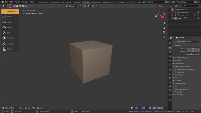
As always for my speed sculpt, I like to start from the very beginning, which is a cube. The magnificent default cube!
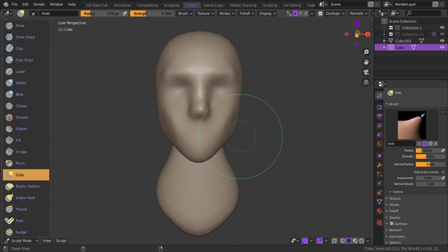
From there I started to sculpt the rough shape of the head, defining the spots for the facial features without going into too much detail too soon, and the neck.
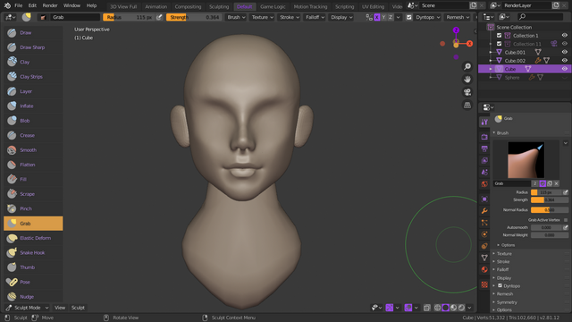
After that, I always start to add further detail from the nose and mouth first. I tried differently, such as from the eyes first, but I find it too difficult for me to picture the whole face that way. So, for me the order is usually the rough shape of the nose first, then mouth, ears, and nostrils.
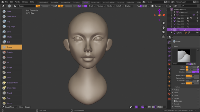
Then the eyes. This used to be the least part that I like about sculpting a character but now it has become my favourite part—placing the eyeballs, defining the size, and sculpting the eyelids. You might notice the change of proportions in each stage, that’s because the better (or more proper) look of the shapes always appear as I progress.
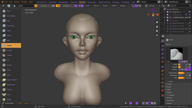
After that, as you can see, further details were added. The ears, the eyebrows, the eyelashes, which I like to make stylized like that, the base hair, and the torso. This is the first time I make a character with an open mouth. It was tricky to get a good shape for the corners of an open mouth.
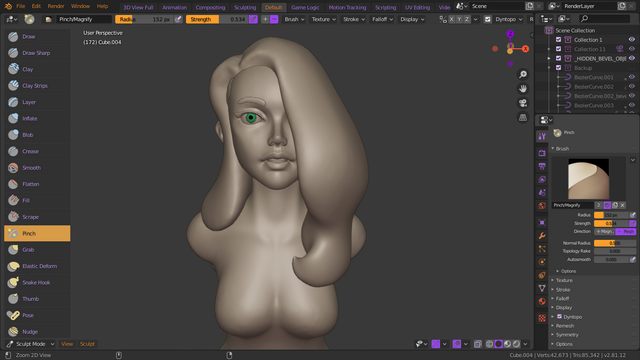
Ah yes, the hair. This was fun to sculpt because I already knew a couple of techniques I can comfortably use to sculpt a character’s hair. This was made with Blender 2.81 Alpha, and there are some new super awesome sculpting brushes. I haven't explored all of them but I'm so happy with the new draw sharp brush. It helps a lot in sculpting stylized hair.
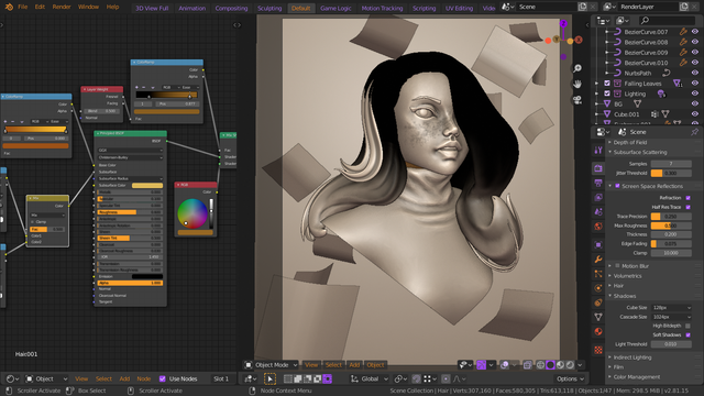
In simple terms: The complicated things on the left control the colour, the one in the middle is where the magic mostly created, and the even more complicated things on the right are settings for... stuff.
After I was satisfied with the sculpted details and can happily exit the sculpt mode, it was time to give her better appearance and prepare the scene for the render—lighting, texture paint, shaders and whatnot. I also added some smaller hair strands using bezier curves after I was done sculpting to make it look more dynamic.
At this point I should have finished this quickly by doing the clay render and light her nicely instead of making her what she is now. But as I said, I just couldn't stop there and decided to make this a better portrait.

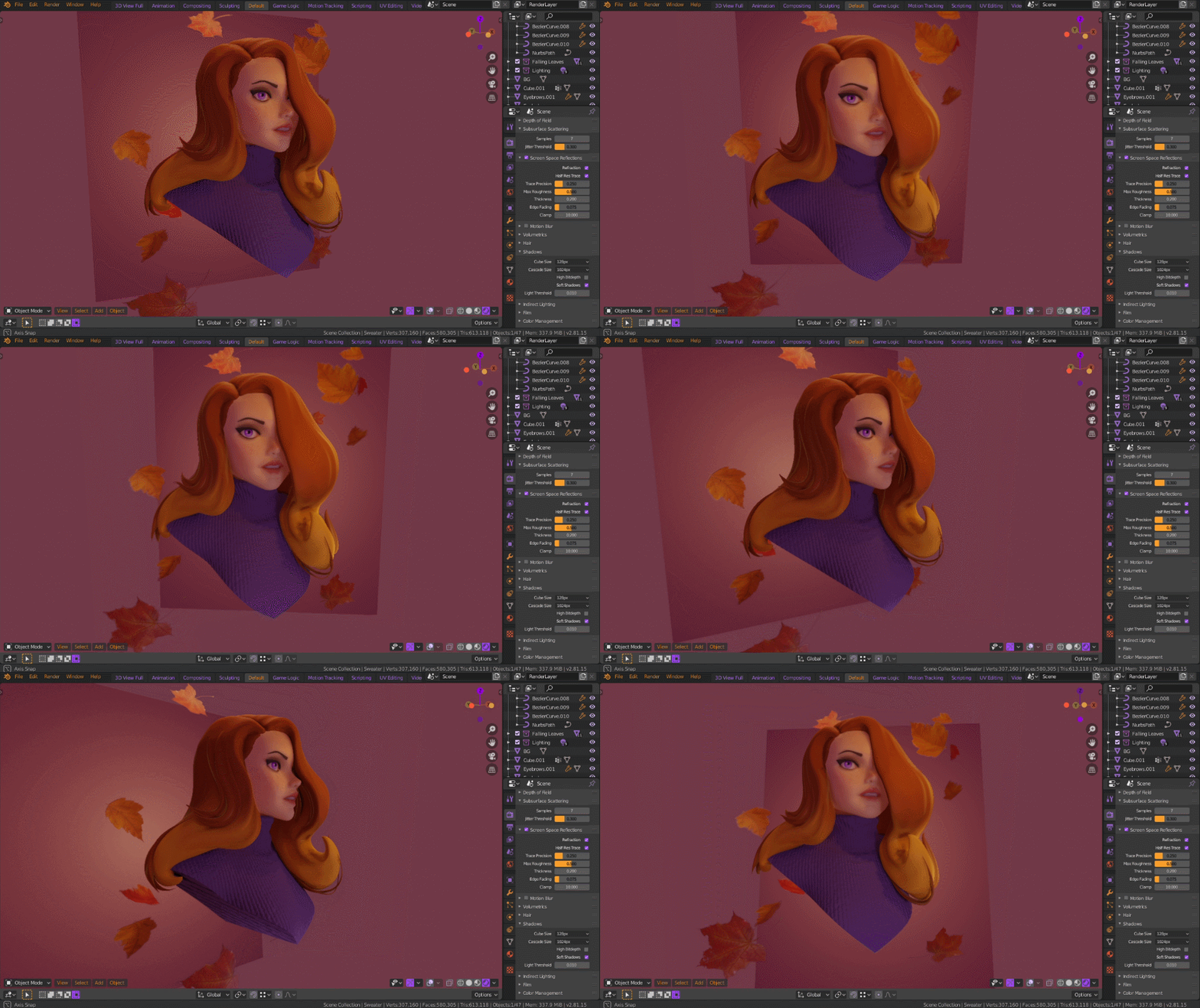
Around 1 a.m. my inspiration was flowing still but I was too exhausted to continue. So I decided to tweak my Blender UI instead and make it autumn-themed too. Fell asleep in front of my laptop and continued the tweaking in the morning. Yeah…
I also made a second one with swapped colours. Which one do you like?
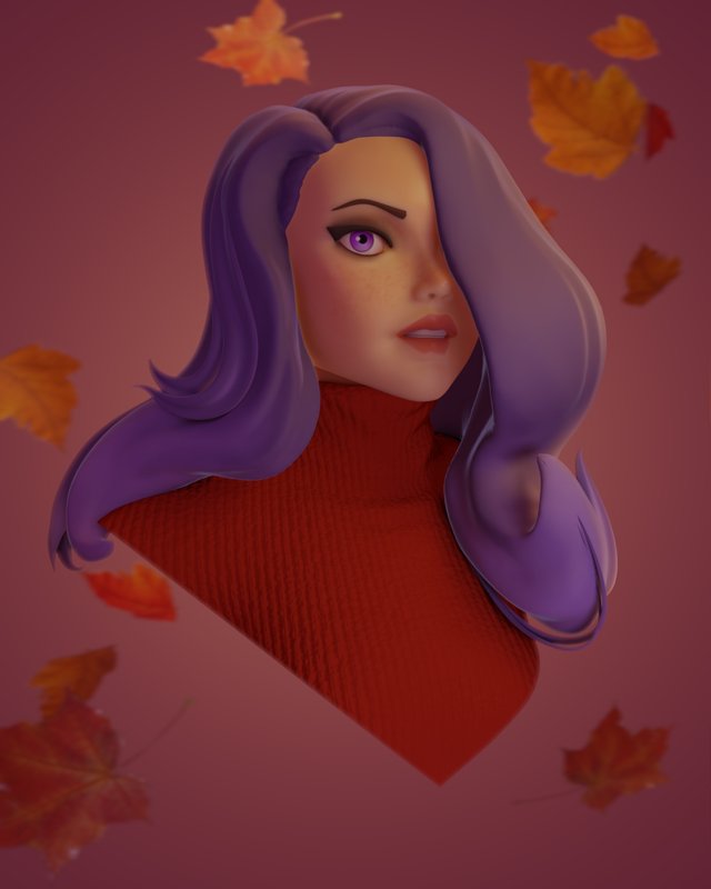
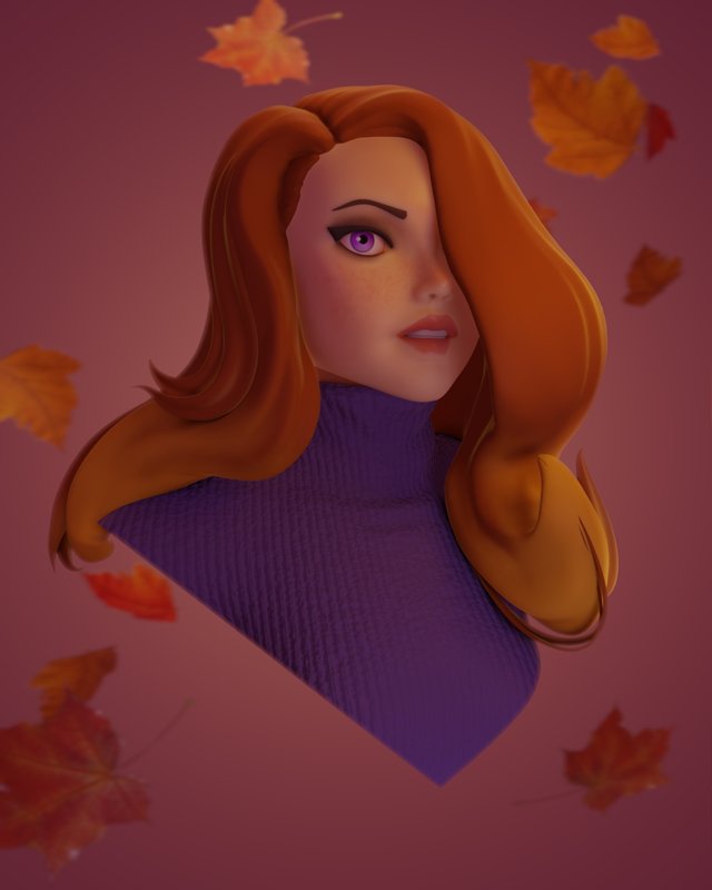
I actually still had to look it up on Google for girls make up reference because I was worried if her makeup was too much. Also, they are barely visible but she has freckles too.
I hope you like what you see, people! If you have any questions, criticism, or any thoughts about the portrait, let me know what you think in the comment below!
I'm open for commission. I make 3d rendered stylized character portraits for your icon, portrait, wallpaper, etc. I also make logo, 3D print-ready models, and game-ready character! Click the buttons below to see the terms and conditions.
If you’re interested, you can contact me on:
Discord: Rain#9999
Instagram: @probablyrainite
Email: [email protected]
©2019 Adam Rainite Lawsone


Hello!
This post has been manually curated, resteemed
and gifted with some virtually delicious cake
from the @helpiecake curation team!
Much love to you from all of us at @helpie!
Keep up the great work!
Manually curated by @scrawly.
@helpie is a Community Witness.
Thanks for the cake, Helpie~
This post was shared in the Curation Collective Discord community for curators, and upvoted and resteemed by the @c-squared community account after manual review.
@c-squared runs a community witness. Please consider using one of your witness votes on us here
Sup Dork?!? Enjoy the Upvote!!! Keep up with the dorky content for more love!!!
Congratulations @rainite! You have completed the following achievement on the Steem blockchain and have been rewarded with new badge(s) :
You can view your badges on your Steem Board and compare to others on the Steem Ranking
If you no longer want to receive notifications, reply to this comment with the word
STOPVote for @Steemitboard as a witness to get one more award and increased upvotes!
Looking good Raini :D
Think you might have needed to do something about the background as well as the redhead with the blue jumper looks much better on that background, maybe post another version with a different background that makes bluehead with red jumper pop out more? The colours otherwise seem to work either way :)
I thought so too, but I couldn't seem to find the perfect bg colour for the purple-haired one to make her pop out more in the scene. I spent about 30 minutes playing around with the RGB wheel XD So I decided to at least not to make her colour scheme to compete with the bg too much (Though it still kinda does, apparently).
Maybe it should have had patterns, or maybe I should have spent another 30 minutes finding the right colour hahah.
Thank you, Ry. Very much!
Hello @rainite, thank you for sharing this creative work! We just stopped by to say that you've been upvoted by the @creativecrypto magazine. The Creative Crypto is all about art on the blockchain and learning from creatives like you. Looking forward to crossing paths again soon. Steem on!