Light Parallels
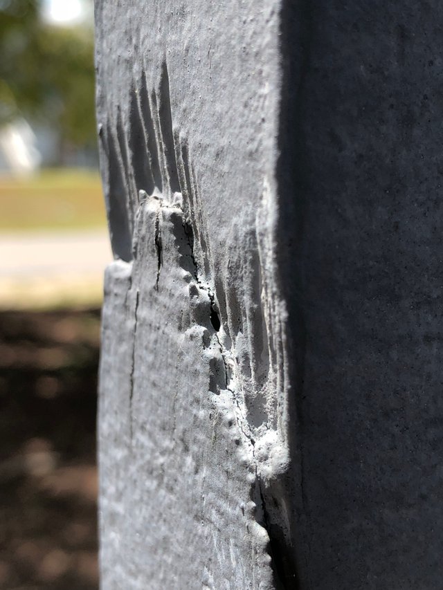
This is my latest piece and as I was uploading the photo here to Steemit I was looking for something to call it. If you look at this photo you will see 3 areas from left to right split by 2 vertical lines. The first area on the left is the blurry area. The second area is the grey area of the column. It’s rough and looks like a dinosaur took a bite out of it. And the third is the shadowy part of the column. So I decided to call this piece “Light Parallels”. I love abstract photography. It is really fun and easy and requires little to no thought. Just creativity.

yes you need some creativity in abstract photo...thats why its different & beautiful...
& you have the creativity....nice one...:-)
This is the reason I'm a fan of abstract art, photography in this case. It leaves much more space for the imagination of the viewer while still exposing the artist's view, nice photograph!
Yes!
thanks for share exp
Good point,,, abstraction photo.... I like it... Thanks for share..
Really nice photography. Thanks fo sharing.
Your abstract content is unique and you have great creativity... fantastic photography...