Daily logo design #40
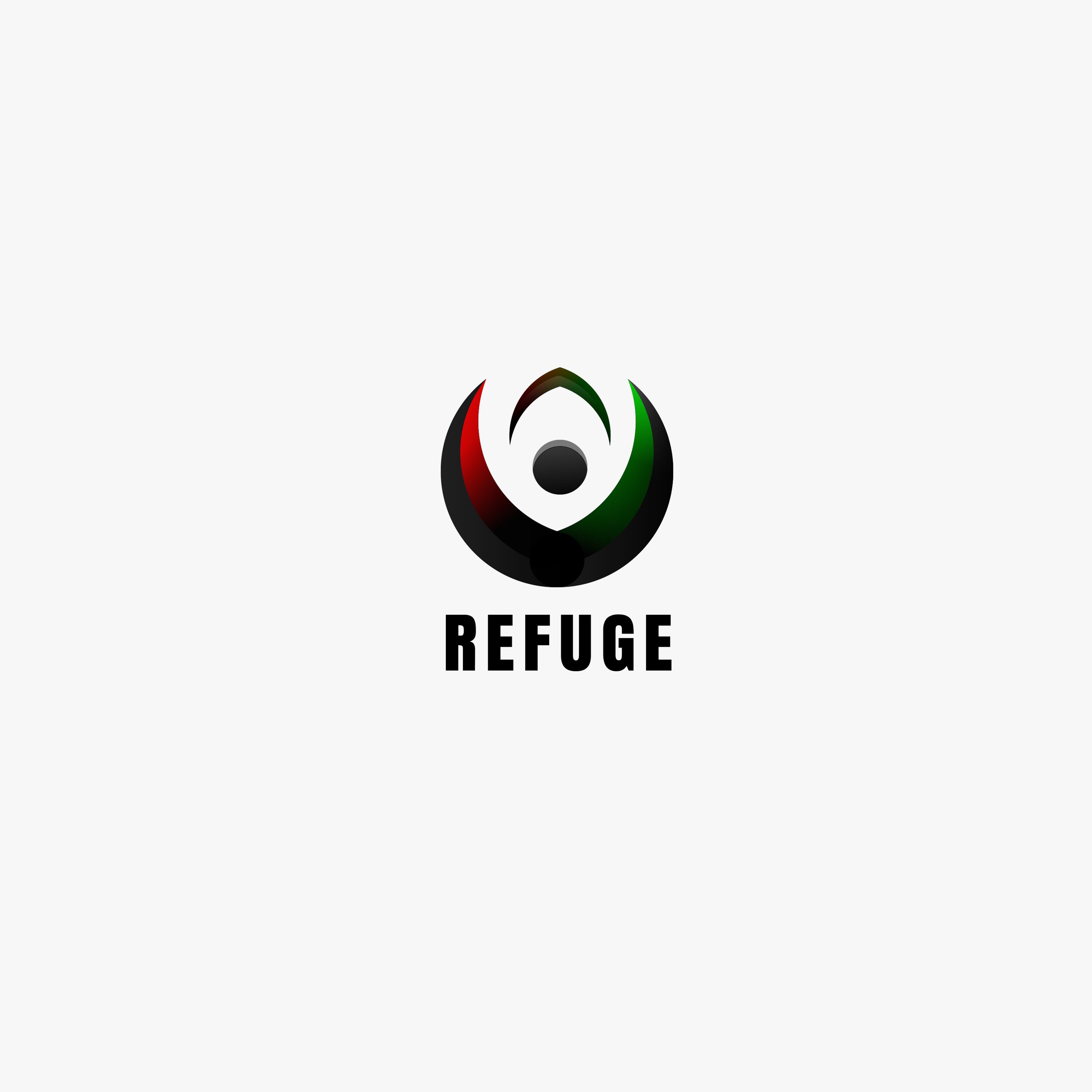
Tried my best to combine 3 of the colors, red, green and black as requested by the contest holder. @_@
Company name: REFUGE
Industry: Non-profit organisation
Link to the contest: Click me
Brief Description:
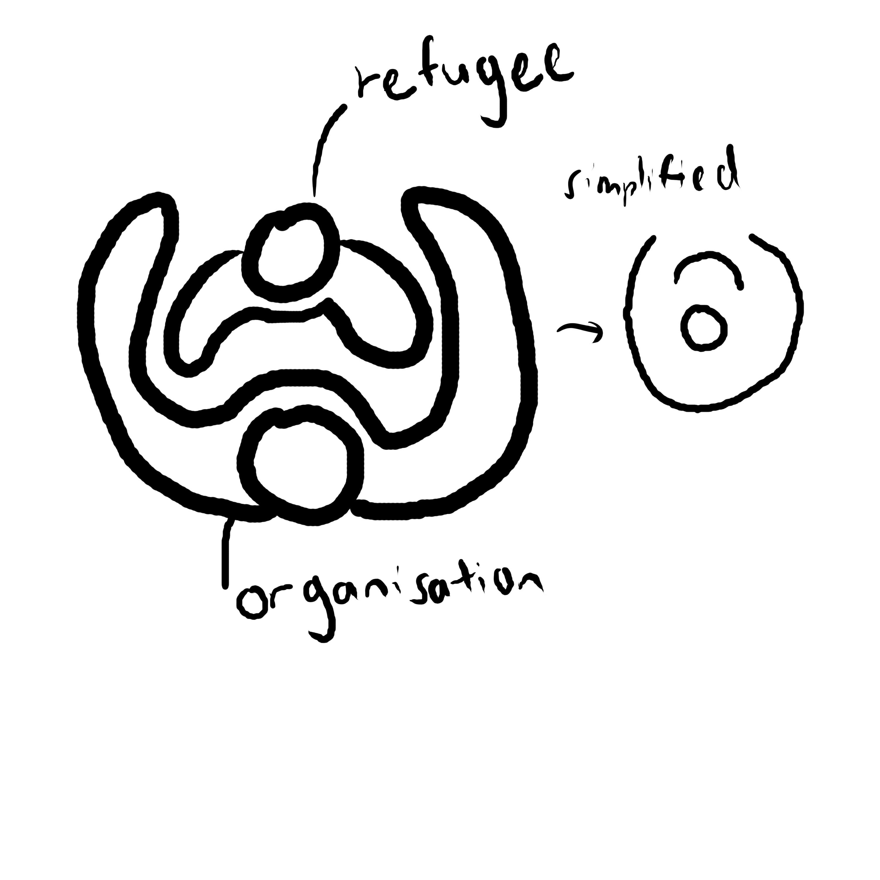
- The logo shows a larger organisation (the circle as the head while the U-shaped curve as the arm) protecting a smaller group (the smaller U-shaped curve).
)
Process
Sketch and idea. In top-view, a larger person is protecting a smaller person with its arm. This symbolizes the non-profit organisation protecting the refugee and giving them a place to stay. Simplified by combining their heads together.

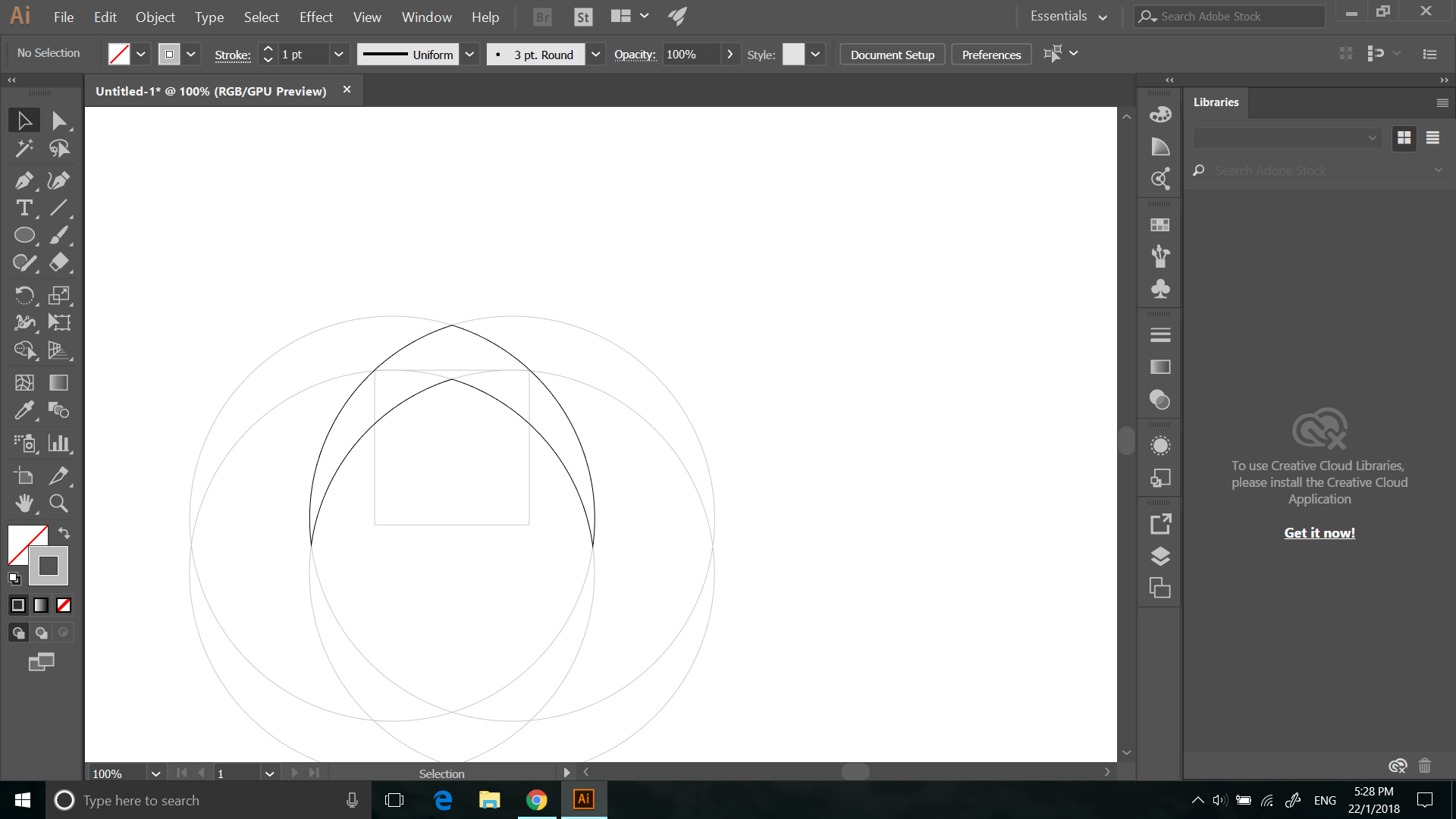
Building the lower part
.png)
Building the upper part
.png)
Compositing the parts
.png)
Color up and adding font suggested by the contest holder

