Why Vector Art is Exhausting, My Best and Worst

As much as it continues to be one of the types of art I admire the most, it continues to be the part I fell short of mastering. I did a lot of artworks with it but I had more fails than successes and it was only a matter time before I decided to abandon the art.
It's temporary though
Autodesk sketchbook was not particularly made for vector design as it lacks the required tools but the software seemed to be my area of speciality. A software like Adobe illustrator seemed to me like the perfect solace for my plight and I was hit with a wave of enthusiasm to move to the popular software but the lack of wacom tablet for pressure sensitivity - an essential tool for standard outline - killed my career. *That ends there, to be resurrected later *.
Sincerely, it takes next level creativity to be able to perfect vector art and that is why I'll always have respect for experts in the field. To say it is challenging in itself is an understatement. I watched alot of videos on it and I know how daunting the process can be.
Creating and synchronising lines, shapes and circles to make a whole, that's what vector is all about. Creating shadows and highlights with them, and blending them perfectly to nearly imitate a 3d art.
MY BEST?

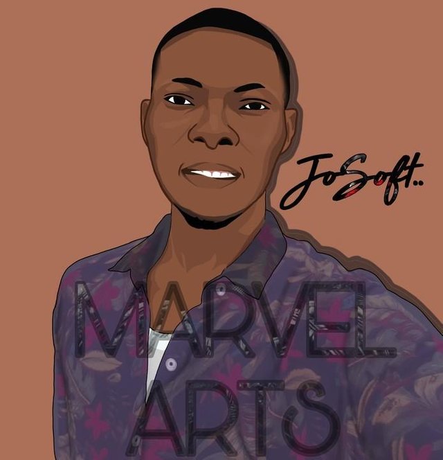
For this picture, I really don't know why it clicked. Probably the picture just gave room for a near perfect vector art or I just got lucky. Although I know I spent quite sometime on this and I strayed a bit from the norms for my outline, which I made brown. I tried to make it as accurate as possible and I think I was close to that. The complexion perfectly matches the guy's skin tone. The eyes? Accurate but not to the detail. Only now that I've seen the importance in details do I realise that the eye is missing some critical components that would have made it come out better.
Realistically, there is never a pure white eyeball. Making it grey would have sufficed or at least, making the edges grey. Then the eyes are just pitch black, no reflection. I got to know how important that is while making some artworks and I see the fine touch it adds to the final work.
The only part that still gives me problem till date is the mouth. Or more specifically, the teeth. Highlighting some critical areas is a tall order for me. I don't really know why but that's my sad reality. Although now I could have made the mouth better. Soo... That's just all.
WORST
For this pick, this isn't exactly the worst. I lost my memory card which contained all my artworks from the very first. So I could have easily gotten the worst. Well, I was able to get hold this one I uploaded two years back.

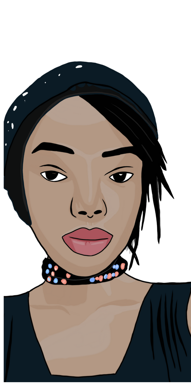
Oh my word! I mean look at that 😂 Damnn. Everything is totally switched off from start to finish. Talk of the UFO shaped eye or the paddle-like eyebrow. Or the nose that could pass for the front of a volkswagen beetle. The shadows? Terrible terrible terrible. I don't know how I manged to present that to the client with confidence,it was only after she screamed in revulsion that the magnitude of my sin dawned on me, unforgivable.
Believe me, while I was at it, I thought it was awesome. I just learnt shadowing at that time and it was part of my first trials. I had a constant color pallete I used for dark people. I forgot the fact that colours could vary from person to person, that's why you have the awkward color combination. And the hair. I don't know what I should call it because it looks seriously starched 😂
At the end of the day, it worked for the greater good though. I've learnt from my mistakes and I pray they won't repeat. I've learnt not to do my artwork at a stretch. I include some breaks in between so when I come back later to continue, I'll see some obvious errors and other underlying discrepancies in the art. I hope you had a good read.
https://twitter.com/MarvelStalwart/status/1218953049961570304?s=20