The Basics of Painting - Part 1: Introduction, Aerial- and geometric perspective
Introduction
Hello fellow artists,
In this tutorial series I will try to put down everything I know about the fundamentals of painting and drawing, so that you will be able to create spontaneous, convincing pictures in any media of your liking. While doing that, we will be aiming for a rather realistic style but this knowledge should be applicable for any style really, even photography.
I, myself paint and draw for a hobby and freelance assignments. Just, so you get an idea, here are a few of my pictures
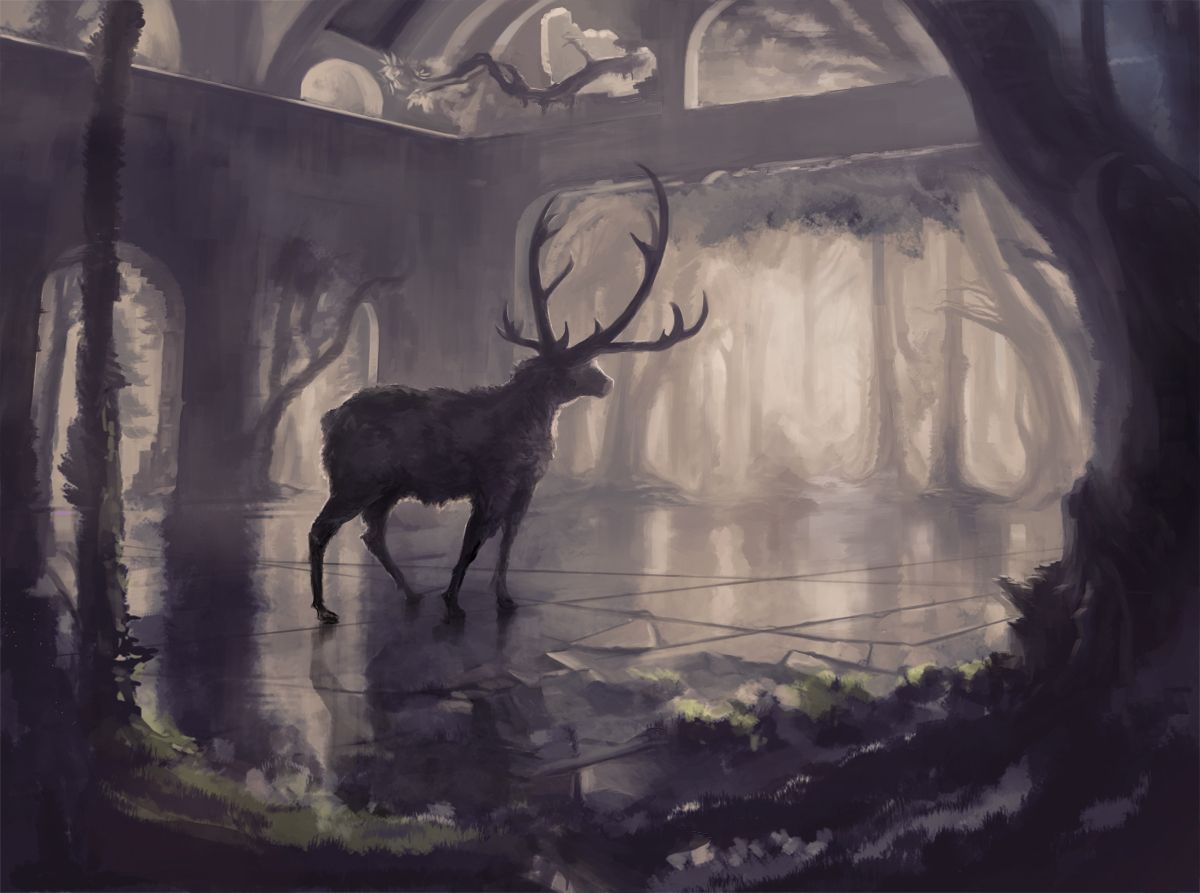
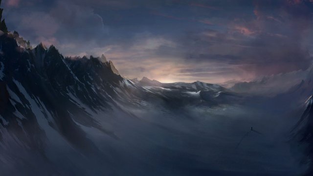
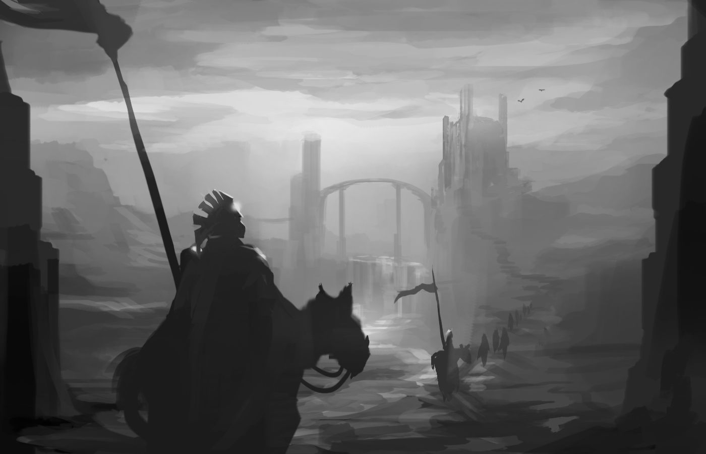
I will try to keep things as down to earth and applicable as possible but like any skill, painting requires practice, a lot of it and there isn't any other shortcut than getting the basics down and to develop them further.
No fancy graphic tablet or a crazy set of brushes will get you there faster, sorry :/
While this is not a tutorial on digital painting, I will be mostly using images done in Photoshop with a graphic tablet.
I decided to start this series with a specific principle, that is easy to grasp and that can be applied right away, so you won't get bored by too many abstract concepts right at the beginning.
Before we jump right in, I wan't to describe the main idea of this whole tutorial, on which all the topics throughout the series will be based on:
Finding and remembering simplifications of complex forms and reducing visual phenomena into simple principles, that are easy remembered and applied.
Aerial perspective
Aerial perspective describes, how things become fainter and adopt more of the color of their surrounding atmosphere, the further away they are.
To get started, determine the the color of the atmosphere in your scene.
Takes the scene place under a blue sky? Well, then it's blue. If the scene takes place during a sunset, it will be reddish and so on. This will affect the tint of all the objects in your painting depending on their distance (and the density of the atmosphere).
The nearer the objects, the more true to their "natural" color they will appear.
The further back the objects, the more tinted and similar to the atmospheres color they get until they disappear eventually.
Also rembember that in atmospheric perspective the highlights (brightest areas of objects) disappear first, then the shadows, leaving only the midtones. Thiner parts vanish and the edges of the broader ones get rounder.
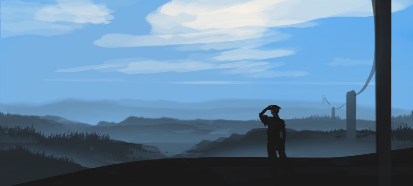
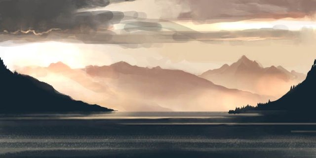
That's because the particles in the air are catching the atomspheres color and start to add up over distance, beginning to cover up the view. Same applies to underwater scenes and even indoors but in a much smaller way. Still, it lies within your artistic responsibility to experiment with these things. Maybe you'll come up with some gloomy/moody pictures. N64 Games anyone?
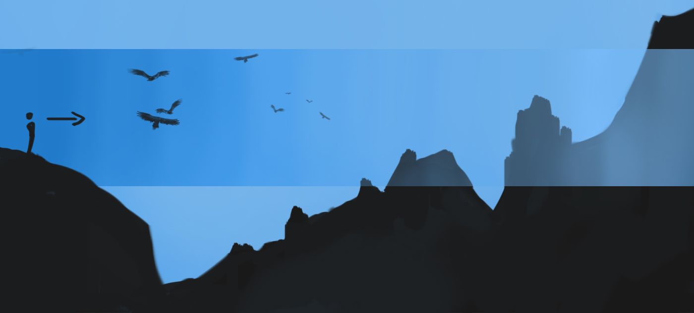
From now on try to spot the small (or sometimes even huge) differences in color, relatvie to the distance of your position in your everday life. Consider also, that edges of the forms nearer to you are sharper and get blurrier, the farther away they are. It's a very subtle difference but still worth considering.
With only this simple principle you can already start painting in a specific manner but never hesitate to use reference pictures to study the topic deepen your understanding of it.
Sidenote:
Keep in mind, that the hue of the lightsource to which your scene is exposed, also plays a significant role on how the colors of the objects will look but to keep things simple, lets don't use any strong colored lightsources yet.
Also, in reality, there are often gradients in the atmosphere from one color towards another, which also will influence the scenery.
Conclusion:
- The farther away objects are, the more they adapt the color of their surrounding atmosphere
- The farther away objects are, the blurrier their edges become (it's a subtle difference)
- Highlights (brightest areas of objects) disappear first, then the shadows, leaving only the midtones
- Use reference pictures for study. Search for pictures with the search term "Aerial perspective"
Geometric Perspective
I won't torture you with immaculate drawn perspective grids, because honestly, I don't believe in their value for our purpose, which is just getting started with painting and drawing.
There is definitely a place though for perfect drawn perspective grids, like industrial design, architecture, even sometimes concept art but don't bother with it too much in the beginning.
What I do believe in, are hand drawn perspective grids to help you get started with a interessting sketch or concept and to make your pictures look much more dynamic.
In the beginning, it will seem impossible to get it somewhat right, but keep trying.
The idea here is to hand draw a perspective grid that acts as a guide for all your elements of your painting.
Draw the lines fast. Swing it out of the elbow and try to stick with an steady inclining or declining angle starting at the horizontal line. Don't worry, if the lines aren't totally straight. Important is the consistent angle increase/decrease.
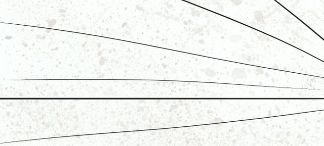
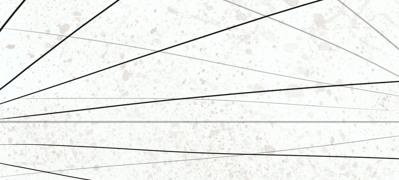
Adding the vertical perspective.
It's insane, how much of a difference just a small amount of vertical perspective can make. It makes your picture look really dynamic and draws you much more into the scene.
Don't overthink it too much.
If the imaginary camera within your picture is pointing slightly up, draw the horizontal line below the middle of your picture frame and let the vertical perspective lines point up.
If the imaginary camera within your picture is pointing down, draw the horizontal line above the middle of your picture frame and let the vertical perspective lines point down
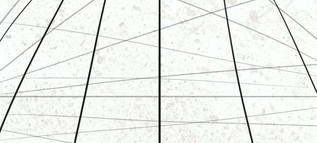
Camera pointing up
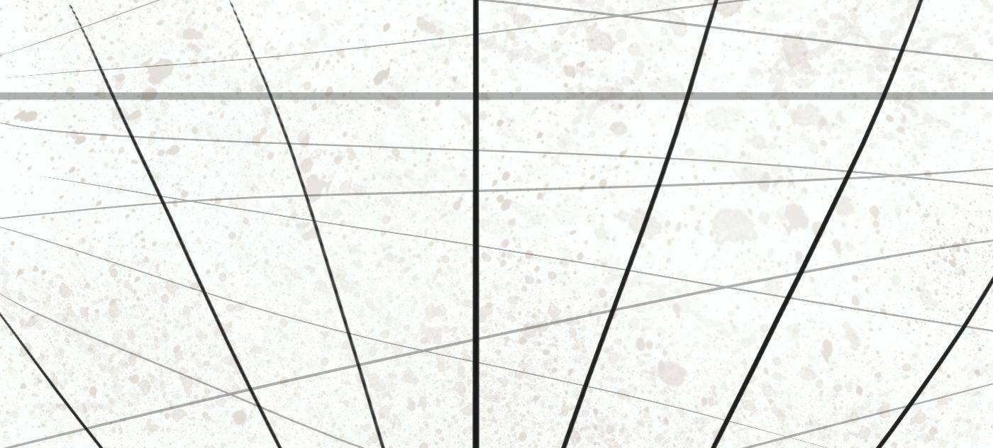
Camera pointing down
Usually this takes me about 15 seconds.
Now, lets use the grid to paint a simple scenery. I will keep the perspective lines somewhat visible.
Notice how the aerial perspective also takes place in a vertical manner, meaning, the higher things go up into the sky, the fainter they become.
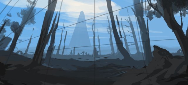
Notice, how the trees don't need to be directly on top of your vertical perspective lines, you just draw them in, as if the tree themselves were perspective lines next to the actual ones.
Here you go. With only this few things to consider, you can already create some stunning images.
As said in the beginning, I wanted to start this tutorial with somehting, that could be applied immediately.
In the next part though, we will be geting into some more abstract concepts of framing and composition.
It will be somewhat challenging but very worthwile and once you start grasping the value of composition you only will go further down the rabbit hole.
I'm also open for suggestions to include in this series, if it fits the conept of this tutorial.
See you soon.
Thanks for sharing. Spread the art my friend:)
Thx :) Just getting used to this platform.
You're welcome, keep sharing:)
Hi. I am @greetbot - a bot that uses AI to look for newbies who write good content.

I found your post and decided to help you get noticed.
I will pay a resteeming service to resteem your post,
and I'll give you my stamp of automatic approval!
Resteemed by @resteembot! Good Luck!
The resteem was payed by @greetbot
Curious?
The @resteembot's introduction post
Get more from @resteembot with the #resteembotsentme initiative
Check out the great posts I already resteemed.