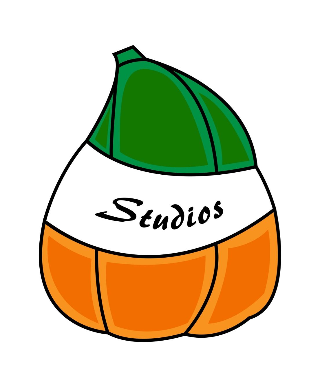
New Logo For Squash Studios!

I’ve been experimenting with new logos and I am finnally satisfied on this version! I kept the same color scheme green, white, and orange. I tightened the squash contour and added highlights. Since it wasn’t obvious from the name “squash studios” I added studios inside the logo to appease my art teacher.
I used adobe illustrator rather than sai for my last logo. I used a simple pen tool to create the shapes, filled the shapes in with color and added text.

This is the old design. I hope to refine my current one in the future as well. It keeps evolving!