Interiors project: Applied knowledge of interior design process
This is an example of how I applied my knowledge of design thus far to my most recent final project.
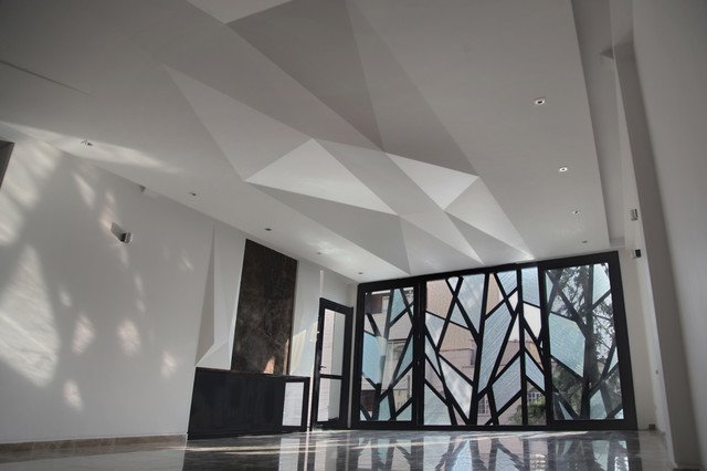
My intent was repetition through solid and void. With my intent in mind I then did a case study and found numerous examples to use but I was most inspired by this photo:
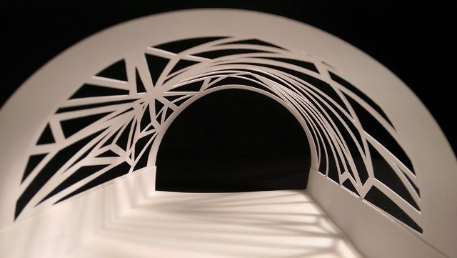
First, I constructed a small paper model. Using two pieces of plain white paper and an xacto knife.
Using the design language and intent of my paper model as inspiration I redesigned my space to contain an entry experience, primary space, secondary space, and transition experience. I opted for foam core board and pushpins. I went through at least a dozen xacto knives.
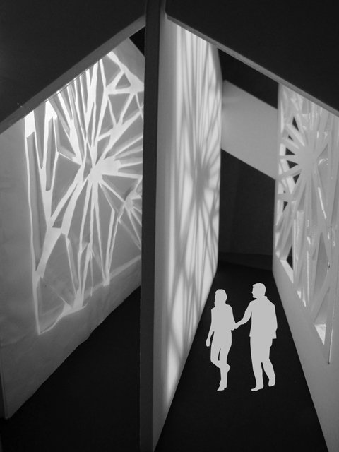
I used the people for scale but one thing I love about this model is that the scale could be any size...you could be the size of an ant. I deconstructed my paper model and used it as a template for this one. I started by cutting out the triangles on one side and placing the left overs on a translucent piece of craft paper to create the other side. Here is a version with the labeled spaces:

Now time for the hard part; Drafting the floor plan. Like I said I'm a student and not someone particularly good at drawing. I admit this first drawing could definitely be improved but keep in mind I did these drawings over my hardline drafted versions. It is actually pretty hard to draw a perfectly straight 11.5" line.
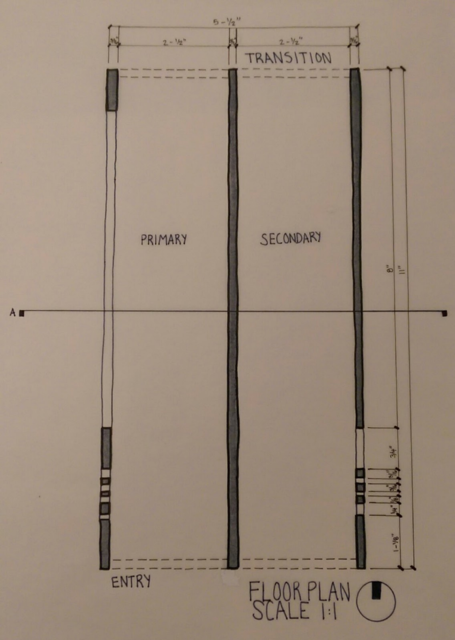
The floor plan represents if I were to cut the top off my model and look down on it. The four different line weights each represent something different. The heavy pochéd lines are the solid part of my model I am cutting through. The medium lines show the parts of the model where you are seeing the edge of it. The fine dashed lines represent parts above where I am cutting. The scale is 1:1 meaning this plan is the exact same size as my model. Next I did a section of my model. Section A.
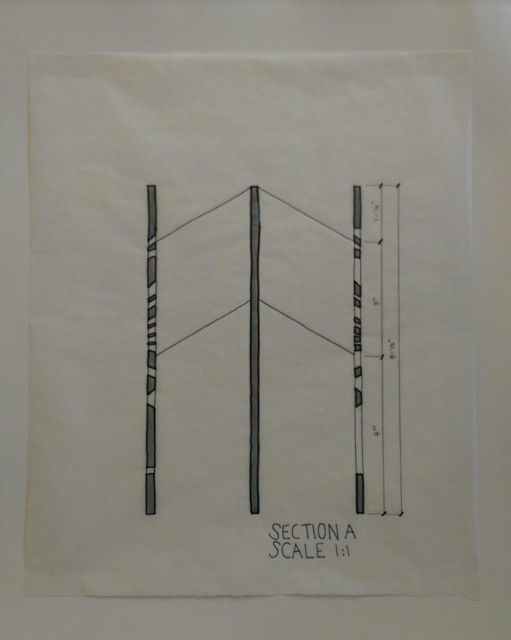
Section A is a view of my model cut in half from the inside. Four line weights. This one is pretty straight forward. Finally, my last drawing is the elevation.
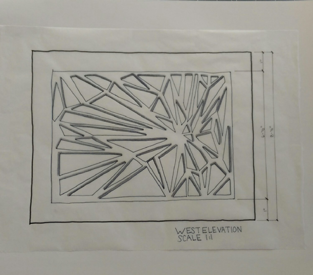
The west elevation of my drawing. Elevations are the inside of sections. This is the west elevation, the side with translucent paper. I added the shadows to give the pieces depth. This was by far my favorite drawing.
This was a great learning exercise for me because I found out what it was like to materialize a design from start to finish as if you were going to build a big scale model of it. This is my first project I put into my portfolio and while it's not perfect, I still worked hard on it and am proud of the way it came out!
Check out my other post about interior design here: https://steemit.com/art/@lovenugz/interior-design-student-it-s-more-than-just-decorating
Thank you for sharing - awesome to see the thought that goes into design! I'm doing a time lapse of a system involving Framecad - (just functional/not creative, they system itself in innovative)
Ah yes, CAD is my next step. I just started learning sketchup to stay busy during summer time and it's proving to be an interesting challenge.
I forgot to mention the compass on the bottom right of the floor plan shows the arrow pointing North.
My recent project wasn't just about aesthetics; it was an orchestra of interior design principles in action. From initial client consultations and space analysis to meticulous mood board creation and detailed construction drawings, each step echoed my accumulated knowledge. Color theory came alive in the cohesive palette, while space planning ensured functionality without sacrificing flow. Every element, from furniture selection to lighting design, resonated with the project's core concept, culminating in a space that transcended mere decoration it became an experience. Check out more information https://roomtodo.com/fr/4709/floor_plan_software/ through this site.