The Meme Review - Poster Design
He has a second channel called "thatistheplan" where he makes weird meme related videos (they are pretty funny" and where he reviews memes.
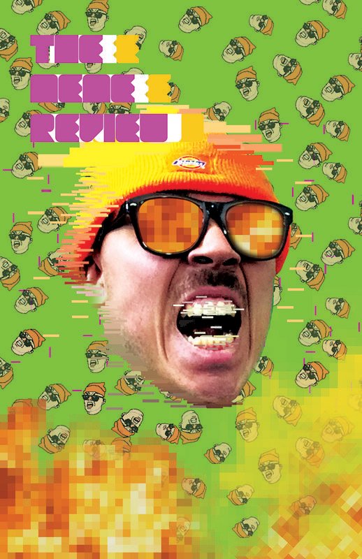
So in light of the content he makes, he took me on to design him a poster of his show, "The Meme Review" and after all the research and thoughtful concept development, I designed this poster that sold $200 in a day.
The Concept Development, Research and Planning:
So, this took a while, getting ideas and such, and I am not going to lie, I was a little intimidated to go far in this project, but I powered through.
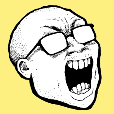


For the project, me and Anthony Fantano agreed the artwork would be a photo manipulation. So this was the challenge. I first looked at these pictures because they explained Anthony's energy when it came to his brand and how his video and aesthetics are executed in his show The Meme Review. This was the perfect way to start the concept development for the poster. It gave a lot of direction.
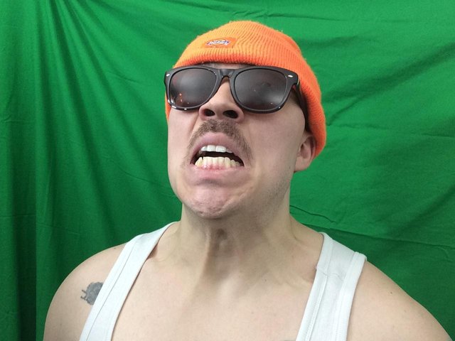
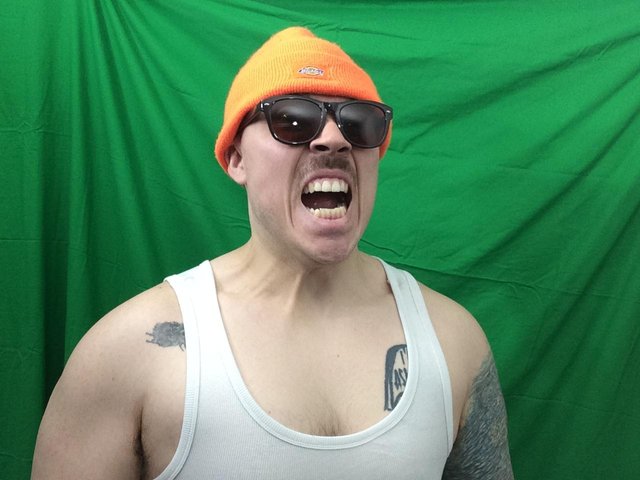
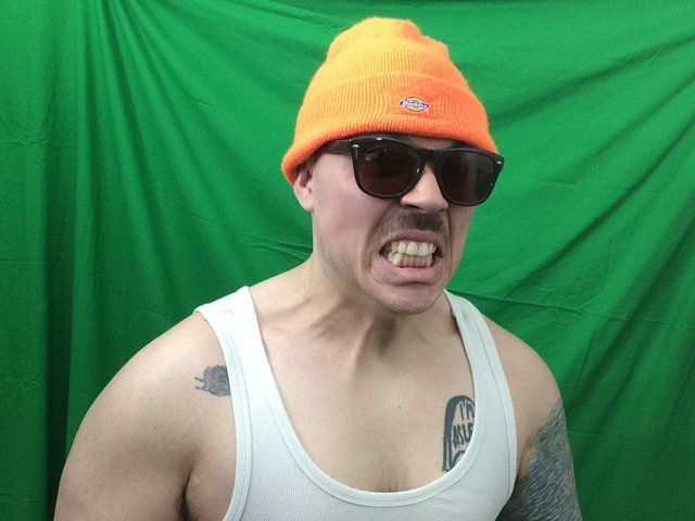
So after fiddling around with brainstorming webs and researching Anthony's brand, and his meme review videos (of which I already regularly watch) to get a good understanding of how his video emulate the meme glory and all its hilarity, this project was then a piece of cake to execute. So the concept went like this.
Concept:
I chose a 8-bit gamer themed, bright colored meme fest of Anthony's face, the colors, light green, purple, orange, and white were color related to Anthony's The Meme Review videos and his branding color. The orange represents Anthony's famous orange beanie, of which he used a lot in his video, it is sort of like a mascot for the meme review. The purple and light green represents the glitch and inverted colors his video editors pull of in his videos to make it funny and seem low budgeted, also Anthony uses purple and light green a lot for thumbnails to catch the viewer's eye to click on his video (awesome strategy by the way). Finally, the white is used to balance the colors evenly, but it is used very sparingly, as I wanted to use the bright colors more in this design to signify high energy to the viewer.
Finally the famous low budget explosion Anthony does in his videos, to add more comedy relief is used as a foreground to signify Anthony's real face getting blown into a digital meme, in which the meme faces are all in the background to add more activity to the poster, Also I used his glasses as a reflection of the 8-bit explosion. It was the most appropriate design, I said to myself "damn I'm good", and then sent his the JPEG, he got the posters, and sold, sold, and sold some more. This was a fun project.
If you like my process and want to see more of my work, please upvote and follow me @lotusflamedesign