How I adapt my photos to Instagram. (Canva Tutorial)
I usually like to take photographs that some might call "Simple", of everyday objects or even in the same search for the abstract reading of spaces, taking advantage of the resources of blur, bursts, etc.. So when I share them on my social networks I always ask myself the question: is this photograph good enough on its own? With the great competition that there is in social media of incredible images sometimes it' s very easy for me to doubt my photos and want them to become something much bigger.
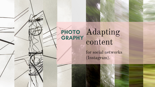
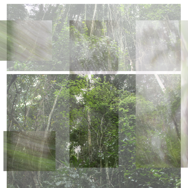
That's why today I bring you my templates hoping that they can serve as inspiration to create really unique photographs, as I play with the plastic technique of collage taking the photographic work more towards the experimental and plastic, in search of an authorial voice.
The first job I bring you is the most recent:
Espejo. (Mirror)
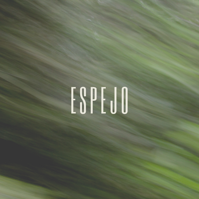
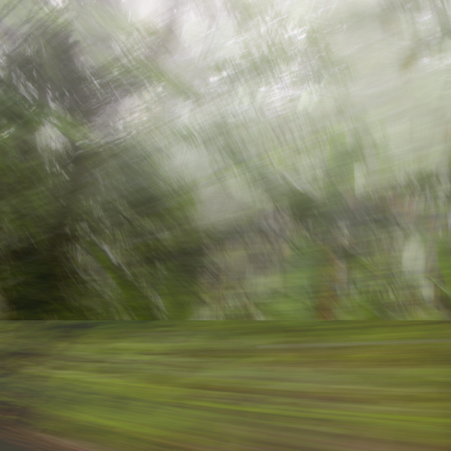
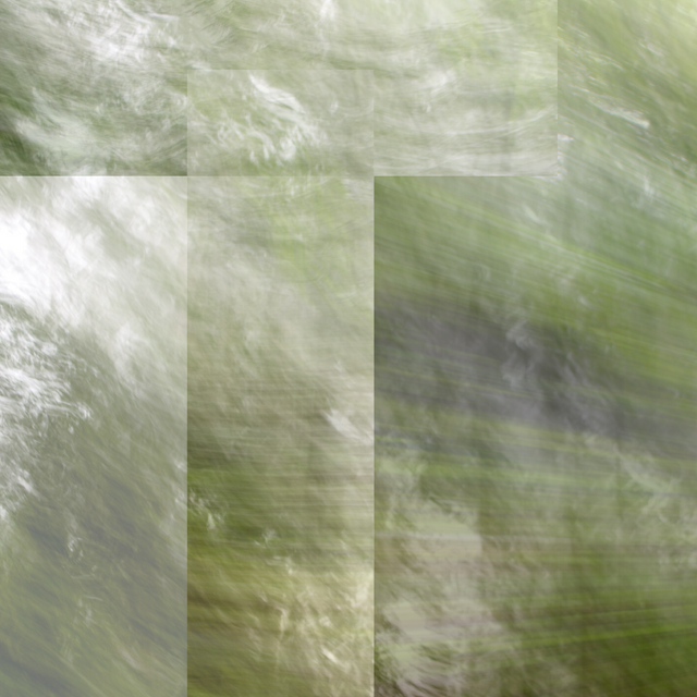
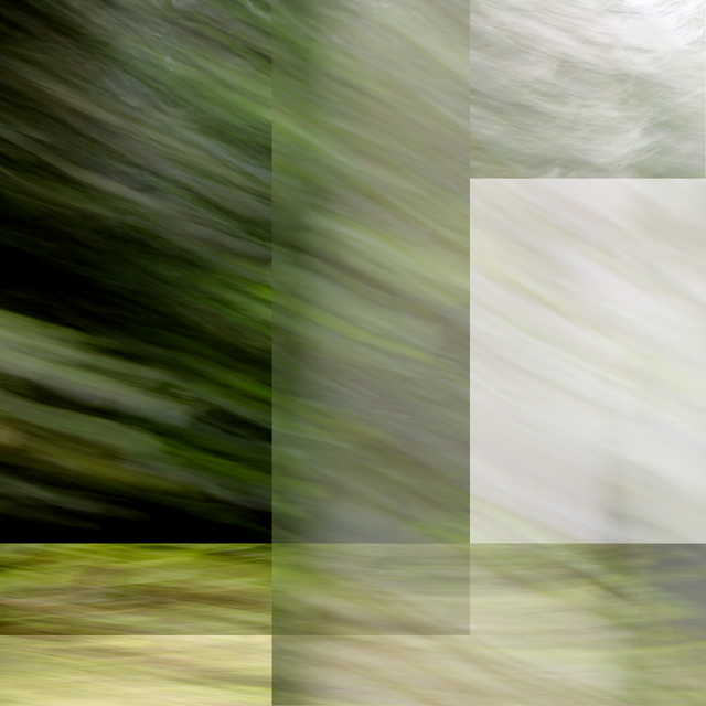
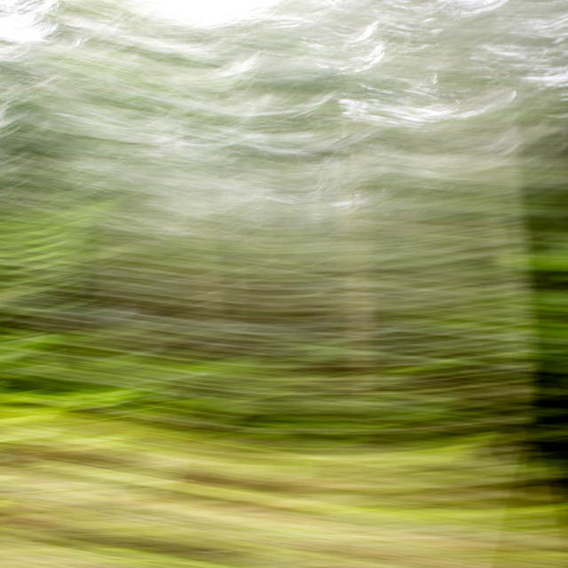
Recently I published here in Hive these photographs of a trip to the beach, more specifically they are the photographs of the route to the beach, in this post you can see them without clipping.
The tool I use to edit my photos is Lightroom, where I edit its values. I edit Collages in CANVA, a free online design software that I highly recommend. Sometimes I start from a template and from there I begin to experiment but usually I do what I already had visualized in my head and what I do is move and remember images.
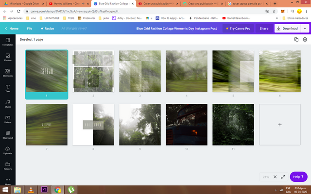
In this collage I didn't use the carousel design so each photo could be worked on individually. Something like this ends up showing off my screen in Canva. There I'm still working on another post that does have a carousel and you can see how one image links to the other, but I'll be talking about this later. Here is the final result:
 |  |
|---|
 |  |  |
|---|
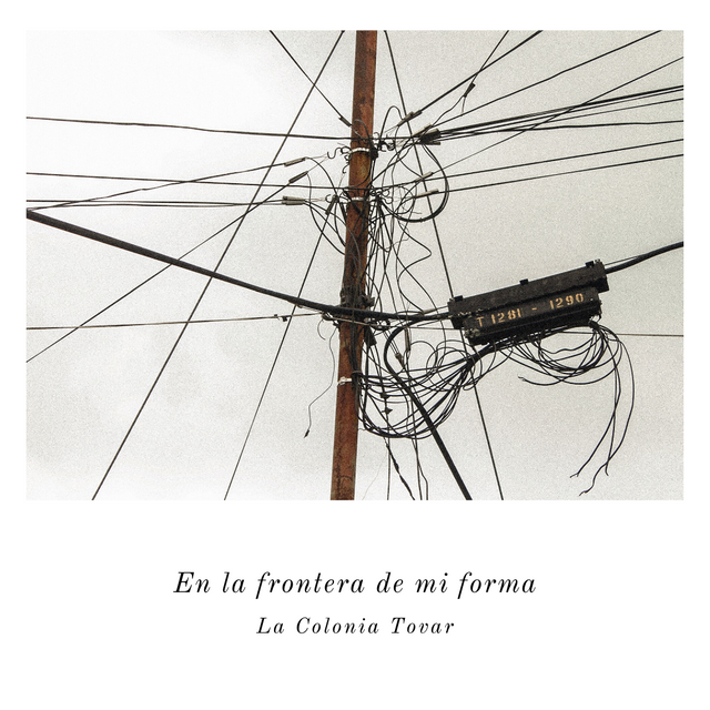
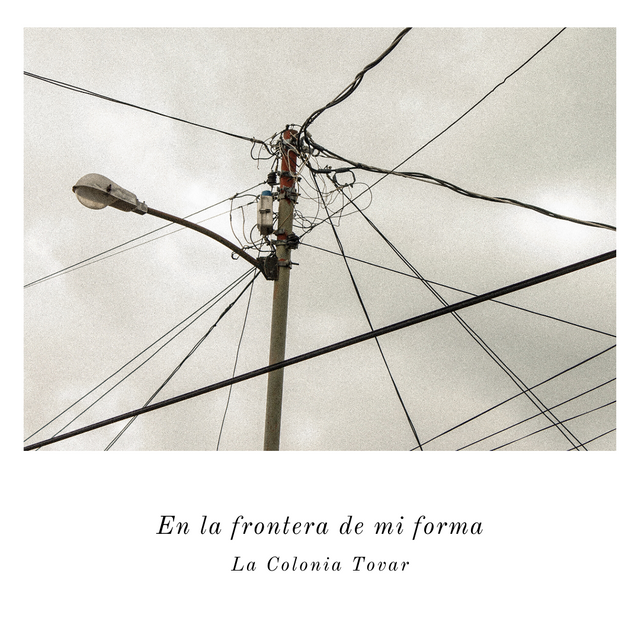
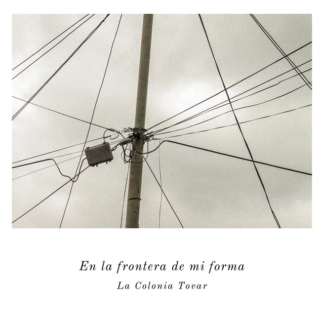
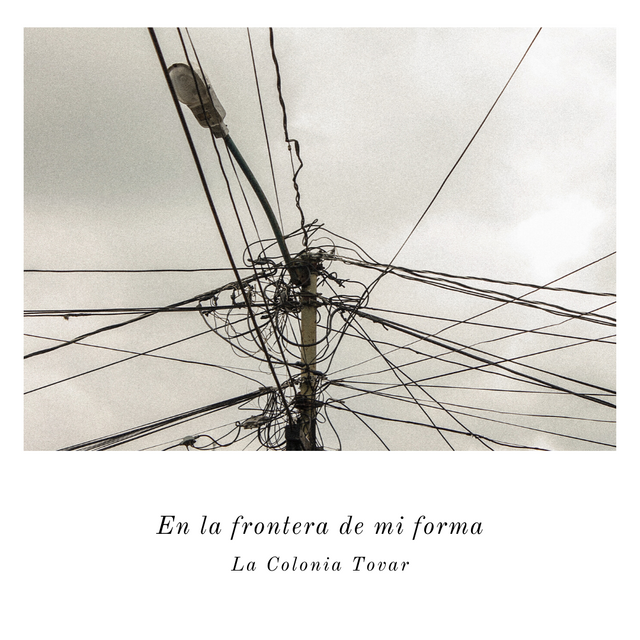
En la frontera de mi forma. (On the edge of my form)
.png)
This project was one of my favorites and I feel that it was also very successful on Instagram, the complete pictures can be seen on this Post. At first I felt that these photographs spoke to me in a different way, that these cables were not just cables, but that they spoke of my relationship with this space and what I felt at that moment. Not for nothing do we find ourselves attracted to certain objects more than to others, however common they may be.
.png) | .png) | .png) |
|---|
.png)
.png) | .png) |
|---|
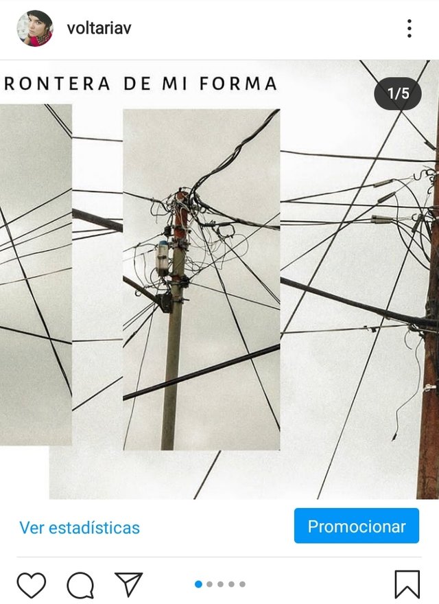
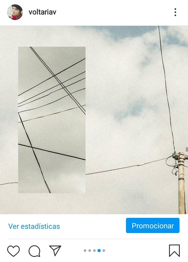
So I started experimenting and this was the result. In this case I did use the carousel tool as you can see in the Instagram Post and it's much easier than it seems (specially for those who think it can only be done in photoshop), what you have to do is to be patient. However, once you get the shot, you're ready.
I work in the 1:1 format of the Instagram grid, precisely to be able to play with the possibility of the carousel with a little more freedom, and from there I try to be attentive to the measures of the photo. If I want a photo to be divided into two templates, the rectangle of the photo in which it is divided should be 693x1080 while the other should be 1080x1080.
Short tutorial
(my personal way of doing it)___
- Rectangle 108x1080
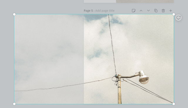
We identify the limit that our image obtains in that measure and we create the other rectangle:
- Rectangle 693x1080
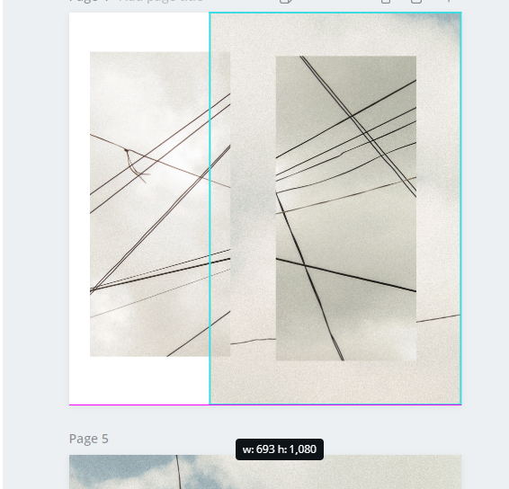
To make them fit what I do is take this 693x1080 rectangle to the 1080x1080 template, join it to the edge of the image and take advantage of the opacity that the program gives you to join both photos and know which is the limit of the small rectangle that correctly completes the 1080x1080 rectangle. This will give us a 1773x1080 image.
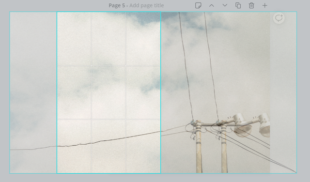
You need to move the larger rectangle to give the smaller one space and to be able to place it next to it, from there we see how the images do NOT coincide)
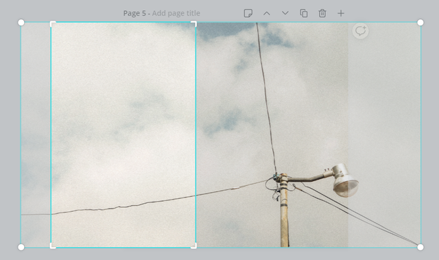
And here by moving the image inside the shorter rectangle until it fits the larger rectangle, we can see how they now match, then the smaller rectangle is moved to the edge of the previous template and we have the carousel effect, as in these two examples:
 |  |
|---|
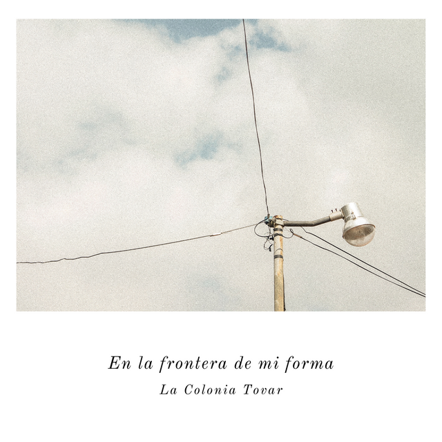
I end up playing a lot of Canva because it has such a friendly and recognizable interface. As I' m a fan of the written word, I almost always fall into the temptation of accompanying the image with text, as it was in this case where I took advantage of the photographs alone (almost like postcards) and added descriptive text, which somehow gave them the identity I wanted these photos to have, which were not just photographs of posts, but the characteristic posts of Colonia Tovar as I see them.
 |  |
|---|
 |  |
|---|
Something like this ended up showing off my project in Canvas, here you can also appreciate a little better the work to achieve the carousel effect:
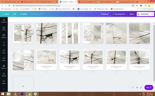
I hope that this post will inspire you to continue creating and enhancing your images, whether you are a visual artist, a photographer or an audiovisual artist, or whether you are an image lover and try to get out of it the invisible, without staying only in the photographic fact and in this way expand our perception of the common to the unknown.
Thank you very much for reading
And tell me. How do you handle your content on other social networks?