Woman In Front of Mirror Reflection Digital Illustration [Process Drawing]
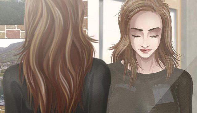
Sometimes taking a commission can be a frustrating experience. This is usually a result of poor communication. For example, if someone's request is so vague and incomplete, I take liberty and create something that is eventually turned down because it didn't line up with what they envisioned. I don't rush my my work, so that sometimes means hours lost and having to start from scratch.
This specific illustration is my attempt to salvage some rejected work that would otherwise never be used in the finished commission. I had also drawn several other characters, but they weren't shaded and finished like this woman was so I scrapped those completely. Since this commission required a front and back version of the character, I thought it would be a fitting to use a mirror to show both separate drawings in a single illustration.
The Wire Frame
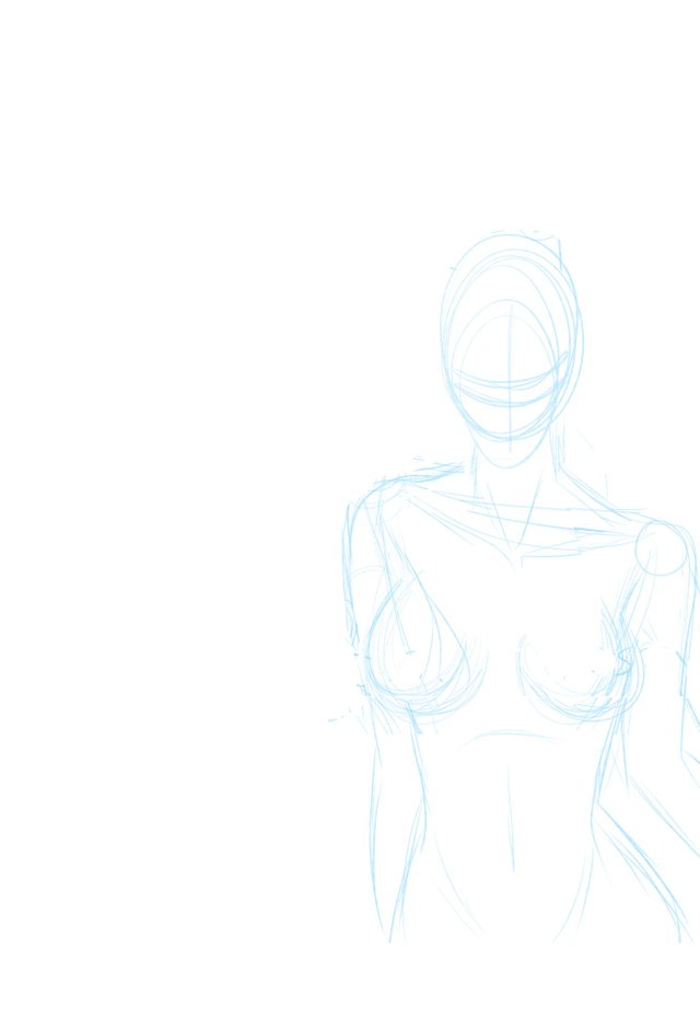
The vague and incomplete description of the commission didn't specify how much of the character to show (ie: bust, waist shot, whole body, etc). I went with a waist shot. They did request that she have her eyes closed and her head tilted downward slightly, as if in deep meditation.
The Sketch
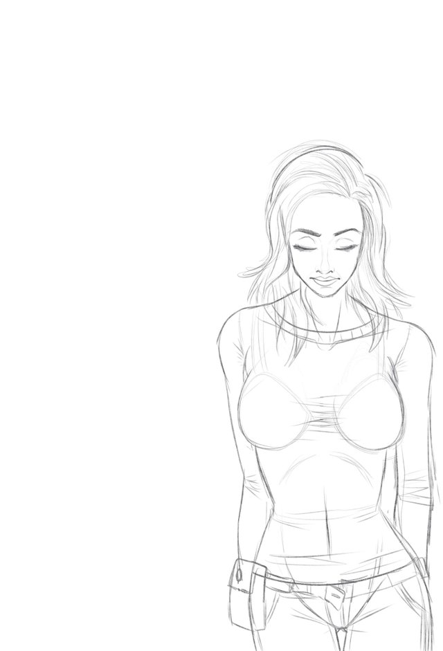
I was provided a simple sketch of her attire, so at the very least I knew what she was suppose to wear. They also asked that she resemble famous actress, Eva Mendez. Therefore, I used photos of the real world actress as reference when composing her facial features, hair style, and figure.
The Line Art
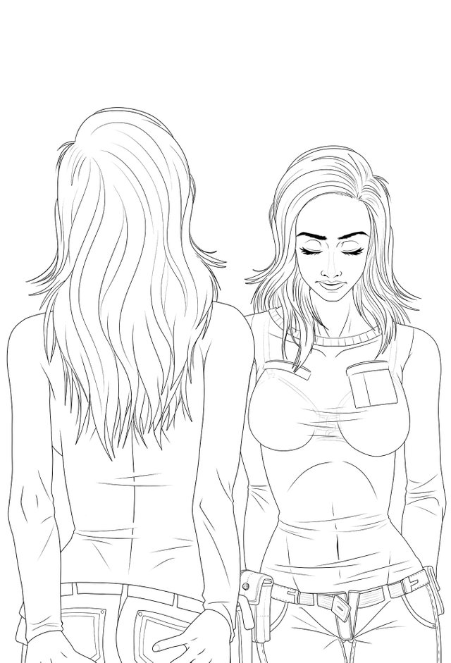
This illustrations leans more toward the realism side of the spectrum, especially when compared to my usual drawing style. This was requested and so I kept that in mind with every little detail. To draw her backside, I copied all the layers and flipped them horizontally. Then I erased all of the interior lines so that I had her silhouette. From there, I filled in the details of her backside.
The Flat Colors
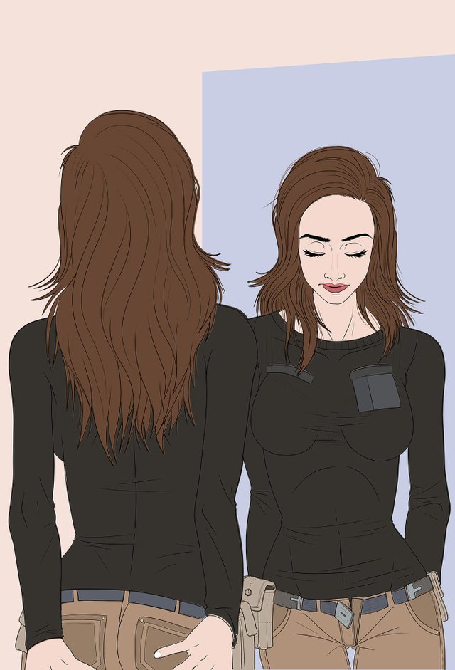
My usual flat coloring method involves using the paint bucket fill tool and setting the fill area to reference the line art layer. Doing it this way allows me to have the flat color layer on top of the line art layer. But this time, I filled in the empty spaces where otherwise the lineart would have prevented fill. Doing it this way means I had to move the layer under the line layer. But this allows me to select entire color areas and shapes without worrying about missing details.
The Finished Illustration
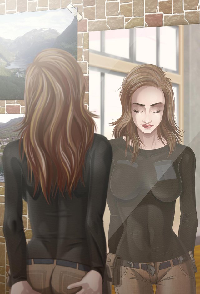
I used a combination of several shadow layers at different opacity. I usually only have one, but this requires more than simple cel-style shading. I also had a layer with multiple gradients for each color shape. I went one step further and created shapes for my gradients to match the muscle groups on her well toned body. Then I used the blur tool to soften the edges. Blurring the backside version of the woman makes the mirror reflection the point of focus.
The background was composed of material found within Clip Studio Paint EX. The wall is a repeating texture and the wall posters were taken from the included generic photographs in the materials folder. The background in the mirror is actually a rendered 3D landscape, also found within the software. I don't like relying heavily on pre-rendered materials, but in this case it wasn't the main focus of the illustration and just ads a little more to the realism.
This post was shared in the Curation Collective Discord community for curators, and upvoted and resteemed by the @c-squared community account after manual review.
@c-squared runs a community witness. Please consider using one of your witness votes on us here
Congratulations @jamesartville! You have completed the following achievement on the Steem blockchain and have been rewarded with new badge(s) :
You can view your badges on your Steem Board and compare to others on the Steem Ranking
If you no longer want to receive notifications, reply to this comment with the word
STOPVote for @Steemitboard as a witness to get one more award and increased upvotes!