Dungeons and Dragons Commission Original Art [Process Drawing]
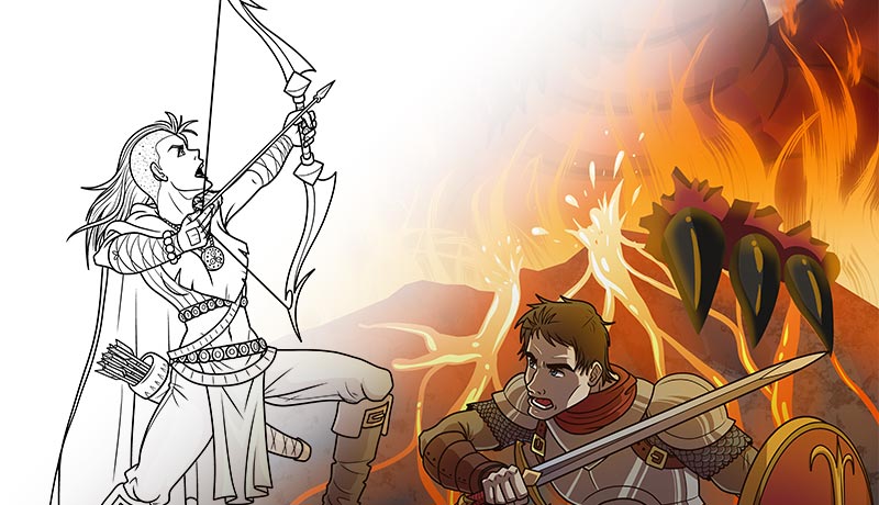
Earlier this year I was commissioned to illustrate two Dungeons and Dragons avatars in mid-battle against a fire-breathing dragon. When it comes to Fantasy role-playing games, this is pretty much the iconic scene played out time and time again from one franchise to another. The female was the archer and the male the swordsman. I personally have never played D & D, but it really would be something that I think my wife and I would have a lot of fun doing together.
The Wire Frame
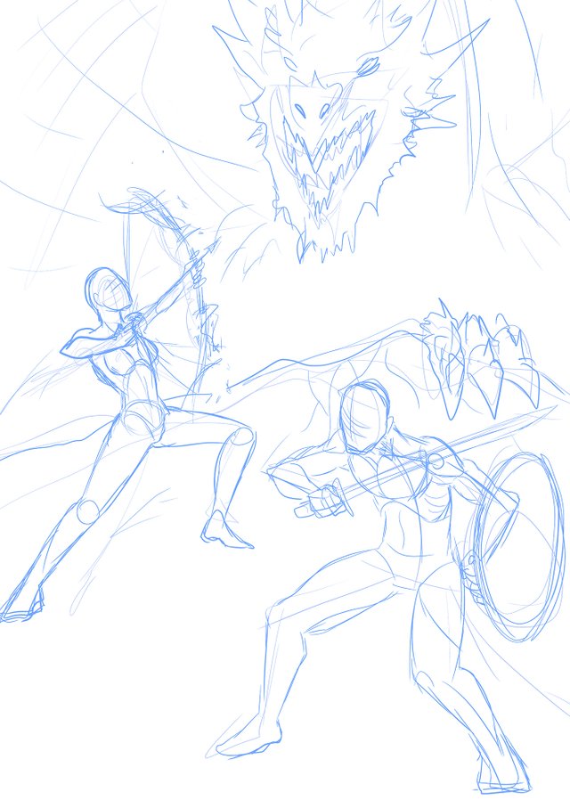
It's no surprise that the level of work an image requires is directly correlated to the number of subjects the drawing will contain. In my case, I had three characters to render from scratch: the male, female, and the dragon. I didn't use any references for this one, and you can tell because my poses look a little stiff.
I'm not too experienced when it comes to weaponry, and it's pretty obvious if you analyse my drawing carefully. Earlier this year I had been recovering from a low point in my personal life, and I had taken a long break from drawing. This piece was one of the first for this year and I was still getting back in the saddle. I'm happy to say that by the end of this year my gallery has increased a great deal and I am more confident as an artist now than I have ever been before.
The Sketch
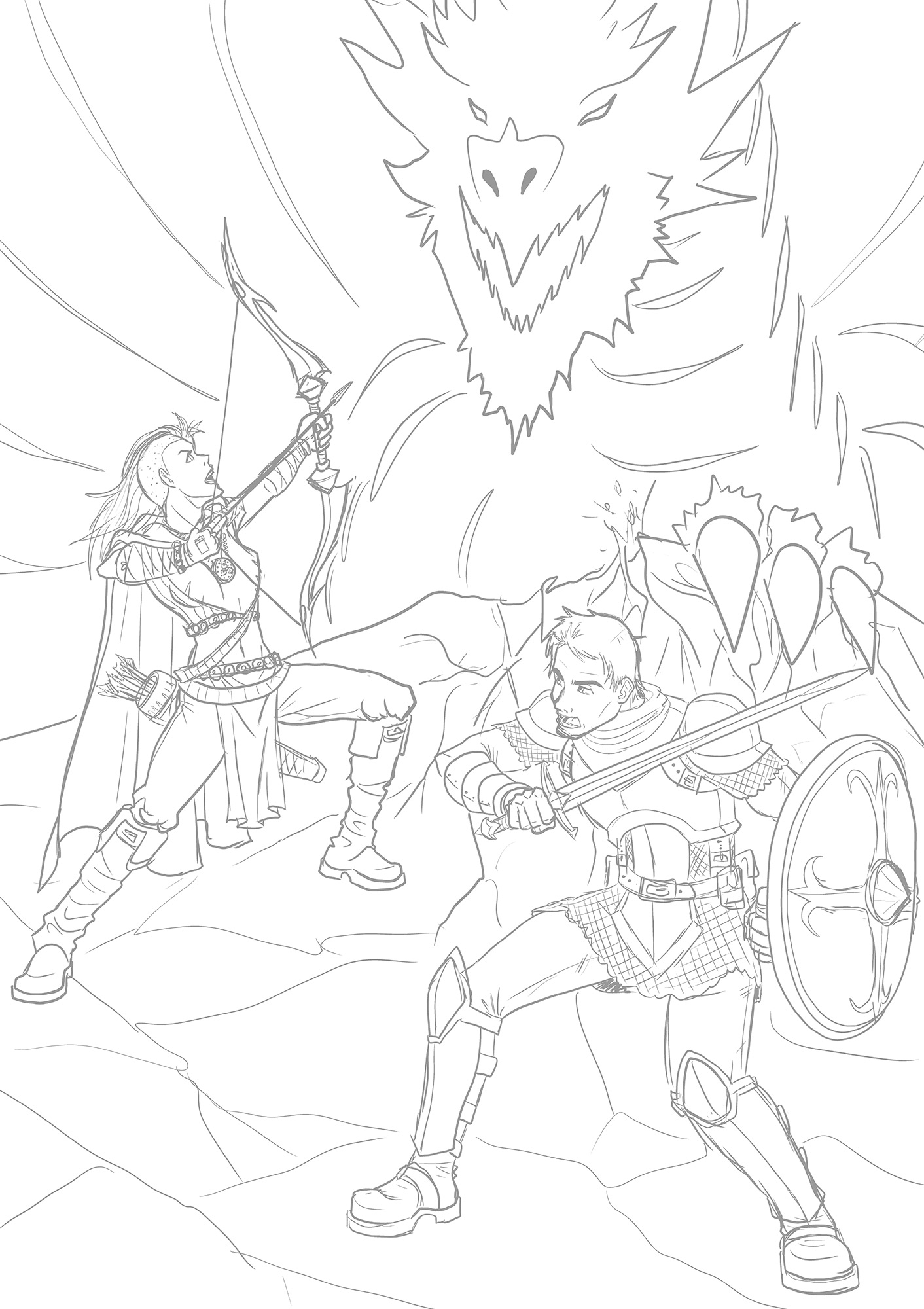
The official commission didn't provide me with very many details regarding the appearance of the characters. I had a few things to go on, for example, the female was an archer and she had pink/purple hair, shaved on half her head. The male was a knight and he had medium long brown hair. Aside from that, their armor was completely on me so I had to churn the creative gears in my brain to design some outfits that were fitting for their roles. I was inspired by other works, including the Lord of the Rings, The Legend of Zelda, and Soul Calibur.
The Line Art
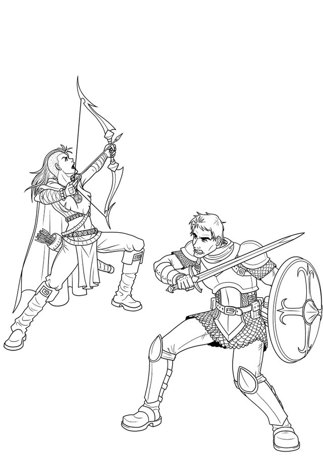
The first thing that's obvious about my line art is that I didn't draw the dragon. This is because I didn't the beast to have any black lines. I wanted him to blend in with the background and be somewhat hidden by a wall of flames and smoke. It was my intention to have the two warriors be the focus of the image, with strong bold lines and detailed armor. These characters were rather enjoyable to draw. I was happy with their final designs.
The Flat Colors
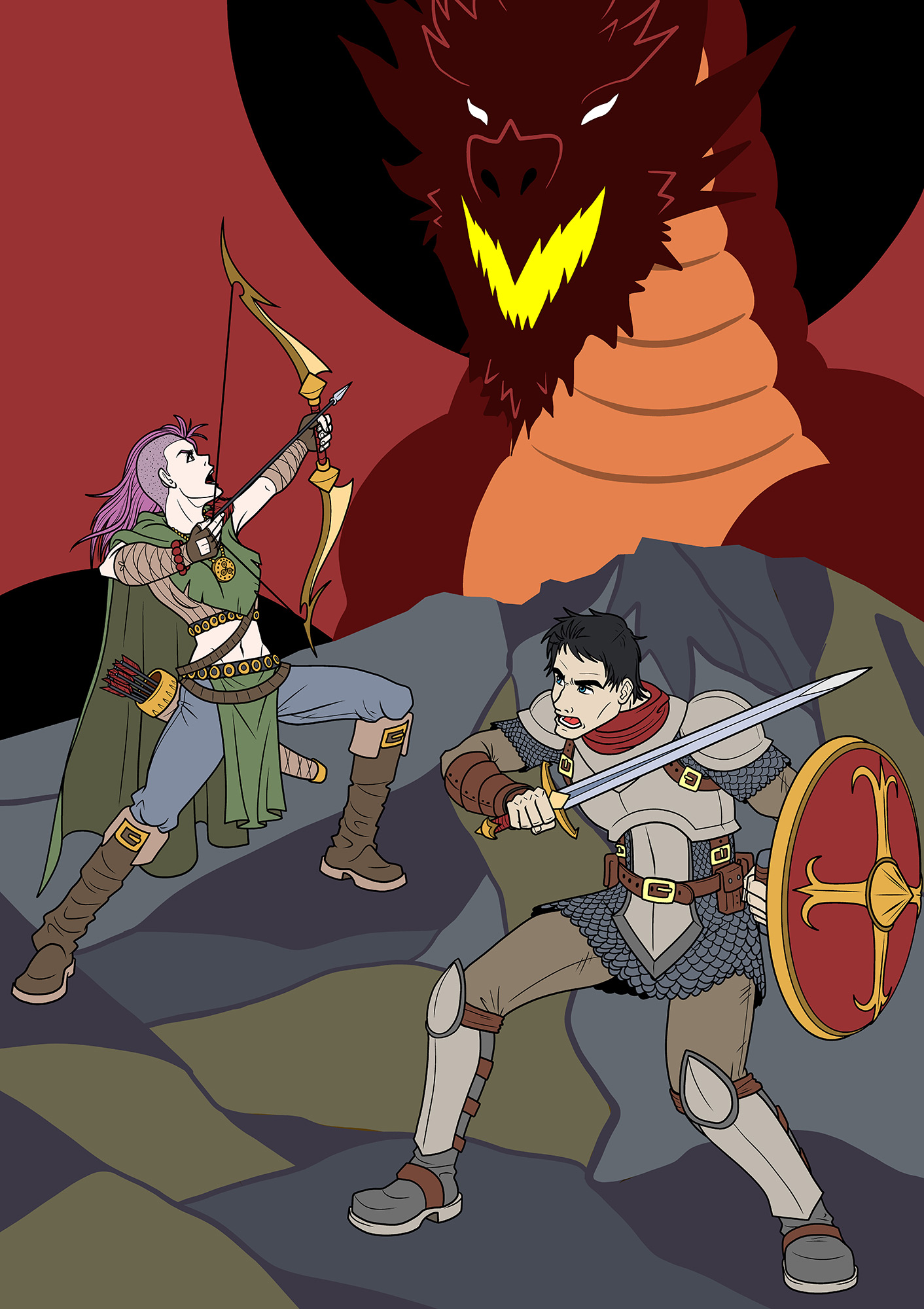
I was surprised by how long this one was taking me. I charged my normal commission rate, so in hindsight the person got themselves a really good deal! In the future, I need to remember to charge accordingly if the piece will contain more detail and characters than my standard offering.
The dragon and the cliff peak are illustrated using solid colors thanks to the G-Pen in Clip Studio Paint and the paint bucket fill tool. It took me a while to find colors that I was happy with. Especially the ground, I wanted something that would contrast well with the yellows and reds from the dragon and fire. Meanwhile, our heroes contain a lot of Earth tones, something neutral.
The Finished Illustration
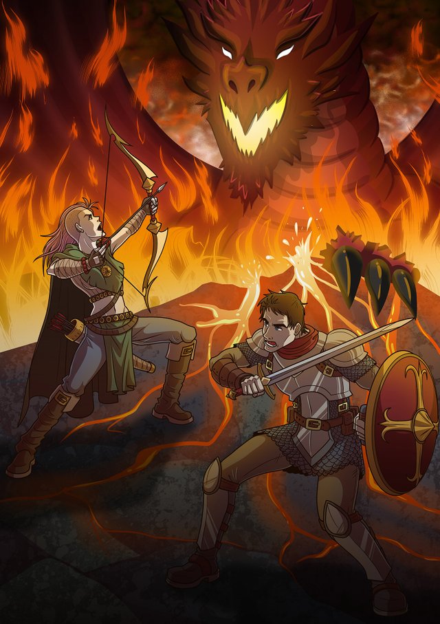
I shaded and highlighted the two characters first. But when it came to the dragon I wasn't sure how I was going to approach it. I didn't want cut and dry cel-style, but I was too exhausted by this point to make anything too realistic and detailed. I ended up using the G-Pen again, but making several strokes with lowered opacity to create several levels of color. This helps give it more depth and shape, but still technically cel-style.
When with the dragon complete and the lava/texture on the cliff I still wasn't 100% satisfied with the result. It was missing something. I tried to draw smoke fuming up from below to conceal the dragon, having only its eyes and mouth glow. But that didn't meet my expectation either so I got rid of it. I found my solution while browsing the different brush options in Clip Studio Paint and I found one for flame. I tested it and immediately liked how it looked. So I created my wall of fire and made it glow red hot.
And with that last piece, I was happy with the illustration and called it a night.
Love the design of the characters. Good work.
Thanks. I'm glad you like them! Good news is, so did the person who commissioned me!