Scale Model / Aerial View : The Fruitful Gap between 2D and 3D
The Disconnect in Dimensions
Anyone who has followed along with my posts for the last few months has probably discovered that I have an obsession with navigating the gap between two dimensions and three dimensions. Whether it's finding a landscape hidden within the Mona Lisa, writing with a three-dimensional alphahet, or attempting to peek around the facade of the Google homepage, I've continuously found that there is endless potential for discovery in transforming two-dimensional imagery into three-dimensional forms.
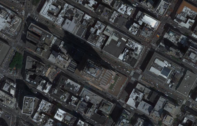
As an architecture student, I was always fascinated by the disconnect between architectural drawings and the three-dimensional models that come from them. A plan drawing of a home (a view of the space from above) can provide a lot of information to a homeowner, but it's very hard to gain an understanding of three-dimensional configuration of the space without a model of some kind. By looking at a plan drawing or an aerial view of a building, you have no real feeling for how tall it is. The easiest example of this disconnect can be found in an aerial view of the Empire State Building in New York City:

From an above view, New York City appears like any other city. Square blocks of concrete and steel. You have no real sense of the sheer size of each of these skyscrapers. The long shadows are the only hint of the grandiosity of the buildings.
Scale Model / Aerial View
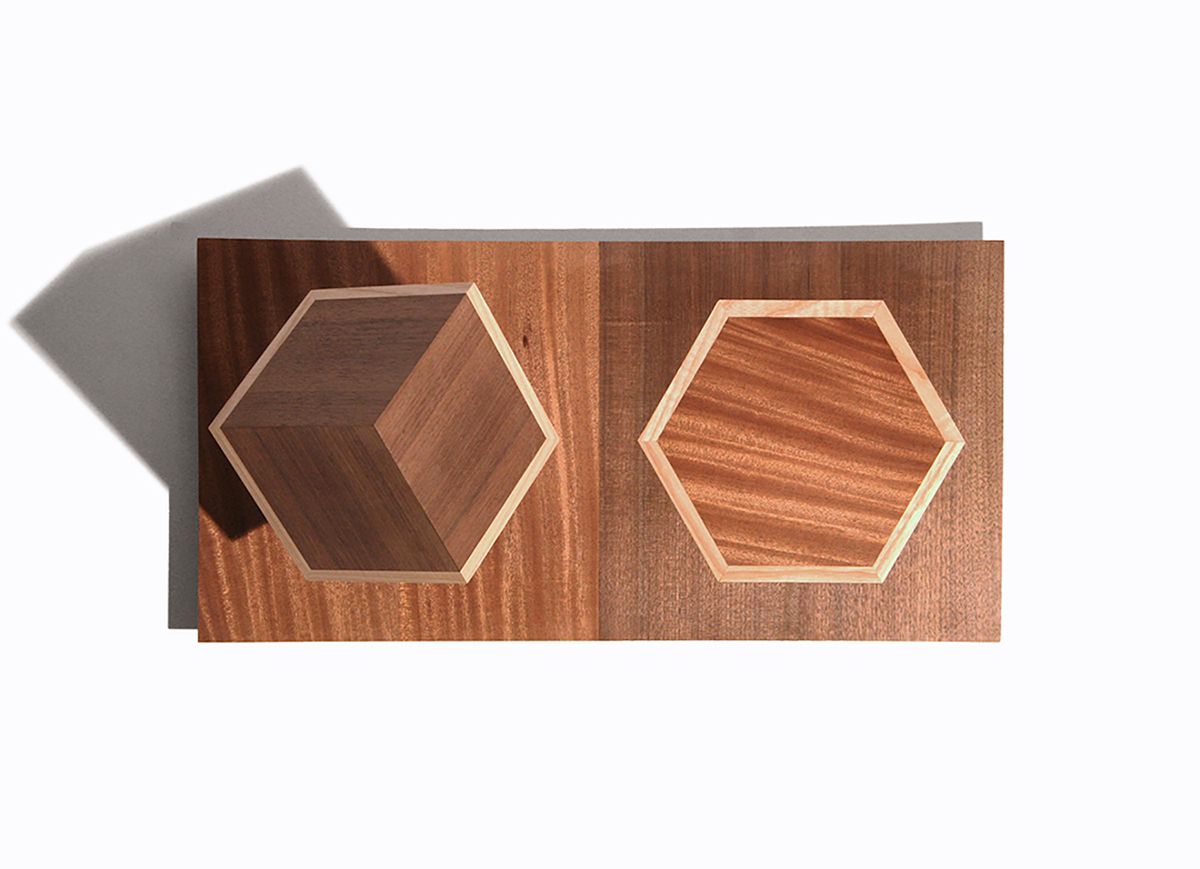
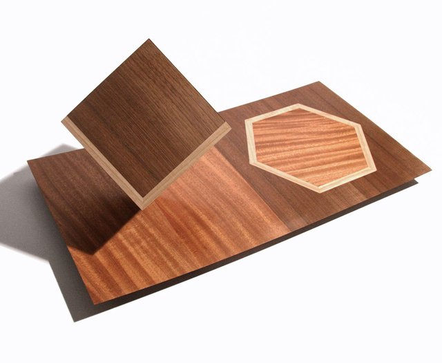
In 2010, I set out to make a sculpture that would display the above concept in simpler terms. Through my studies as an architect, I spent a lot of time messing around with simple geometries like cubes. One day I came across the strange and unexpected fact that a cube, when viewed along its diagonal axis, creates the shape of a hexagon. I translated this fact into a sculpture with two distinct halves, using ash, mahogany and walnut wood to create a distinction of color. On one half there is a three-dimensional cube propped up on one corner. On the other half there is a two-dimensional representation of that cube when viewed from above:

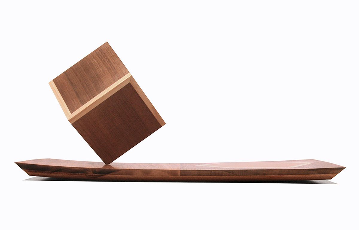
When looking at the sculpture from above the visual connection between the two halves is very clear, but if you came upon this sculpture on a pedestal in a gallery, you would see it from the angle in the photo below. From this angle the connection is less clear, so the viewer is given the chance to figure it out for him/herself. This sculpture was presented as part of a solo exhibition titled Double Take, because each work created that moment of initial confusion followed by a sudden realization and understanding.


Let me know what you think of this sculpture in the comments below.
All feedback is welcome!

Simple yet profound. Interesting how you translated the 2d to the 3d and get the viewer to think a little bit about both. How did they react to the visitors to the exhibition react, btw?
I did something similar (but a lot more literal) to your statement about how 2d architecture drawings don't give an idea of the space to the user. Last year, as a part of this exhibition with the firm I was working for, we explored the circulatory lives of migrant labourers between the rural and the urban. A collaborator and I went to the houses of a few of these migrants in both the city and the village to document them. He's got this really simple style of drawing 3d architecture plans that can be easily read. We wanted to showcase these houses in an architectural language because it gave legitimacy to its builders - the labourers who had become construction workers in the city. At the same time, we wanted the plans to be readable by the visitors to the exhibition, most of whom would not be architects.
(This was a WIP, and looks a lot better at a bigger scale. Can't find the final files right now!)
The drawings were super simple - 2d plans projected in one point perspective from the top. And the viewers loved it. We got so much feedback saying that they understood so much from the drawings that they usually would not get from a typical plan. It was interesting to observe how they read it.
This is really great! The one point perspective definitely makes the drawings more legible than a typical architectural plan. You can actually get some sense of the heights. It has always bothered me how un-intuitive most architectural drawings are, so I think it's cool that you tried to remedy that in this drawing. Thanks for sharing this @manouche!
It's looking cool and so professional art thank you for sharing thia amazing stuff @erb
Thanks @hidayat4u
The optical illusion with the view from above is really good, we retrieve the aerial view of the Empire State Building with its shadow. Nicely done...
Thanks @heroldius! Yeah the shadow is the give-away for both the Empire State Building and my sculpture, but I like that.