Designing the ADU-135
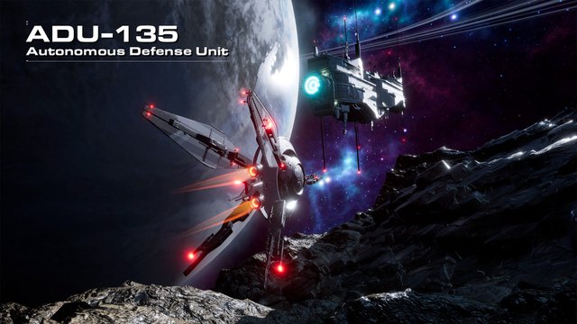
In the Project Genesis universe, the ADU-135 (Autonomous Defense Unit) functions as a kind of hawk-like patrol unit for installations or resources that need protecting. To develop it, we went through several iterations to get the right kind of aggressive look that one would expect from a unit who’s primary role is defense and deterrence.
One of the benefits of working with exceptionally talented artists is the ability to bypass a few of the traditional steps in content development. While great for streamlining our art pipeline, we do miss out on the ability to highlight an important part of the creation process: concept art. While skipping the concept art phase resulted in some extra work initially, Mark Nicolino (our resident universe builder) is so good at what he does that he can blockout “sketches” on the fly in 3D — and then make up the time later in the process.
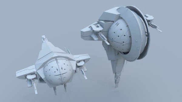
For the ADU-135 we wanted a ship that was of a counterpoint in style to our D-PARC class ship. Where D-PARC ships are blocky, robust, and stocky, ADU-135s are rounder, athletic, and sleeker. We opted to start with a hardened sphere (hence the integration of hexagons) and build out from there.
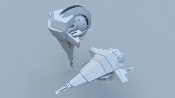
We also wanted to explore some concave styled rings as well. Since the ADU-135 was to be a defense drone, we also wanted to introduce a kind of carapace inspired armor plating. You’ll notice two versions here as Mark was trying out different orientations and configurations. This kind of rotational exploration is actually a great way to see if there are some interesting attributes to explore that may not be obvious at first glance.
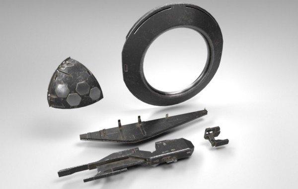
After some debate we felt that the proportions weren’t quite right and that this initial design was a little too much like a weird bug or prehistoric sea-dwelling creature — so we bailed on the plated insect shell idea. While either option could have been cool in their own right, it wasn’t quite what we were going for so we shifted directions; keeping the two aspects that looked cool: the sphere and the rings. We wondered what might happen if we explored blade-like panels to emulate wings. The thinking was that it would expand the surface area of the model, while still appearing lightweight and agile.
After Mark worked his magic, he quickly “sketched out” the following design:
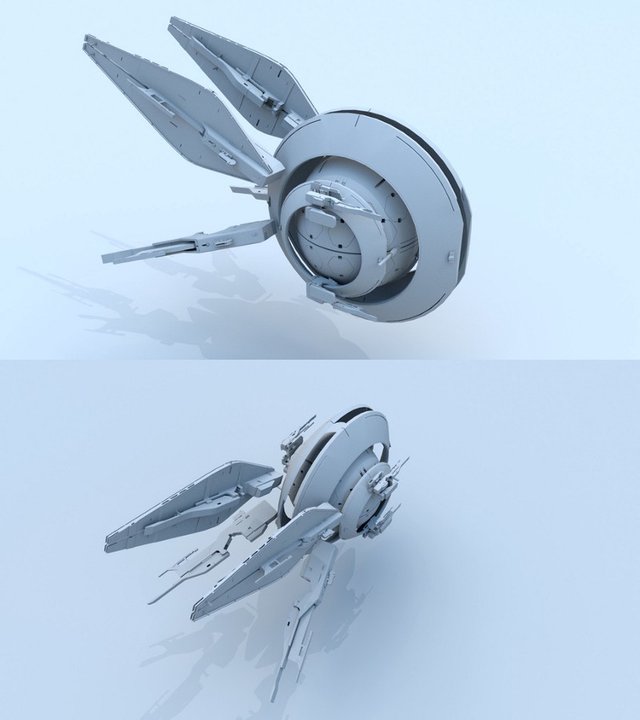
This new configuration felt sleek, aggressive, and had the added bonus of lending itself well to animation — especially with the wing blades. These blades could now be animated to express different postures: back for chase-mode or positioned up and out as a threat display.
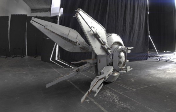
In the opinion of members of the Project Genesis team, the “clay” or white-box versions have something so appealing about them. In an odd way, it’s really tough to let them go on to the final polish, but character is crucial — and the best way to introduce depth and quality is to take the model builds through the remaining stages of the process.
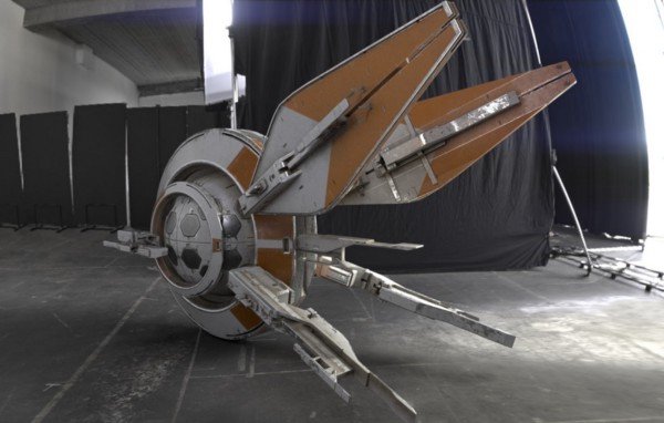
To the left, Mark evaluates the massing and proportions in different lighting environments as well as exploring different banding and paint schemes. This is a quick way to get a sense for how the object will look when ultimately introduced into the game environment.
From there, materials are introduced to evaluate the appeal of different combinations and normal map detail is added to provide additional surface complexity without adding polygonal density to the model.
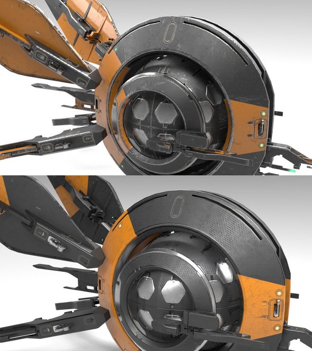
Once the ship is fully detailed, it is ready to be placed on display.
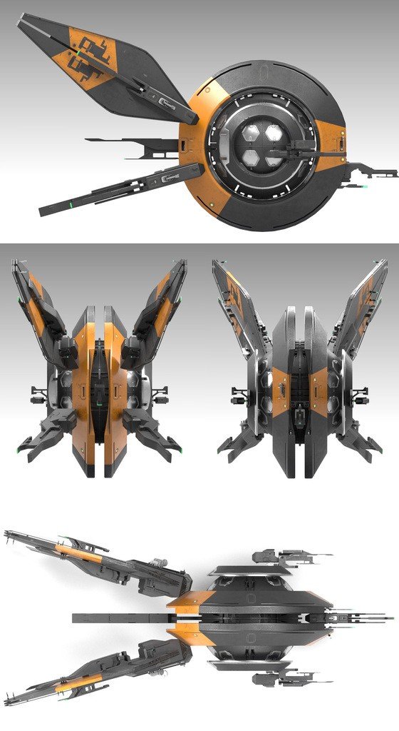
This final step with the various paint schemes, and laid out in front, side, and rear view, is the final step to get a more clinical view of the final product. These views are particularly helpful when checking out the silhouette profile of the ship (or any ingame object). The profile design is important, because we want players to quickly identify their target as friend or foe — and be able to react and make the appropriate decisions quickly.
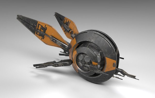
Final Render:
One final aspect that we didn’t mention was the lack of the cockpit. This was an intentional and specific choice. We didn’t want to have a place that had a perceived vulnerability target. This concept was originally suggested by H.R. Giger to make the xenomorph in Alien more menacing or frightening by mandating it have no eyes (sited in Alien Evolution, in the Alien Quadrilogy box set).
We’re interested to hear if you agree!
If you have any thoughts or opinions about our work, or the direction we’re taking with ship designs, we’d love to hear from you — jump on over to our Discord channel to keep the conversation going!
For more on 8 Circuit Studios, be sure to follow us on Twitter, YouTube, and/or Facebook. You also can try out our first mobile title, Alien Arsenal!