Reworking my Profile Picture - 2 🥰
Hello!
Yesterday, I made this post about designing and drawing a new profile picture.
I've made my second design; here's my process!
Once again, I used Canva to format my pictures into a card format so that my post has a cohesive look.
I used Procreate on my iPad to draw my work!
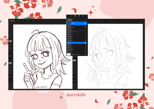
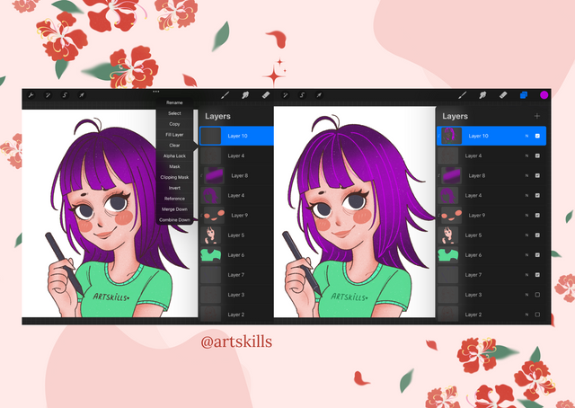
I used my same sketching process as my last post- I do the initial sketch, lower the opacity, create a layer above, and tidy/refine the sketch until I'm happy with the layout of the drawing. I repeat this step several times until I'm ready to do the final line art!
I do find this very helpful, I'm someone that needs to create several guidelines for myself when drawing as my hands are quite shaky and I get quite tired- so it helps if I need to take a break and come back to my drawing, because I've left a plan for myself to follow.
I do my final line art with my sketchy inking brush- this brush has quite strong stabilization so I can get some really smooth, curved lines.
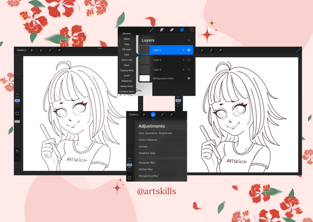
This time, I tried to use different weighted lines, for instance, the overall line art has a thicker look, but smaller details such as the face and the details on the skin and shirt have more delicate lines. I've found that this creates more of a natural look! It's not so chunky and heavy, it's more dynamic.
I then duplicate the line art layers, and add a gaussian blur effect, to blur the lines in the bottom layer- creating a small shadow look. This makes my lines look a bit smudged and thicker which I really like.
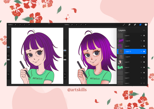
Here's the screenshot of my finished colours blocked in. When the colours don't have my added textures- I feel like it looks quite flat and lifeless. Which is why I love having textures and different tones added it because it makes the colours pop and look more lively.
I do my colouring areas on different layers, so the hair, skin, and shirt etc. are all separated. This makes it easier when I'm doing the textures, because I chose a layer above the specific coloured in area that I want to draw on and it doesn't mess up any other area because I've set it as a clipping mask layer.
I added some oval cheeks and two toned lips while using a clipping mask over the skin. I would usually just got for an airbrushed look but I think this stands out a lot more, it looks quite cute in my opinion.
Once finished with the line art, colouring in, and the textures- I still felt like something was missing, I wasn't sure what...
So I made a layer above my actual line art layer, and created a clipping mask to isolate the lines and colour them in individually!
Colouring in the hair strands as a more vibrant colour fixed whatever I thought was missing, It looks a lot more exciting now. I also coloured in details on the face such as the eyebags, nose and lips- because when you look at a real face it's mostly shadows- not lines! I'm so glad I did this because it made the drawing look less bulky and heavy and a bit more natural.
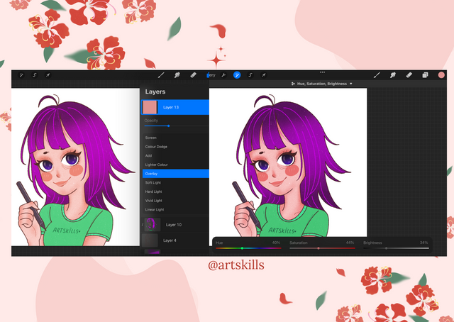
I created a layer above everything else, filled it in with a lovely pale pink colour and set it as an overlay- this acts as a filter for my art.
I adjusted the tones because I felt like it looked a bit washed out and pale- so I went with more of a vibrant, deeper tone.
Here's the final drawing!
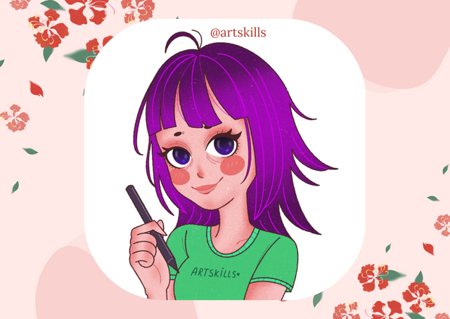
I'm so much happier with how this one turned out, I feel like it's already a big improvement from yesterday's design.
I wanted to go with something more stylized and slightly bolder, hence the bigger head and big eyes with vibrant hair colour.
This time, I went with my avatar holding a drawing pen (for the iPad) instead of holding a coffee cup like my last drawing.
Maybe I'll do a third design and somehow combine both of them? Not sure how yet!
Thank you for reading!