Reworking my Profile Picture - 1 😄
I've had the same profile picture here for a while, so I've been thinking of changing it...
My plan is to draw a profile picture, use it, and see how I feel about it (while showing the drawing process) to see if I keep it- or draw a new one!
I used Canva to edit and format my pictures into little card templates to make this look cohesive!
I also use Procreate on my iPad to draw my art. It's an iPad/Apple exclusive (for now?) paid art program.
My idea for this profile picture is to have a character's face holding a cup of coffee- because I post about coffee a lot! 😁
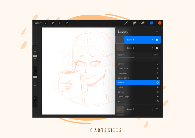
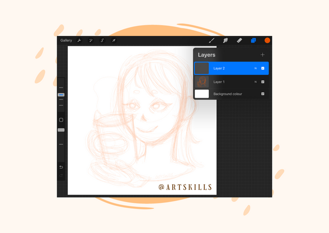
In these two pictures above, I show myself working on the initial sketch with an orange pencil brush, then lowering the opacity of the sketch layer, adding another layer on top and tidying up my sketch by doing line art over that. I do this with all my drawings because I like building up my sketch layers until I'm happy with the composition! I'm someone that has shaky hands- so I find the guide lines extremely helpful, hence why I chose to do the sketch + layer + sketch technique to refine the look I'm going for.
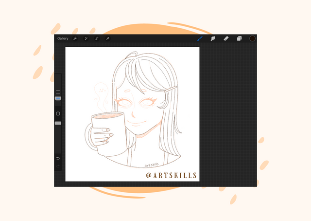
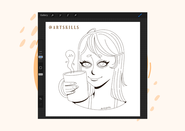
Beginning my final line art! I use an inking pen brush with quite heavy stabilization because, as I mentioned, my hands are quite shaky. So any help with guidelines or stabilization is very useful to me. I love doing line art, I find it more relaxing than colouring in sometimes!
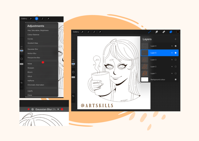
Once I've finished my line art, I duplicate the layer, and use the Gaussian blur effect on the bottom line art layer. I do this to 2% (because I don't want it to be too blurry). I've found that this really makes my line art pop and look a lot more interesting because it gives it some weight!
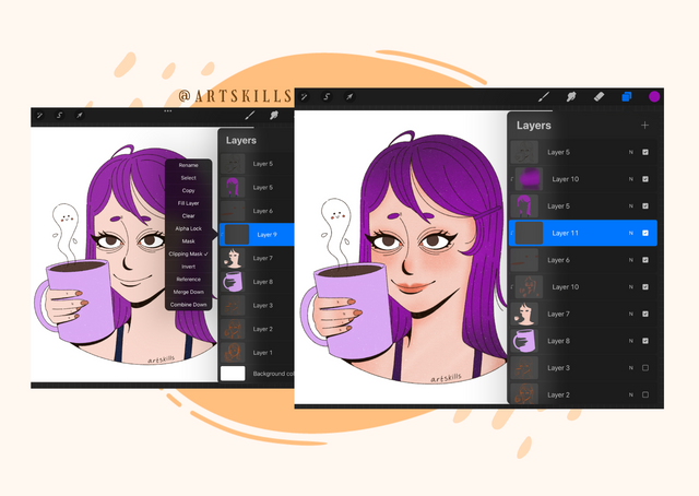
The finished colour blocking! My colouring process is the same 90% of the time: I colour block in the colours and then I add texture separately- all on separate layers just in case I make any mistakes and need to quickly correct it!
To add texture to my colours, I create new layers above the specific coloured in areas, such as the skin or the hair, and I select the layers above the colour and set it to a clipping mask. This ensures that I only draw texture onto the specific area I've coloured in. It helps a lot to avoid making it messy!
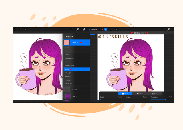
Once my line art, colouring and textures are done, I create a new layer above everything else, block it in completely with a colour (in this instance I chose a pale pink) and set this layer as an overlay. I do this to sort of add a filter to my drawing, and then I use the effects button to add a noise filter onto this because I like the look of grain/noise textures- it makes it look more organic or as if it could be drawn on paper.
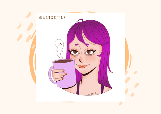
The finished drawing! I'm not sure how I feel about it, I tried to do a simpler style because I didn't want it to be too busy or overwhelming, but it did turn out to feel a bit plain and rigid- not a very good profile picture because it is very pale with tiny line art so it doesn't stand out.
I'll be trying this again but working on a better composition- I want this profile picture to STAND out!
I'm looking forward to draw another new one and changing it again because I don't really like this one too much... I don't think it stands out much.
Thank you for reading!
Great profile picture. I especially liked the smiley steam from the cup. Will you keep it in the next picture? Or maybe you can also draw a coffee bean on the cup so it's clear what's in it?
Thank you, nobilisa! I'm currently writing a post with my next profile picture idea- this time without the coffee cup. I might combine them when I do my third idea/drawing!
I love the process pictures, great to hear your thoughts too! Reminds me that I should try do a profile picture
Thank you, jen0revision!
Would you draw a profile picture too? Or chose a photo?
hmm not sure, I'll see !