BLOCKTRADES LOGO CHALLENGE, MY ENTRY SEE IT FOR YOUR SELF :)
Hi.. Good day to all of you Steemians. :)
I would like to submit my design logo for @blocktrades held by @officialfuzzy. Hopefully you would like/up vote it guys. here is my design. Thank you...

DESIGN EXPLANATION
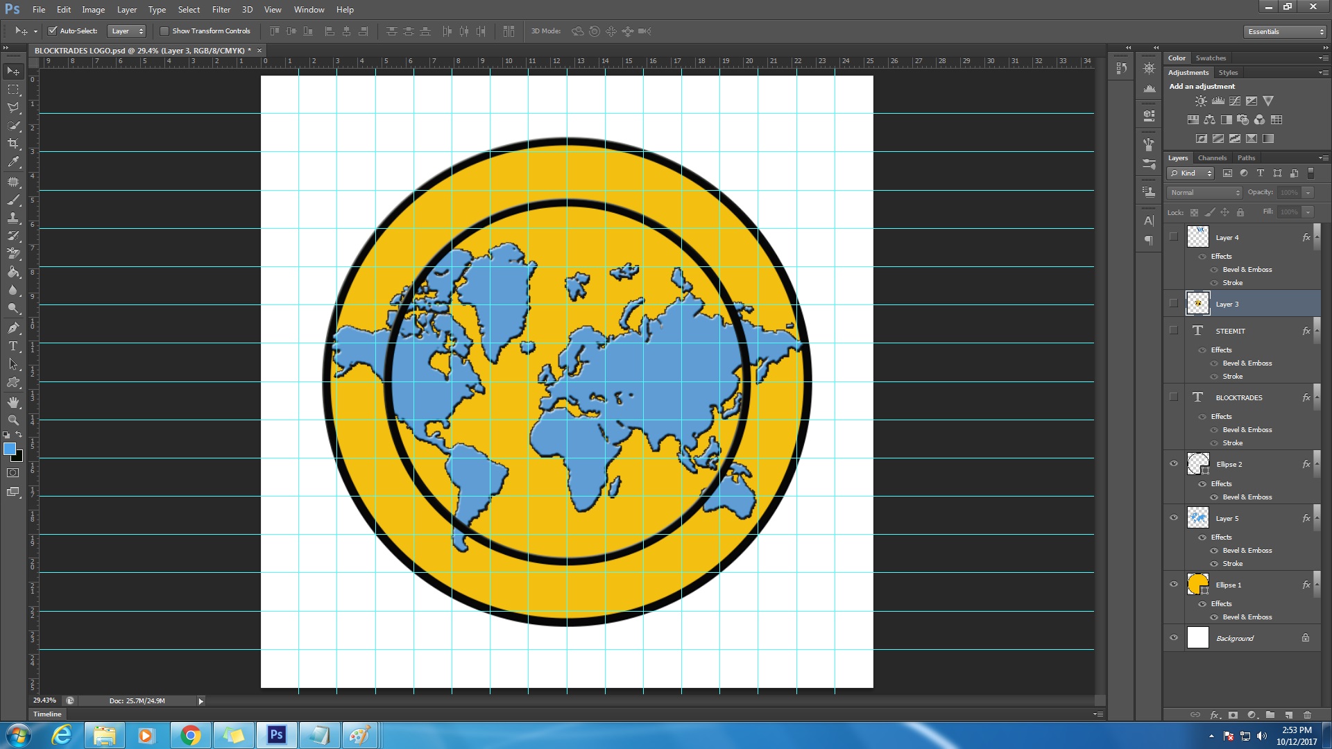
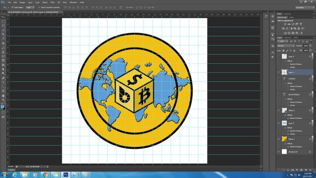
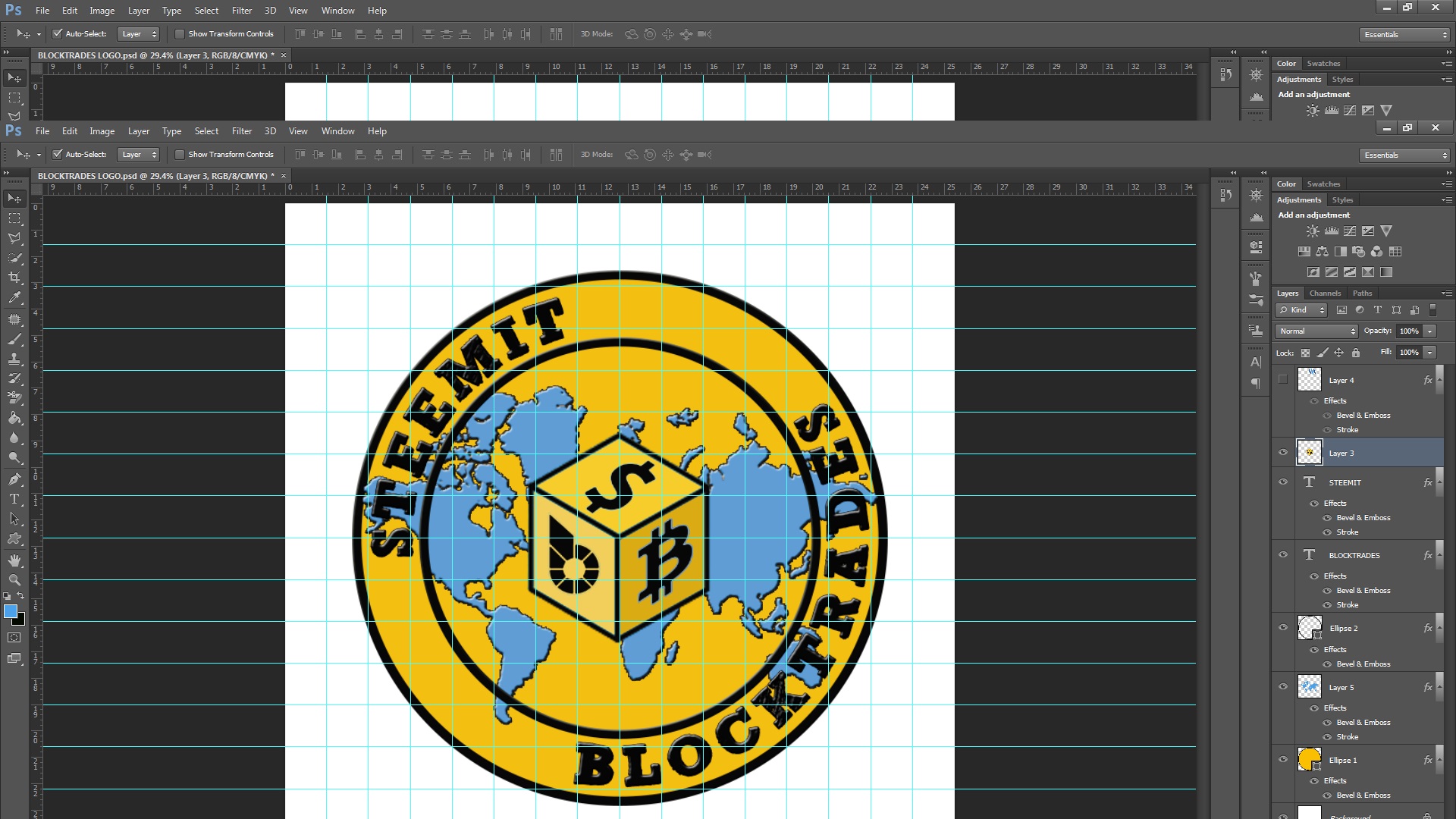
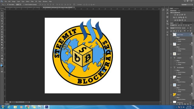
As you can see my design is round/ellipse with a background of a world map its obviously represent EARTH. I centered the block with a symbol of different cryptocurrency which mean that the digital currency is dominating our world now a days. I also use the logo of steemit to represent that steemit helps our new generation to fulfill their dreams and in term of financials especially in a third world countries like us (Philippines).
DESIGN PROCESS
SOFTWARE USED: ADOBE PHOTOSHOP CS6, IT IS A GREAT TOOL FOR THOSE WHO ARE LOVE DESIGNING LIKE ME. :)
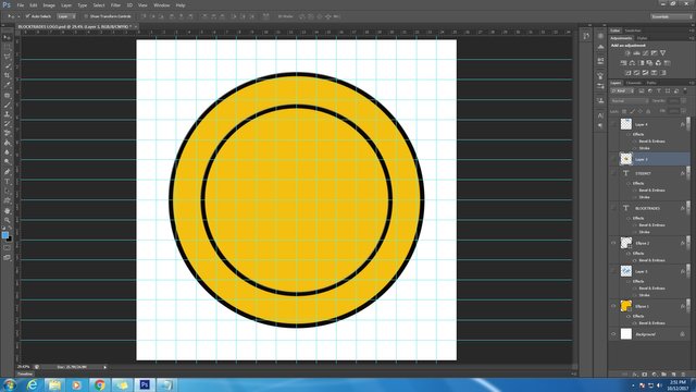
PROCESS 1 - CREATING GUIDE LINES AND ELLIPSE
PROCESS 2 - PUTTING A MAP
PROCESS 3 - CENTERED THE BLOCK
PROCESS 4 - PUTTING TEXTS "STEEMIT" AND "BLOCKTRADES"
PROCESS 5 - PUTTING STEEMIT LOGO
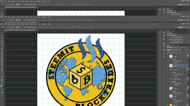
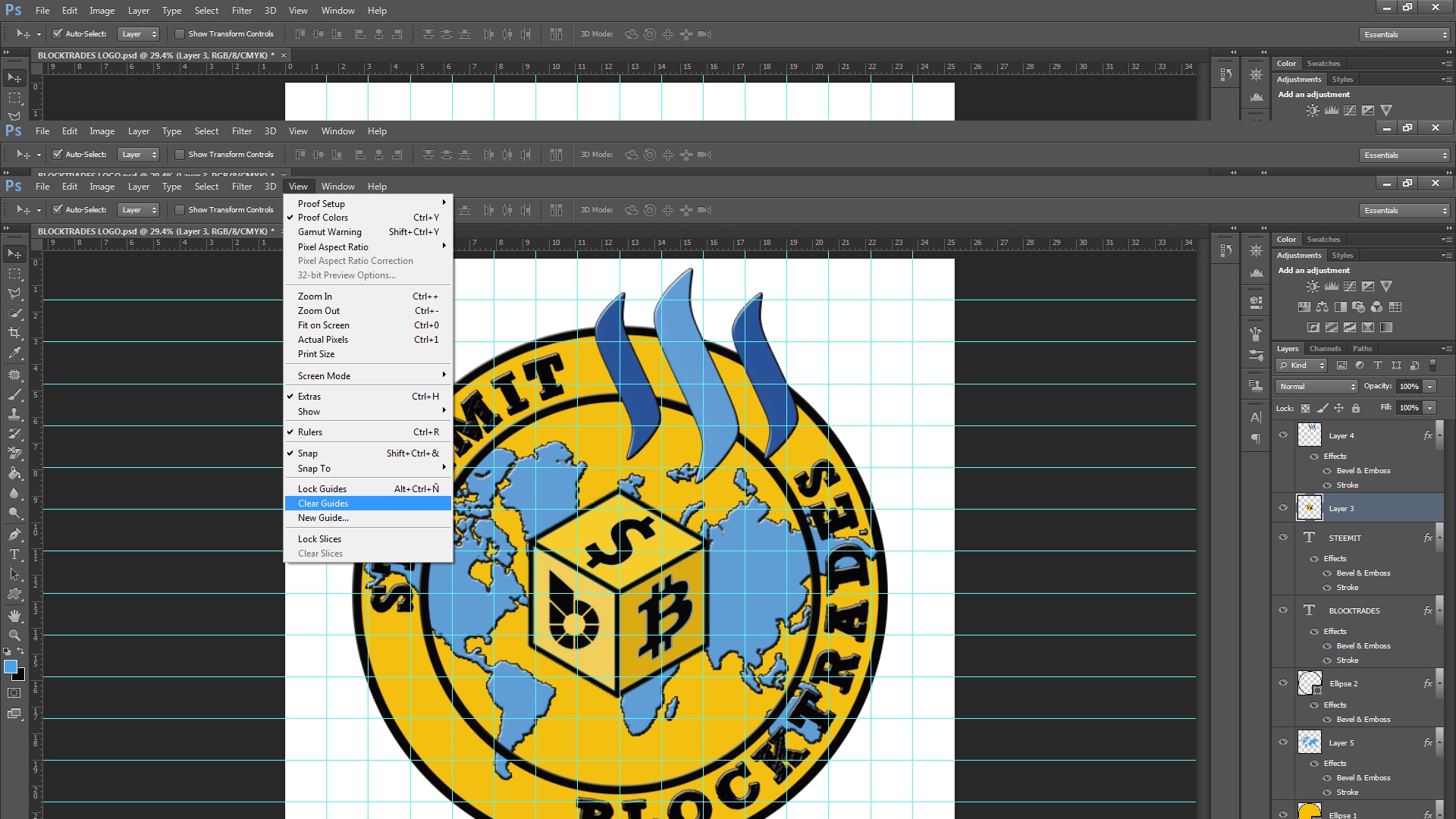
PROCESS 6 - CLEAR GUIDE LINES
FINAL RESULT
FOLLOW, UPVOTE, RESTEEM. FROM: @artjan :)
THANK YOU EVERYONE AND GOD BLESS US ALL. :) :) :)
Congratulations @artjan! You have completed some achievement on Steemit and have been rewarded with new badge(s) :
Click on any badge to view your own Board of Honor on SteemitBoard.
For more information about SteemitBoard, click here
If you no longer want to receive notifications, reply to this comment with the word
STOPThank you @steemitboard much appreciated... :)
Great. You can also offer your expertise as a service under #steemgigs. What's your inspiration for the background colour?
Wow.. Thank you for noticing my design @surpassinggoogle its an honor and I will try my expertise in designing at #steemgigs. Thanks much appreciated. :)
I choose the dark yellow background actually because its represent the color of a coin which is gold and a black border to perfectly blend with the yellow because in designing choosing a colour has a rule, if you have a lighter background color your foreground should be darker or vice versa and that's the basic in designing and choosing a perfect color. :)
Good job @artjan
Thank you @cloudspyder glad that you like it..
Congratulations @artjan! You have completed some achievement on Steemit and have been rewarded with new badge(s) :
Click on any badge to view your own Board of Honor on SteemitBoard.
For more information about SteemitBoard, click here
If you no longer want to receive notifications, reply to this comment with the word
STOP