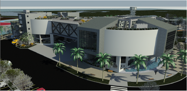
How to Design a Museum of Contemporary Art by: Angel Ramirez (Part 3)
Hello Steemians, I am back with the third part of this architecture guide, and this time i gona show you how was the process of assign lines and figures to create the formal concept of the proyect, based mainly on the results of the analysis made in my previous article.
If you have not seen the other two parts yet, I invite you to check it out first:
Part 1:
Part 2:
https://steemit.com/architecture/@chuchurz/how-to-design-a-museum-of-contemporary-art-by-angel-ramirez-part-2
After having analyzed the work area and its surroundings, I was able to make justified decisions that let me pass.......
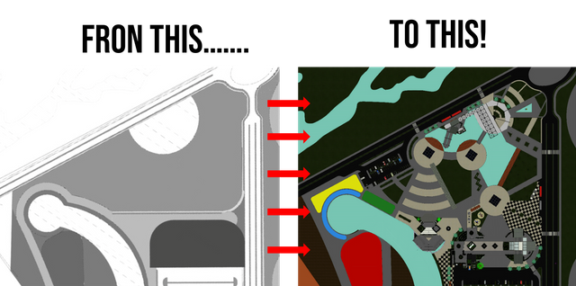
For those of you who do not want to know the details of each decision, here is a short video of this design process:
But if you wanna know more, here is the detailed explanation:
The first thing I did was to assign a "design pattern" to the project, which responds to the shape of the museum's ground and the necessary retreat for a building of this magnitude.
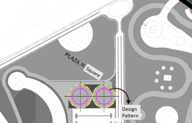
The idea was that this figure would be repeated throughout the project to help formally and functionally link the land of the square with the land of the museum. That's why I proceed to find link points between the two geometrics, and the first one was an axis that starts from the main pattern and extends until it forms a 90 degrees angle with the Northwest edge of the square geometry.
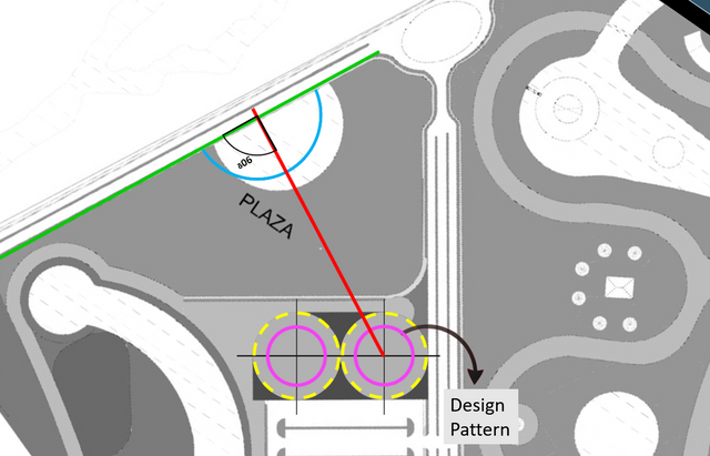
Then, an axis is created equal to the previous one but it originates from the secondary pattern in the opposite direction, which causes that both lines are intercepted to give origin to the location of a third pattern.
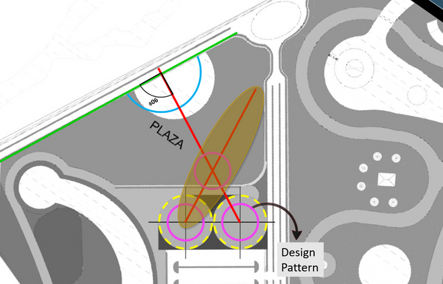
Now, an axis extends from the center of the second pattern at an angle completely perpendicular to the ground of the museum, until intercepting the first line raised to generate a new pattern ubication.
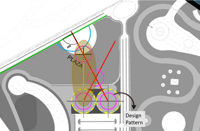
Using the intersection of the first line with the northwest edge of the square as a center, an arc is generated. This arc extends its radius until it coincides with the center of pattern number 4, which gives the premise for the creation of an axis parallel to the ground of the museum that when intercepting the aforementioned arc, generates the location of pattern number 5.
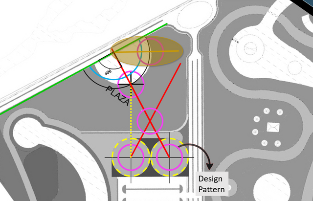
Then a mirror effect was made to the previous axis for the ubication of pattern number 6.
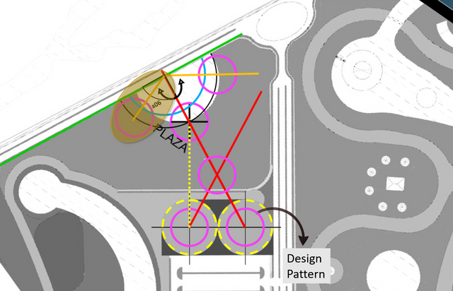
In the following image we can see how the centers of patterns 2 and 6 are very close to a connection between their centers, when we are using the same orientation of axis number 1. But this diference between lines makes a linear figure that takes importance on the general shape.
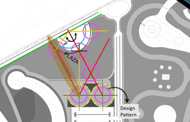
Now the mirror is applied to the axis that has just been generated, to try to cover the remaining area of the square space.
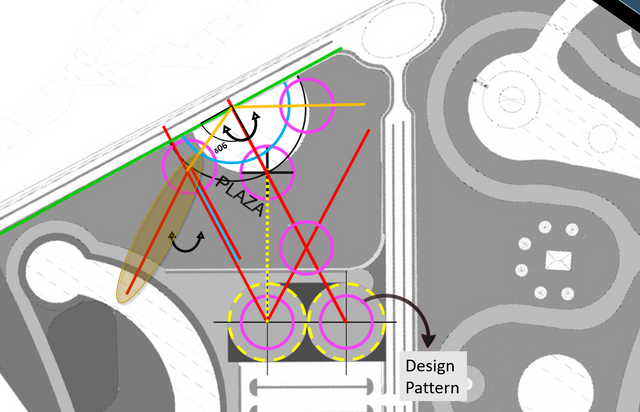
Using the center of pattern number 6, a radius is generated that starts from the center of pattern number 3 until intercepting a new axis perpendicular to the museum's ground.
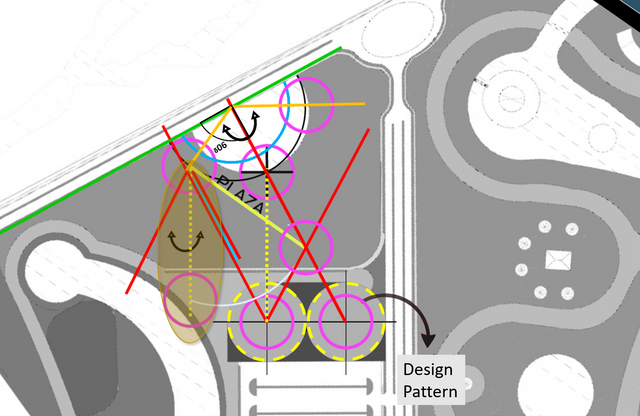
And finally, we have the deployment of a set of axes that start from patterns 3 and 5 to be tied to the remaining spaces.
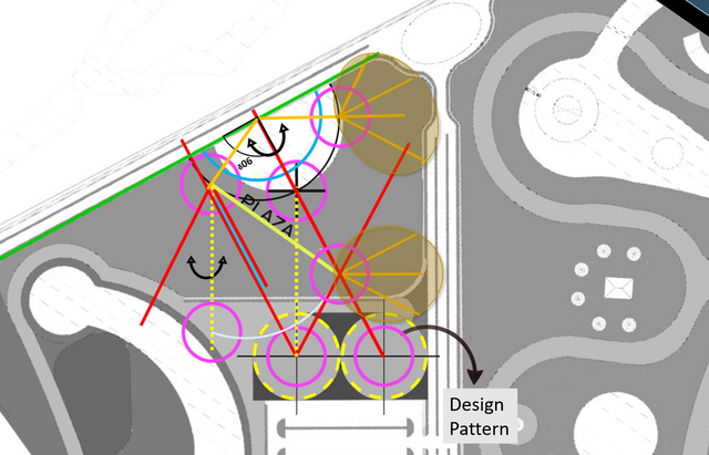
Here you can see the spaces destined for the auxiliary parking and the future construction of the river port.
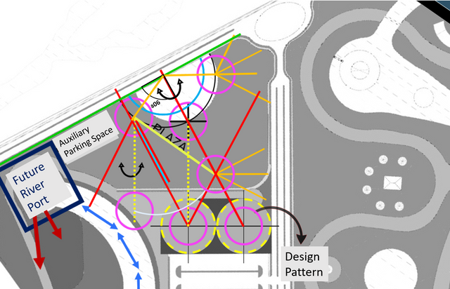
And this is the result:
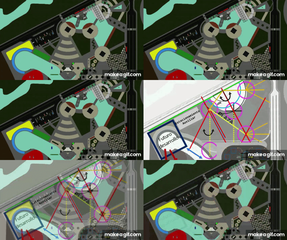
Now we go with the museum area....
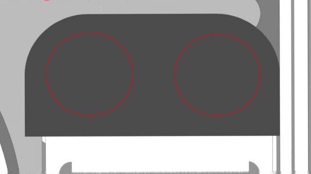
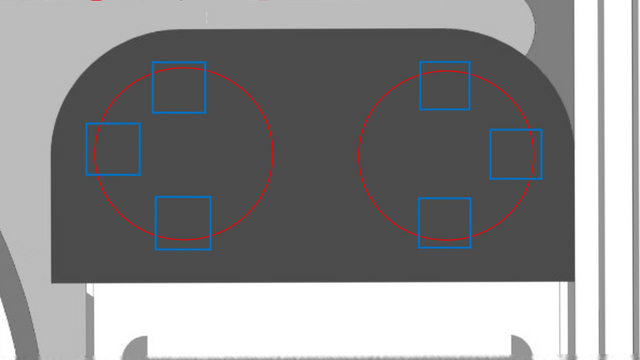
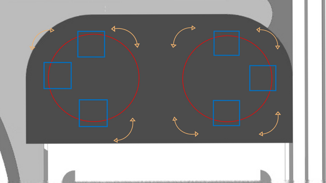
The importance of the implicit circumferences in the shape of the museum obliges us to take them into account for the development of the volume. that is why a set of square figures was added around the circumferences to give them support points.
In the following image we can see how the different flows that interact with the area are complected, and they demand free movement because the transit through the museum becomes obligatory for the users of the parking lot and the visitors who are left by car in the building.
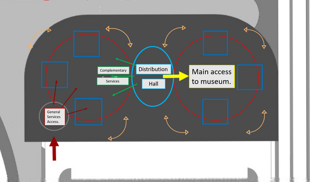
This is why an access hall is proposed in the space between the two main circles, which will serve for the reception of the visitors of the building and those of the square at the same time, giving the option of directly accessing the hall of the museum, to the areas of restaurants and to the area of the square, without having to skirt the structure.
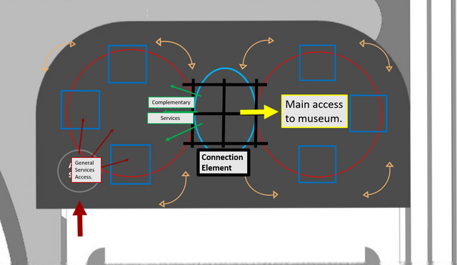
And of course, a connecting element that articulates the two main circumferences and in turn generates protection to this hall.
In the following images you can see how was the first 3D conceptualization of this idea:
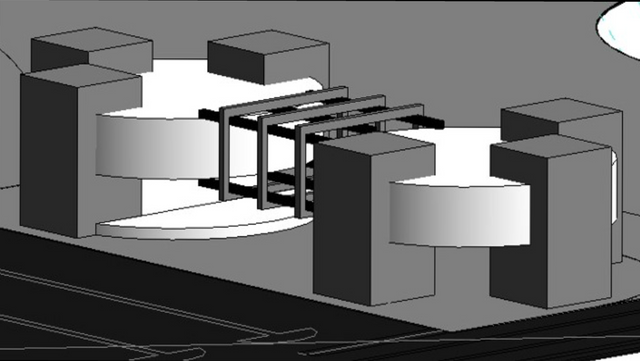
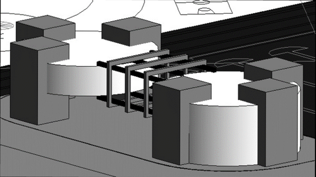
And deepening in it, I came to this:
Well, this is it for now. I hope you liked this article and keed in tune with my posts for more design and art.
In the next part of this articles i will show you more in deep all the functioning of the final proyect.
