Creator-Guilds Contest 1 - Nekomimi
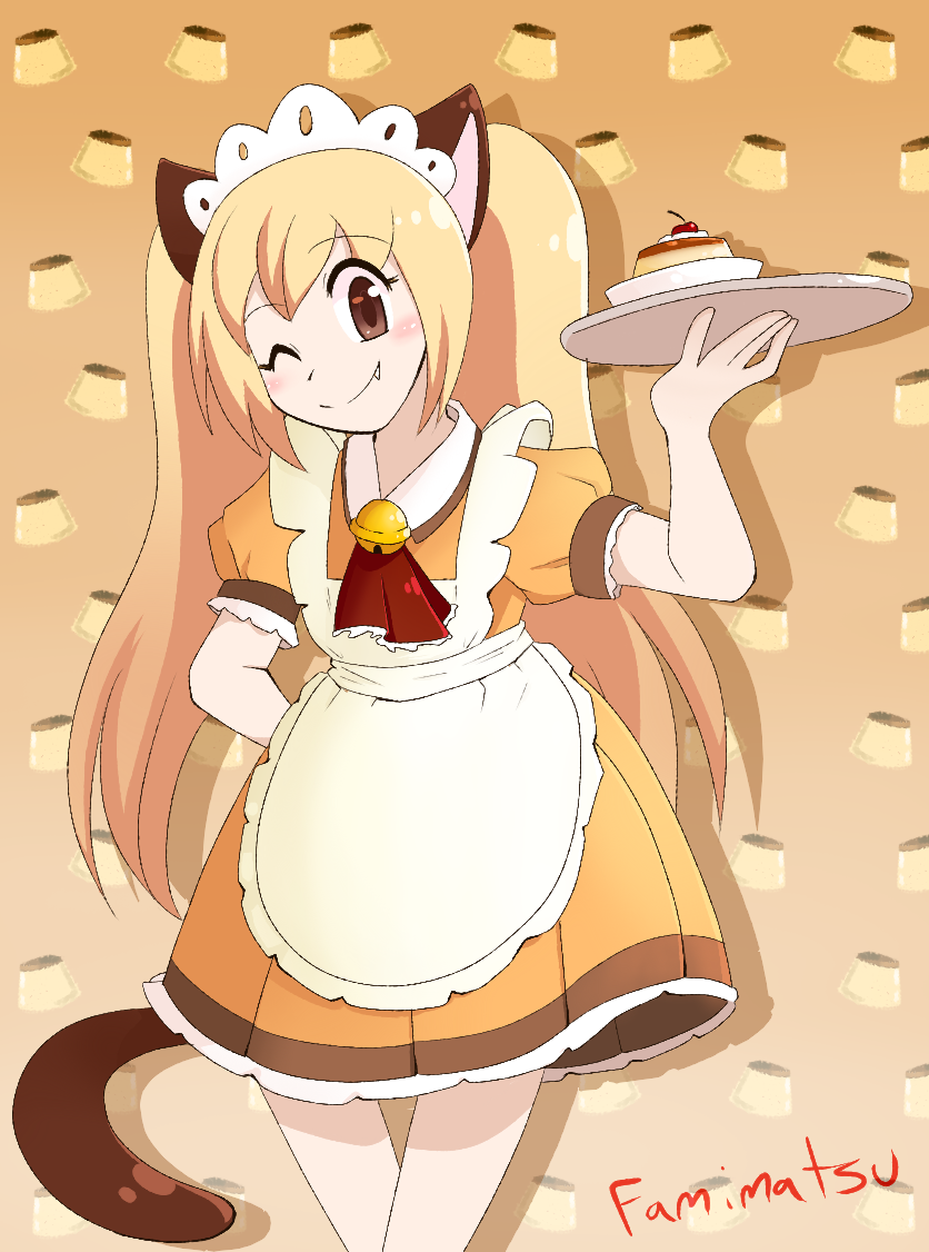
I'm not usually one for contests, to be totally honest. At least not anymore. However this one really got me right in the nostalgia.
This contest's theme was "Nekomimi" or, Cat Girl if you prefer. Which happens to be one of the things I drew the MOST of when I first started my art path. Why?
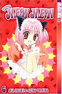
Tokyo Mew Mew.
When I was just getting into manga as a kid, Sailor Moon had actually just stopped being printed with its first actual volume run. So I picked this up instead since it had a similar vibe. Oh boy did it get me drawing. So, in the spirit of that, why not try a cafe girl cat girl a la Ichigo?
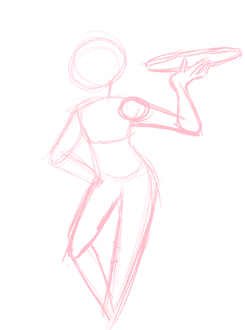
So first we need to make a general pose. My rough sketches are pretty... all over the place. Sometimes (actually more often than not lately...) I do the hand sketch on this "loose leaf" sketch on accident, which looks really silly against the basic shapes. This is in part due to me getting a little too into my references sometimes haha.
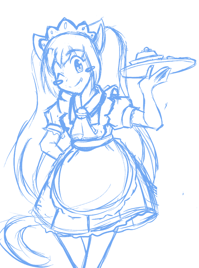
After that's done, I start putting a more detailed sketch over the pink sketch. Usually it looks more messy in progress, but I erase overlapping lines almost immediately or I seem to end up confusing myself. This is where I kept a page of TMM searches up to get a feel for the general aesthetic of the style. At this point I figure "hey I'm gonna make her Flan themed."
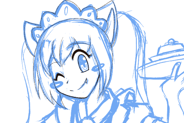
Let's get lining! On my usual art, I use about a 6-9px brush depending on the size of the canvas. To keep the anime aesthetic though, I used a thin 1px brush.
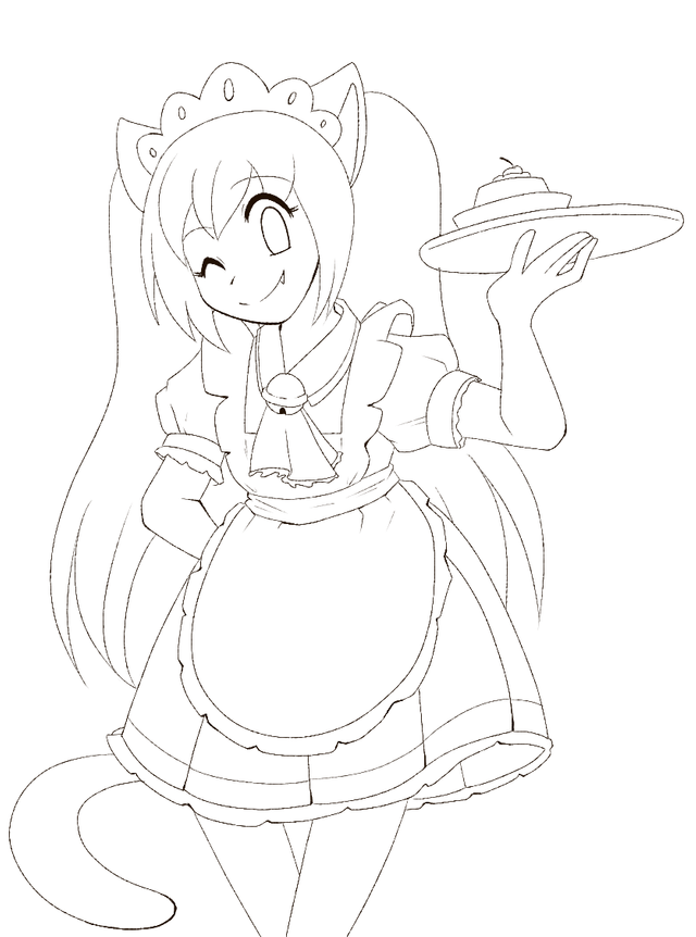
Lines done! Not much to say here aside from that I refined some lines and added a couple of smaller details that I didn't really consider in the initial sketch, like the colored band at the bottom of her skirt.
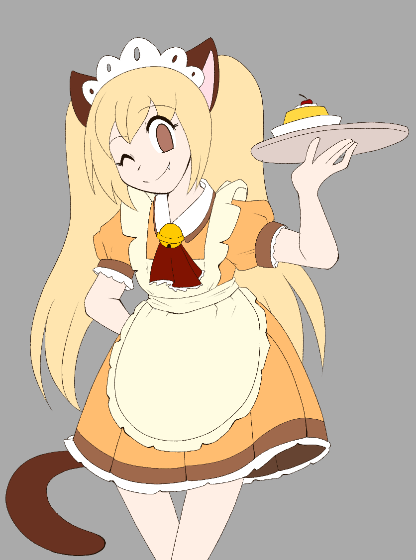
From there, I put down some flat colors. This is the easiest, yet hardest step at the same time. If you don't have a color scheme in mind... this can be a headache. Luckily with the flan theme, I had a general palette in mind.
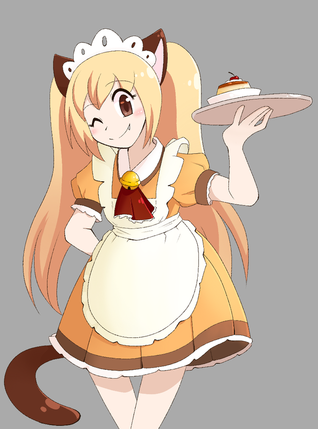
Then I did some shading! I originally was going to try the more watercolor-y shading that you can see in the manga cover example but... I went with a more modern anime style for that instead. I feel it just complimented my lines a little bit better.
And finally we got to the image you see at the top there! For the background, I just tossed down a shade of yellow orange and sketched a quick little flan akin to the strawberries on the TMM covers. I then flipped and repeated the flan to make a pattern, added a shadow of our nekomimi onto the backdrop and added a light gradient just to make her stand out a little bit more.
I think I'll name her Purin. Or Purr-in if you want a cat pun. ;P
Hope you enjoyed this little trek on how I drew this! What a blast from the past... haven't drawn anime in a while...wow.
There she is!
such a catchy maid-nekomimi XD
thanks for your entry @famimatsu!! ^^