You are viewing a single comment's thread from:
RE: How l learning animation #1 | The timing and the spacing
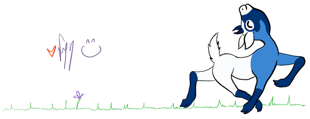
I don't know if it's just the gif, the third bounce seems slightly awkward. Good idea including the flattening out in the bounce, makes it look more convincing and cute :)
