Android Material Design Step 1 (start)
Hi steemit,
Your first article, android material design, welcome to step 1.
Why this Layout concept, let's start to examine what it does now.
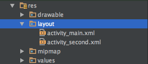
In our Android applications visual parts are created by the layout files located under the res folder, and these files are in xml format. If you open the Layout section in Android Studio, you can do whatever you want on the screen, you can create visual components with android by dragging and dropping it with the code (on the xml side) if you want to.

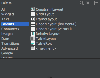
As you can see below, there are several types of layouts we can use in the application. (I will list fragments in the layout types because it is listed in the fragment structure but it is a different concept.) I will explain all of them in detail in the next lessons, and for now I will talk about just what it does and in what situations we should use it.

Each layout has width and height properties. width is the horizontal field, and height is the vertical field.
match_parent : covers the area in which the player is located, either horizontally or vertically. This feature; It was mostly used with fill_parent, but after the android 2.2 version it is now started to use match_parent.
wrap_content: takes up as much space as text, image, or component in the area.
android:layout_width="match_parent"android:layout_height="wrap_content"Android Layout Types
RelativeLayout: With RelativeLayout, we can drag and use Android visual components to whatever we want. According to the left, according to the bottom, according to the upper part. With Relative Layout we can make more flexible designs.
LinearLayout: With LinearLayout, we can use all the android components in a single location. We can also position it as horizontal LinearLayout (horizontal) and vertical LinearLayout (vertical) using the orientation property. We use components with LinearLayout to be located on the same line on the lower line.
TableLayout: With TableLayout, you place Android components in a table structure. It is used to display a table structure like in HTML.
FrameLayout: Android component overlays with banner with FrameLayout. For example; you have two buttons and you want to be located in the same place, you can use FrameLayout if you want one to disappear when one is visible and vice versa. Another example is that you want a button to always stay on a Listview in your hand. In this case you can use FramelLayout.
GridLayout: A layout type that collects android components that have a row and column structure.
ConstraintLayout: This layout comes with Android Studio 2.2 and we can create responsive images by dragging and dropping Android components, and we can also create compatible designs for each device using ConstraintLayout instead of LinearLayout, which we use to get the bottom line and side by side android components.
Yes friends layout types As you can see, I'll explain all these details in detail I have explained these layout types in terms of getting an idea already. It will be useful to review these layout types until the next lesson.
In the next ANDROID article you can share a topic by your request.


Congratulations @bestekarx! You have completed some achievement on Steemit and have been rewarded with new badge(s) :
Click on any badge to view your own Board of Honor on SteemitBoard.
For more information about SteemitBoard, click here
If you no longer want to receive notifications, reply to this comment with the word
STOPCongratulations @bestekarx! You have received a personal award!
Click on the badge to view your Board of Honor.
Do not miss the last post from @steemitboard:
Congratulations @bestekarx! You received a personal award!
You can view your badges on your Steem Board and compare to others on the Steem Ranking
Vote for @Steemitboard as a witness to get one more award and increased upvotes!