ASAP Launcher - A New Take on Your Old Home Screen
If you ask an Android user what launcher they're using, you're likely to get one of two answers. They either use Nova, or they don't know what you're asking them. Many Android enthusiasts know what a launcher is/does and has probably heard of most of the ones available. New ones come and go all the time, but hardly ever do any of them stick. Nova is king and has been for a long time. It is simple to use and very easy to customize and make your own. When a new launcher comes out, it's typically a clone of Nova with just a little something different. This is where ASAP Launcher comes in.
The Play Store page promises you the ability to "do what you want faster, without the clutter." How can the developer promise such claims? The answer is simple really, Cards.
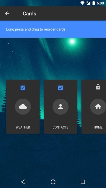
Cards
While ASAP Launcher does not allow additional screens, it does provide cards. You get to these by swiping left or right from the main screen. By default, the cards or shown in the order below:
Weather
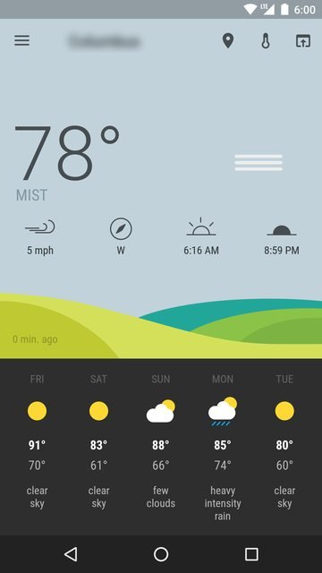
The Weather card is a very nice, Material inspired forecast. The majority of the card is covered with current information. Things such as the current temperature, condition, wind speed + direction, sunrise + sunset times. It also says when the information was last updated. On the bottom of the card you get a 5 day forecast with a graphic of the skies, highs + lows, and conditions. All very useful information, but none of it is interactable. At the top of the screen, you have the ability to change your location, choose between Celsius or Fahrenheit, and a link to the OpenWeatherMap website.
Contacts
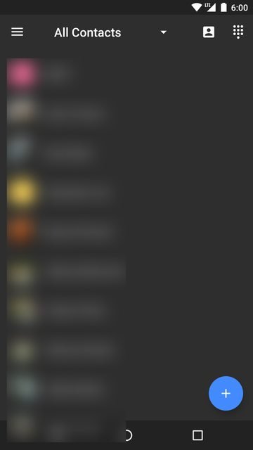
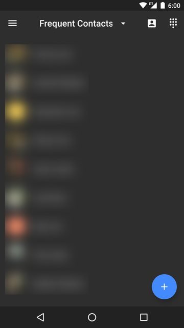
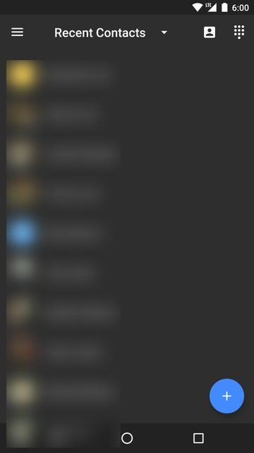
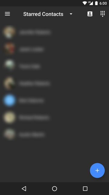
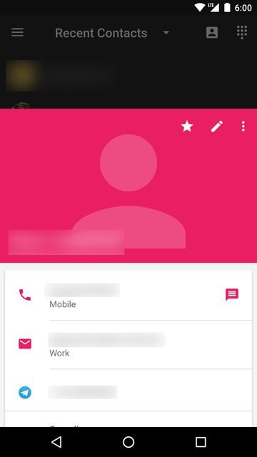
This card is very simple, but very useful for anyone who frequently makes calls. By default, you are shown a list of your Frequent Contacts. This can easily be changed a the top with the drop down menu. Doing so shows a nice little animation of contacts being pushed down and loaded in. The options given are All, Frequent, Recent, and Starred. Next to the drop down menu is a shortcut to your contacts app, and a shortcut to your dialer. At the bottom is a Floating Action Button (FAB) with a plus sign on it. This allows you to create a new contact on your default Google account. Any interactions on your contacts will bring up a preview card for the selected contact.
Home
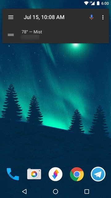
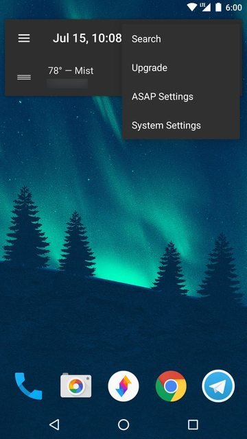
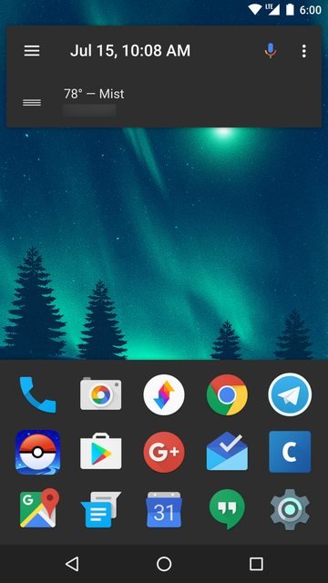
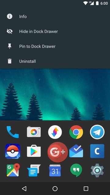
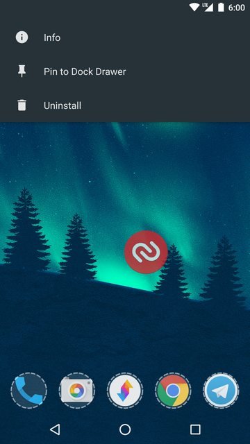
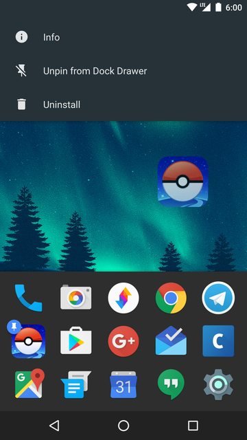
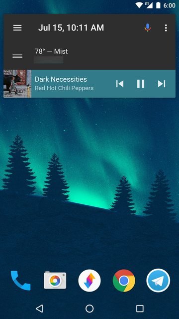
The Home screen is the one that you will likely see and interact with the most. It houses the Dock and what I'll call the Action Bar Widget. The Action Bar Widget contains a lot of info and actions. The hamburger menu opens your full app drawer, the date and time is displayed, a voice search can be initiated, Search, ASAP Settings, and System Settings are all accessible from the 3 dot menu, and a quick view of the weather is visible. When media is player, another card is tacked on beneath the weather that gives you a shortcut to the app playing the media, pause/play, and skip controls. The media portion is automatically colored based on the dominant color of the thumbnail. The dock is at the bottom and contains apps of your choosing. A swipe up (or pressing the home button) will reveal Dock Drawer. These are your most frequently used apps and can be pinned to ensure that they are not accidentally removed from the Dock Drawer. This list is automatically generated.
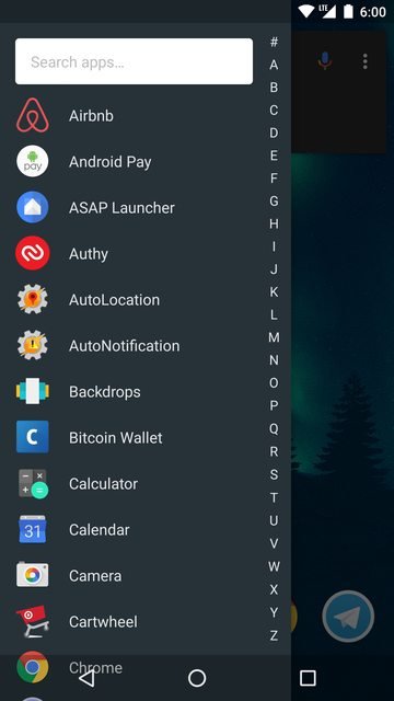
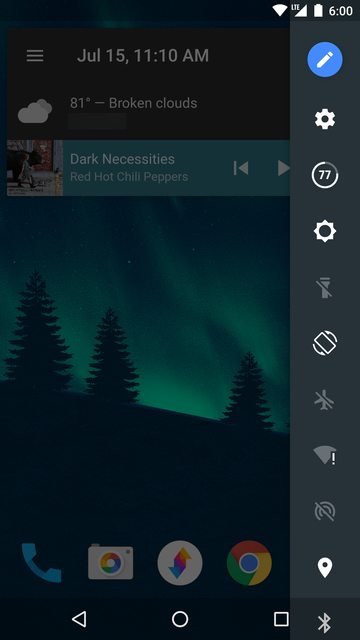
A swipe from the left side of the screen will also reveal your full app drawer. This can be quickly navigated by using the numbers on the right side of it. These items can be dragged onto the Dock to be shown at all times. There is also a search widget at the top. This app drawer can be revealed from any screen via the hamburger button or a swipe from the left. A swipe from the right will reveal quick toggles such as WiFi and Bluetooth. This screen can be edited to your liking. These toggles can also be revealed from any screen.
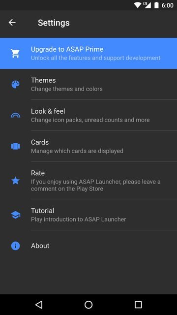
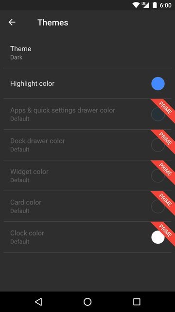
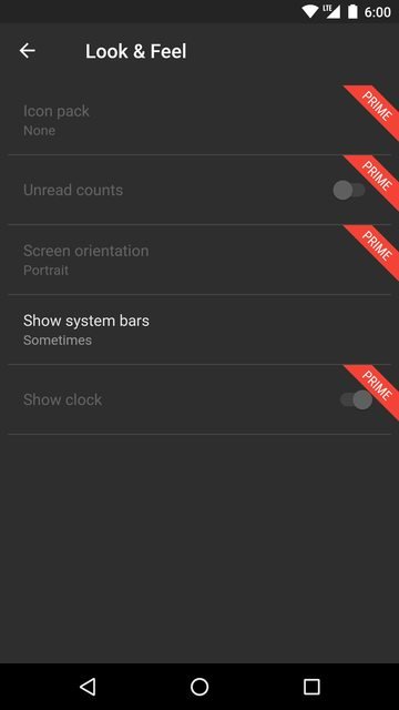
ASAP Settings does not contain a whole lot, but the important things are there. You are able to change the overall base theme and highlight color. You can also fine tune colors for every aspect of the Home screen. Icon packs are supported as well. Cards can be turned on/off and can also be rearranged. A lot of the customization features are locked behind an in app purchase. If these things are something that you would like to use, you'll need to upgrade to Prime ($1.42). There is also the option to upgrade to Prime + Donate ($2.85).
Calendar
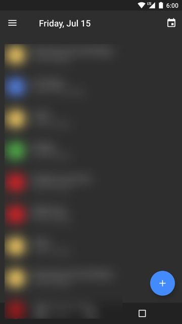
The calendar card is also fairly basic, but informative. You are given a list of all your upcoming events, color coded by the calendar they come from. The quick scroll bar seems to allow going up to 2 years in the future, so you should be able to get sufficient information from this card. This card also provides a shortcut to your default calendar app and a FAB to create new events . Any interactions on this card will open your default calendar app.
ToDo
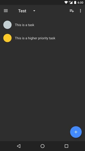
The ToDo list seems to be the only card that has self contained information. Once you create a new list, you will be able to add items to the list with priorities ranging from 1-5. Lists can easily be navigated between via the drop down menu. You can also quickly create a new list via the button next to the drop down menu. The 3 dot menu gives you the ability to sort lists Alphabetically, by Date created, or Priority. You are also given the ability to edit the list name, or delete the list entirely. A FAB is also shown on each list to quickly create new tasks.
Conclusion
While not extremely customizable like other launchers, ASAP has a very strong launch with plenty of unique features. The app is stable and smooth with beautiful animations. While some features are locked behind a paywall, I'd say that the asking price is cheap for how often you'll be using it. In the world of launchers, it's hard for new developers to find their footing. I feel that as long as ASAP continues to update and stay stable, it will have a strong following behind it.
ASAP Launcher can be downloaded from the link below:
Play Store
Note:
Please let me know if you'd like to see me cover more Android apps or start doing reviews. While this wasn't quite a review, I feel that I could easily make one for this or any other app. Thanks!
It seems that on a desktop the screenshots are fairly large. Does anyone have any suggestions on how to improve this?
I was able to reduce the image sizes to make them look much better on desktop.
Beautiful post