Adopt A Minnow Logo Contest
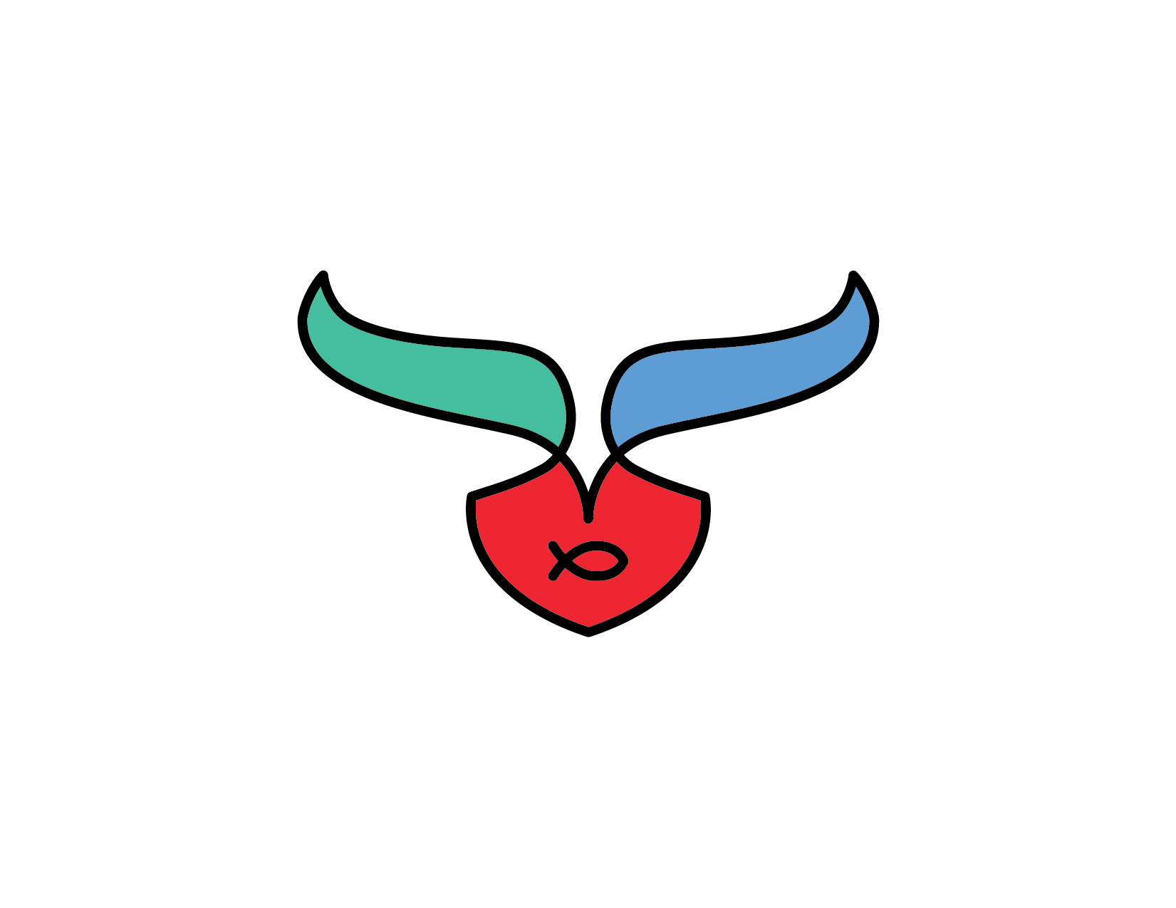
Designing an effective logo is all about reducing the mark to it's most essential elements.
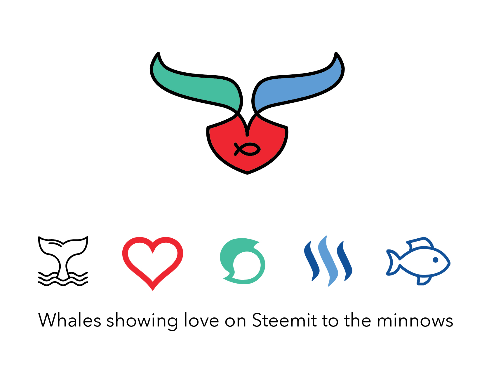
The #adoptaminnow movement is all about whales showing love on Steemit to the minnows. About boosting the little girls & guys out there wanting to make an impact on this amazing blockchain. What's the coolest is that my life partner @brandyb was the first minnow adopted by @whatsup. That’s meant the world to her and I’m proud to be part of it.
This is my official entry to the adopt a minnow logo contest. I’m really happy with the work and I’d love to hear your thoughts.
Conceptually, I used the blue tones found in the original Steem logo and the new corporate Steemit logo. The ‘heart’ acts as a bowl, encasing the minnow in support and love. It represents the cornerstone, the center. The whale is close buy, acting as shelter. I used a single, fluid line to represent the moving nature of this blockchain and its amazing members. I really love it.
original contest post: https://steemit.com/adoptaminnow/@whatsup/adoptaminnow-adopt-a-minnow-make-a-logo-contest-10-sbd-reward
Feedback
I'm always up for constructive criticism, but please realize this is the final logo. I've been designing logos for 20 years and I'm super passionate about the process. I'd love to talk shop with you if you have any questions or want any feedback on logos you're working on.
If you want to check out some of my other logos, take a gander and geek out with me. If you’d like to follow me, I will definitely follow you back. I’m here to build community and support my fellow earthlings. I’ll mostly be writing about my travels with @brandyb, crypto day trading, silver stacking, logo design, Squarespace website design & cryptocurrency. I promise to be polite (as possible).
thats a very cool design really nice work
well,,, thank you, thank you, thank you... it was a fun project.
Most welcome
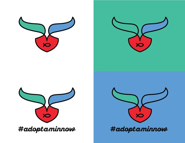
Very talented. I love the wjite background with the hashtag.
you have incredible taste apparently
Is very interesting how you tied them all together.
Your footer is quite clever too.
Thank Ed... I love logos that have a lot of embedded meaning. Finding the meaning is the hardest part sometimes
I think it fits the project very well, good job.
Beautiful work!
Shows how a single continuous line can have such an impact when made into shapes and tell a story that you've described.
Very good logo, and a lot of meaning attached to it.
Thanks. A logo has to have impact and I think meaning is the best way to get there. Otherwise it's just decorations
I know you are my competitor in the contest, but I really like your submission so here is an upvote!
That's awesome of you! Cheers!
I really like the design of these logos, lot's of thought and work put in and it shows. Such an inspirational project as well - keeping quality content producers on Steemit.
#thealliance
Appreciate the love man, thanks
You have received an upvote from STAX. Thanks for being a member of the #steemsilvergold community and opting in (if you wish to be removed please follow the link). Please continue to support each other in this great community. To learn more about the #steemsilvergold community and STAX, check this out.