👨💻 #Proposal-86: Change Log - Bugs #3911, #3915, #3918, #3919, #3923, #3924
I'm at the point where I'm happy with the changes I've made to communities, as well as a handful of bugs that have been fixed so it's time for me to document what I've done.
In this post, I'll cover the bugs that have been fixed, which will include a brief explanation of what each bug is.

Image by Manypixels Gallery
🪲 Bug 3911
This bug was raised by @justyy and covers the inability to downvote when a post / comment sits at the bottom of the screen.
If the page has only 1 comment, and when I want to downvote, half is hidden.
Tested on Chrome and Edge
The solution of moving the downvoting box higher on the screen is relatively straightforward although a little fiddly since moving the box too high, will move it off the top of the screen (due to the length of text explaining when downvoting is appropriate).

This was a few lines of CSS within the src/app/components/elements/Voting.scss file.

This code moves the box up and left slightly - the positioning covering both of the existing voting buttons makes it look slightly neater than just moving it up.
🪲 Bug 3915
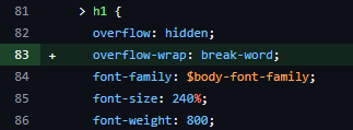
This bug was also raised by @justyy and catered for the scenario where a title gets cropped when a word exceeds a character limit.

This was a straightforward fix, requiring a single additional line of CSS in the src/app/components/cards/PostFull.scss file.
🪲 Bug 3918
I've also revisited bug 3918 which causes the screen to widen on mobile devices. This white space caused problems with the navigation on Android devices and whilst the fix implemented mostly worked, the Primary Navigation would disappear when the avatar navigation was opened.
The reason for this was that when the "Switch to Night Mode" menu option was introduced, this widened this avatar menu which was not adjusted in the code, increasing the left positioning from 85px to 120px in the src/app/components/elements/DropdownMenu.scss file.

🪲 Bug 3919
This bug was raised by @steemchiller to adress the issue of "Hot" no longer appearing in Post displays.
The code was all still present and working - it had just been commented out and so has been reactivated in the src/app/components/elements/SortOrder/index.jsx file.

🪲 Bug 3923
This bug was more complex and was once again linked to the navigation on Android Devices, highlighted in this post.
As discussed in a previous update, the preferred solution was the introduction of the ability to hide the navigation on mobile devices. Once the navigation is hidden, this preference is stored on the user's device (as well as in the current page state) until the user chooses to show the navigation again.
To implement this, the first stage was to include the toggle on the screen, along with writing appropriate CSS.
Within PrimaryNavigation.jsx, an additional variable was added to the returned output which would be configured within the code:

With the code configuration as:

const show_hide_link = this.state.screenWidth > 0 && this.state.screenWidth < this.state.snapWidth && username ? (
The opening line determines the conditions for the show/hide link to appear. We only want it to appear on mobile devices (so use the existing state.screenWidth and state.snapWidth properties) and since the problems only occur to logged in users, the user must be logged in to see this functionality. If any of these conditions are not met, no content is displayed () : null;
There are 3 classNames used for this toggle:
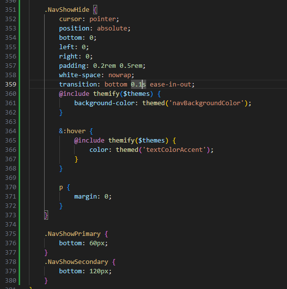
NavShowHide is the hook that's used to define the overall style of the toggle.
NavShowPrimary and NavShowSecondary are hooks which determine the positioning of the element, based upon the visibility of the Primary / Secondary navigation.
These are then defined within the existing PrimaryNavigation.scss file:
The variable which is used to determine the visibility of the Show/Hide is isNavVisible which is stored in local storage as well as in the State.
I'll cover where it gets set later, and instead start with when and how it's retrieved.
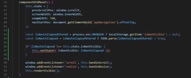
The variable is initiated when the component mounts - since its dependent upon the browser being loaded in order to retrieve the local storage (isNavCollapsedStored).
If there's nothing saved in local storage, the default visibility is set to true (isNavCollapsed). To avoid updating the state if it hasn't been changed, we check this stored value against the state and update it if necessary.
This variable is then used to determine whether the main navigation is displayed:

if isNavVisible is true or the screen width is wider than snap width (i.e. not a mobile device), then the primary navigation is displayed. If not, then it isn't.

There are 3 scenarios when the Show/Hide toggle is updated:
1. When the user scrolls
With the secondary navigation showing / hiding as the user scrolls, the toggle also needs to reposition itself. This is done within the handleScroll() function's mobile section and the NavShowSecondary class.
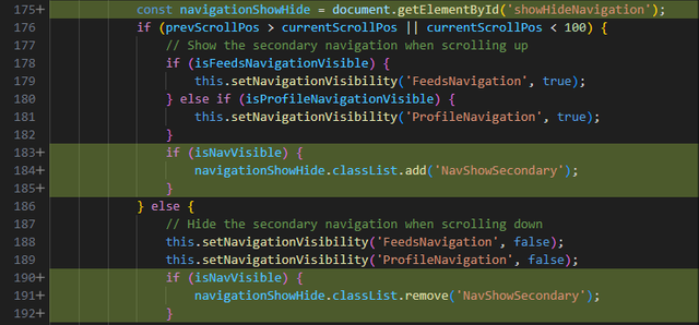
The NavShowSecondary class being added with the user scrolls up and removed when scrolling down, but only when the toggle is visible (isNavVisible).
2. When the screen is resized
When the user switches from a narrow display to wider screen width, we want any hidden navigation to reappear in the left column which meant that the handleResize function needs to update the isNavVisible state.

This is a bit of an edge case but required nonetheless.
3. When the Show/Hide Toggle is selected
A new function has been introduced to handle the "click" of the toggle.
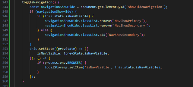
This function sets the classes to be added or removed, before updating the page state. If the page state update is successful, the new value is saved in local storage.
🪲 Bug 3924
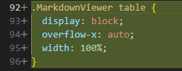
This bug was highlighted by @pennsif and @remlaps where tables with lots of columns are cropped and there's no way to view all of the data.
I expected this to be a single line of CSS to fix which turned out to be a little more fiddly to diagnose. I would have liked to include the scrollbar above and below the table but this would have required additional JavaScript which I didn't want to introduce at this time. So the solution was a classic scrollbar at the bottom of the table.

Whilst it was more than a single line of CSS, it wasn't much more, the src/app/assets/stylesheets/foundation-overrides.scss file requiring the new CSS.
GitHub Branch
The changes documented within this post are available to view on a dedicated branch (https://github.com/the-gorilla-steem/condenser/tree/%23proposal-86-Communities-redesign)


the-gorilla's Alternative Steemit Interface
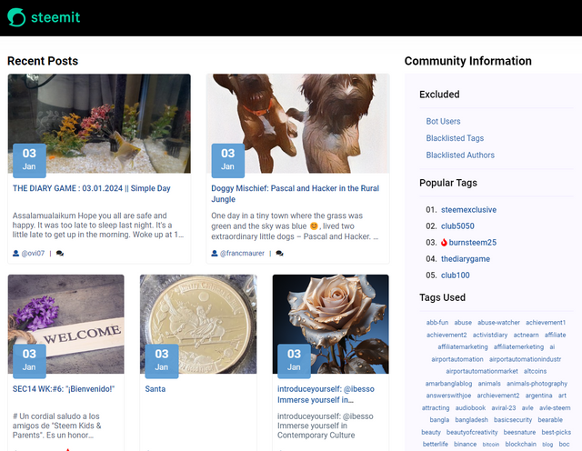
In case you didn't know, I've created an interface to help you find content that you're interested in more easily.
Posts by voting bot users, abusers and spam tags are hidden and you can search by multiple tags - allowing you to find the content that you're interested in more easily.
👉 Launch Alternative Steemit Interface 👈

the-gorilla's Club Status Tool
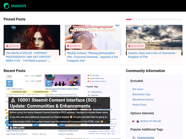
I've also created a tool to help users review their club status - showing them where their power's coming from, how much they're powering up, transferring out and who they share a wallet with amongst other things.
Please use it wisely.
👉 Launch Club Status Tool 👈


Diligent, diligent!
If I had known that some of the bugs described were "reportable" bugs, we would have been in contact more often... 😉
Unreadable tables with more than three columns, impossible downvotes - wasn't that always, really always the case? Hm, you seem to get used to everything... 🤷♀️
All the better that we have you, diligent, diligent gorilla... 🤗
It's nice when I've got a little time but not enough to start something big to look through GitHub at some of the bugs raised... or raise them myself and fix them 🙂 Only the navigation one (3923) hasn't existed for longer than my presence here so we've grown used to many workarounds (e.g. opening and expanding the "Reply" dialogue box to impose maximum downvoting damage).
Once I've documented the "Communities" updates, I need ideas of what to work on next...?! I want to include "Hide Resteems" on the "My Friends" feed... oh, and redesign the "Notifications" page. Maybe do a few "small projects" before embarking on another big chunk again.
Perhaps a button with which you can mute users or posts directly for yourself. I would also like to be able to mute comments under my own posts if I am not posting in a community in which I am an admin or mod.
Am I impressed?
Hell, yeah!
I like "The Ranch" a little too much. Have you watched it?
And I’m kinda Colt in this scenario because I don’t understand anything about these commands and fixes. But now I do know that I can report a bug — that I can manage! Most of the bugs are related to Android phones. And I’m a little embarrassed (in the Colt way) that I use my android phone mostly for Steem-ing. No iPhone in the picture 🙈, and I’m a bit too lazy to fire up the computer. But I can report a bug or something.
Jokes aside, I am very impressed!
Never heard of it 🙂
If you look at wakeupkitty's reply to this post, do you experience the same issue with comment previews?
Hi,
I copied the exact same comment and I had no problem with preview. Sharing the screenshot. Hope it helps!
😢 thanks. Which browser did you use? I think wakeupkitty uses kiwi browser.
I wish that it either works or didn’t work for everybody. Things are always easier to fix that way!
I use Google Chrome on phone and pc.
Today I started moderating/leaving reports and this is what the example looks like (before I post) ☹️ - android - Samsung
This is a problem - what happened? I hope these examples don't show if content is written. It makes it hard to check before posting.
I can't say for certain, but it looks like the problem is being caused by the "Markdown Styling Guide" link - my suspicion based upon how this lines up with where the content is getting cropped.
Would you mind logging in to https://steemitdev.com (it's Steemit Inc's test server that's hosting the old site) and seeing if the same thing happens there please?
Does this only happen in Kiwi Browser or is it all browsers?
I have added your branch to my test branch. However, I get error messages on the server side that lead to the error page being displayed.
I'll have to have a look at it tomorrow. Now it's too late :-)
I assume that you don't have these problem?
🤔 I don’t but… I’ve only committed the changes that I’ve documented so it’s possible there’s a dependency that I’ve missed. There shouldn’t be but it’s certainly a possibility.
Sorry if I've caused you any trouble. The error code led me to believe that it was related to the SSL config of my node. That's what it was.
Update: Your changes are live on steemit.moecki.online. At first glance, everything looks good. But I haven't yet been able to test the modifications for mobile devices.
Ah, good. It was no trouble - I've got both boys today so no chance of really looking into anything until later. I wouldn't have been surprised if it was my partial deployment but I'm pleased that it wasn't 🙂
This is a good example of the new table css and it works very fine:
https://steemit.moecki.online/steemtalk/@remlaps-lite/a-more-granular-look-at
🥳 Cool, that looks like it's working well 🙂
I use a mobile (Android) for upvoting and reading. Sometimes, I encounter an issue where the voting percentage slider is cut off halfway. I’m not sure if it’s a bug or if it’s worth fixing, but I’m reporting it in case it helps in some capacity.
It's a bug (not a new one). It happens when you're the first person to vote - the upvote and downvote buttons appear on a new line if somebody's already voted so the issue doesn't happen.
That one's not just Android 🙂
That's interesting
I've seen something similar with viewing beneficiary settings at the bottom of the /promoted page. I can't duplicate it now, so I guess it has something to do with how long the /promoted list is. Not sure if your fix would have addressed that, too?
Unrelated - maybe this is a stupid question, but a side-by-side preview pane in the post creation page has been requested frequently for as long as I've been here. Is that something you're able to control at the javascript/css level where you're making your changes?
Do you mean this:
steemit.moecki.online
steemit.com
On my server, the payout pane is cut off... I don't know yet what the reason for this is.
Yeah, exactly. At some point, if there are enough promoted posts, it's impossible to scroll down to where you can view the bottom of that overlay.
!thumbup Great work!
Hello @the-gorilla! You are Superb!
command: !thumbup is powered by witness @justyy and his contributions are: https://steemyy.com
More commands are coming!
This post has been upvoted/supported by Team 5 via @philhughes. Our team supports content that adds to the community.
!thumbup Thanks!