[Matplotlib] 02. Axes Setup: Subplots
"""
제 개인적 목표는
- Object-Oriented Programming과 친해지기
- Github와 친해지기 입니다.
이 목표에 닿기 위해 일단 제가 나름 좀 아는 Python, 그 중에서도 Numpy와 Matplotlib로부터 시작하려 합니다.
"""

02. Axes Setup: Subplots
전 시간에 그림(Plot)의 최상위 객체 Figure Instance에 대하여 간단히 정리했습니다. 이번편에는 하나의 Figure안에서 Axes를 배치하는 법을 정리해보겠습니다.
02.1. fig.add_subplot(nrow,ncol,i)
한 장의 도화지 안에 여러 Plot을 그리는 가장 간단한 방법은 도화지를 적당히 나누어 같은 크기의 규격화된 Plot들을 적당히 배치하는 것입니다. add_subplot()은 평면을 2차원 행렬과 같은 방법으로 구획을 나누고, 각각의 작은 부분들에 번호를 붙여 구분합니다. 주의할 점은, Python의 기본은 0부터 시작함에도 불구하고, 번호가 1부터 시작한다는 것입니다.
import sys
import numpy as np
import matplotlib.pyplot as plt

###--- Synthesizing data to be plotted ---###
x = np.arange(5)      # Same as x = np.array(range(5))
#y = x**2             # Basically item-wise calculation for numpy arrays

###--- Plotting Start ---###
##-- Page Setup --##
fig = plt.figure()            # Define "figure" instance
fig.set_size_inches(8,6)      # Physical page size in inches, (lx,ly)
suptit = "Axes Setup: Add_Subplots"
fig.suptitle(suptit,fontsize=15)   # Title for the page

##-- Axes Setup --##
ncol = 3; nrow = 2
npanels = ncol*nrow
for i in range(1,npanels+1,1):           # i = 1,2,...,npanels
    ax1 = fig.add_subplot(nrow,ncol,i)   # subplot(# of rows, # of columns, index)
    ax1.plot(x,x**(i/3.))                # plotting line graph
    axtit = "Panel#{}".format(i)
    ax1.set_title(axtit,fontsize=12)

##-- Seeing or Saving Pic --##
#plt.show()   #- If want to see on screen -#
outdir = "./"
outfnm = outdir+"02_axes_setup.subplot1.png"     # File format is decided by the file name, eg. png here
fig.savefig(outfnm,dpi=80)   # dpi: pixels per inch

sys.exit()
위 프로그램에서 nrow=2, ncol=3으로 설정되었으며, 결과물은 다음과 같습니다.
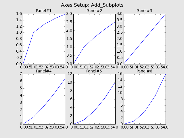
그런데 각각의 Plot들이 너무 붙어서 보기에 안좋군요!
Subplot 사이 사이의 간격은 fig.subplots_adjust()를 이용합니다.
이번에는 위 코드에
fig.subplots_adjust(left=0.1,right=0.95,bottom=0.1,top=0.87,wspace=0.25,hspace=0.25)
이 한 줄을 추가해보겠습니다.
상하좌우 값들은 Figure객체 안에서 여백의 크기를, Figure크기에 대한 비율로 나타냅니다. Width Space와 Height Space 값은 Axes객체 하나 크기의 비율로 나타냅니다.
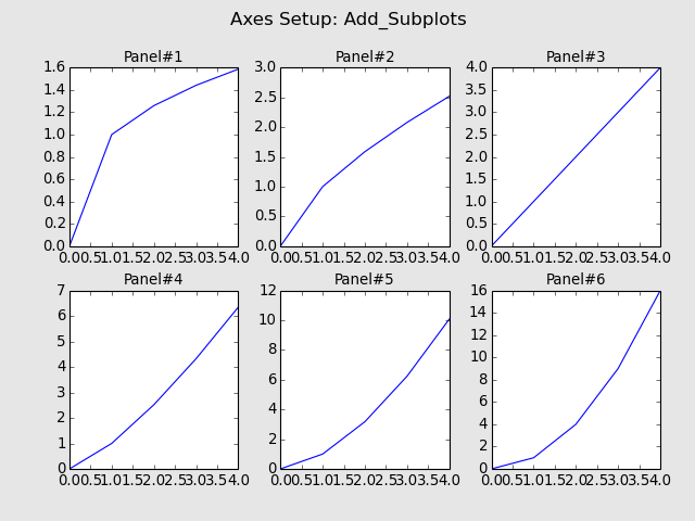
이제 좀 적당히 넓어진 것 같습니다.
02.2. fig.add_axes(coordinate_list)
이번에 사용할 방법은 Figure안의 임의의 공간에 임의의 크기의 Axes를 추가하는 법입니다. 위의 "coordinate_list"는 4개의 항목 (Left, Bottom, Width, Height)으로 이루어진 List객체입니다.
import sys
import numpy as np
import matplotlib.pyplot as plt
###--- Synthesizing data to be plotted ---###
x = np.arange(5) # Same as x = np.array(range(5))
#y = x**2 # Basically item-wise calculation for numpy arrays
###--- Plotting Start ---###
##-- Page Setup --##
fig = plt.figure() # Define "figure" instance
fig.set_size_inches(8,6) # Physical page size in inches, (lx,ly)
suptit = "Axes Setup: Add_Axes"
fig.suptitle(suptit,fontsize=15) # Title for the page
##-- Plotting for axis1 --##
npanels=5
for i in range(npanels): # i = 0,2,...,npanels-1
ax1 = fig.add_axes([i/5.,i/5.,0.3,0.2]) # [Left,Bottom,Width,Height]
ax1.plot(x,x**(i/3.)) # plotting line graph
axtit = "Panel#{}".format(i+1)
ax1.set_title(axtit,fontsize=12)
##-- Seeing or Saving Pic --##
#plt.show() #- If want to see on screen -#
outdir = "./"
outfnm = outdir+"02_axes_setup.subplot2.png" # File format is decided by the file name, eg. png here
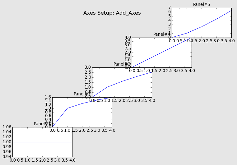
fig.savefig(outfnm,dpi=80,facecolor='0.9') # dpi: pixels per inch
sys.exit()
위 프로그램을 실행시키면 다음과 같은 그림이 나옵니다.
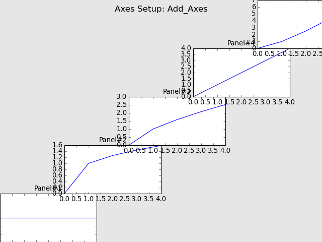
저런... 추가된 Axes의 좌표가 1.0을 넘어가니 그림이 잘렸네요. 이럴 때 필요한 것이 바로 bbox_inches='tight'옵션입니다.
02.3. gridspec
제일 위의 add_subplot()은 모든 Subplot들의 크기가 같게 나옵니다. 두번째의 add_axes()는 원하는 위치에 원하는 크기의 그림을 그릴 수 있지만, 나무 자유도가 높아 관리에 어려움이 있을 수 있습니다. 그래서 이번에 소개하는 방법은 gridspec모듈을 이용하여, Figure안에 작은 모눈종이를 그려놓고, 그 모눈종이 격자를 엮어서 자유로운 크기의 Subplot을 그리는 방법입니다.
import sys
import numpy as np
import matplotlib.pyplot as plt

###--- Synthesizing data to be plotted ---###
x = np.arange(5)     # Same as x = np.array(range(5))
#y = x**2             # Basically item-wise calculation for numpy arrays

###--- Plotting Start ---###
##-- Page Setup --##
fig = plt.figure()            # Define "figure" instance
fig.set_size_inches(8,6)    # Physical page size in inches, (lx,ly)
suptit = "Axes Setup: GridSpec"
fig.suptitle(suptit,fontsize=15)   # Title for the page

##-- Plotting for axis1 --##
import matplotlib.gridspec as gridspec
gs0 = gridspec.GridSpec(10,10)    # (ny,nx)

ax1 = plt.subplot(gs0[0:10,0:3])  # gs0[y0(top):y1(bottom),x0(left):x1(right)]
ax1.plot(x,x)
ax1.set_title("Panel#1",fontsize=12)

ax2 = plt.subplot(gs0[0:6,3:10])  # gs0[y0(top):y1(bottom),x0(left):x1(right)]
ax2.plot(x,x**0.5)
ax2.set_title("Panel#2",fontsize=12)

ax3 = plt.subplot(gs0[6:10,3:6])  # gs0[y0(top):y1(bottom),x0(left):x1(right)]
ax3.plot(x,x**1.5)
ax3.set_title("Panel#3",fontsize=12)

ax4 = plt.subplot(gs0[6:10,6:10])  # gs0[y0(top):y1(bottom),x0(left):x1(right)]
ax4.plot(x,x**2)
ax4.set_title("Panel#4",fontsize=12)

##-- Seeing or Saving Pic --##
#plt.show()   #- If want to see on screen -#
outdir = "./"
outfnm = outdir+"02_axes_setup.subplot3.png"     # File format is decided by the file name, eg. png here
fig.savefig(outfnm,dpi=80,facecolor='0.9')   # dpi: pixels per inch
#fig.savefig(outfnm,dpi=80,bbox_inches='tight')   # dpi: pixels per inch

sys.exit()
위에서 gridspec을 불러온 후 격자를 정의하고 (gs0 = gridspec.GridSpec(10,10)), 정의된 gs0를 이용하여 필요한 만큼의 Axes를 정의해줍니다. 위 프로그램을 실행시키면 다음과 같은 그림이 나옵니다.
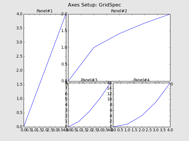
역시 Subplot들이 서로 너무 붙어서 조정이 필요해보입니다. 위에서 소개된 subplots_adjust()에 해당하는 것이 여기서는 update()입니다. 예를 들면
gs0.update(left=0.125,right=0.9,bottom=0.1,top=0.9,wspace=1.,hspace=1.)
이렇게 조정할 수가 있습니다. 하지만, 전 보통 update()을 쓰기보단, gridspec을 더 넉넉히 정의하고, Axes를 설정할 때 1~2칸의 여유를 주는 방법을 선호합니다. 왜냐하면 wspace와 hspace의 경우 gridspec의 격자 하나 크기의 비율로 표현되는데, 보통 격자 하나의 크기가 작아서 비율로 조정하기가 힘들기 때문입니다.
위 프로그램의 일부를 다음과 같이 고쳐보았습니다.
##-- Plotting for axis1 --##
import matplotlib.gridspec as gridspec
gs0 = gridspec.GridSpec(11,11)
gs0.update(left=0.1,right=0.95,bottom=0.1,top=0.88)

ax1 = plt.subplot(gs0[0:11,0:3])  # gs0[y0(top):y1(bottom),x0(left):x1(right)]
ax1.plot(x,x)
ax1.set_title("Panel#1",fontsize=12)

ax2 = plt.subplot(gs0[0:6,4:11])  # gs0[y0(top):y1(bottom),x0(left):x1(right)]
ax2.plot(x,x**0.5)
ax2.set_title("Panel#2",fontsize=12)

ax3 = plt.subplot(gs0[7:11,4:7])  # gs0[y0(top):y1(bottom),x0(left):x1(right)]
ax3.plot(x,x**1.5)
ax3.set_title("Panel#3",fontsize=12)

ax4 = plt.subplot(gs0[7:11,8:11])  # gs0[y0(top):y1(bottom),x0(left):x1(right)]
ax4.plot(x,x**2)
ax4.set_title("Panel#4",fontsize=12)
격자를 (10,10)에서 (11,11)로 늘리고, 각 Subplot사이에 격자 하나의 여유를 주어습니다. 그래서 그림은 이렇게 바뀌었습니다.
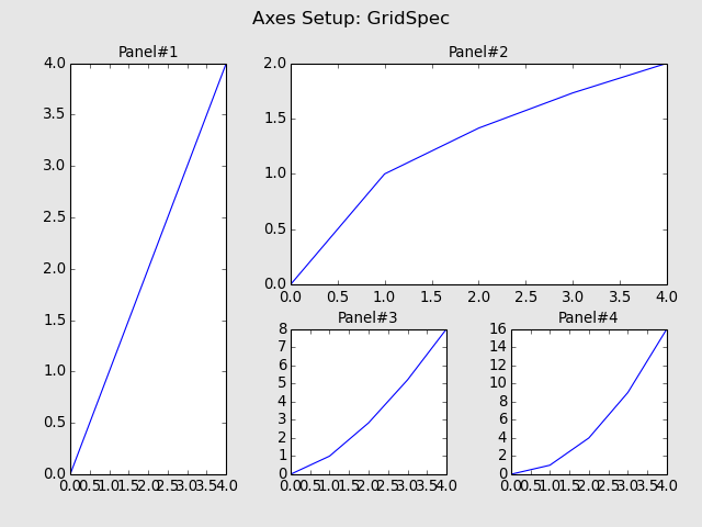
이 그림의 간격이 너무 넓어 마음에 들지 않는다면, 격자를 (21,21)정도로 늘리고 각 Axes크기를 2배로 늘리되 여유간격은 그대로 1칸으로 유지하면 간격이 줄어드는 효과가 있습니다.
이상 Subplot을 마치고, 다음에는 그림의 외양을 꾸며보는 내용을 정리해보겠습니다.
List
[Matplotlib] 00. Intro + 01. Page Setup
[Matplotlib] 02. Axes Setup: Subplots
@Luckystrikes
Have a nice day!!!!
새해 복 많이 받으세요~
요즘 Python쪽도 중간중간 사용할때가 있는데 올려주신 내용이 유용할 것 같아요! ㅎㅎ