SLC21/WK3: Logo Design - Part 2
Greetings friends of Steemit and Instructors
| Discuss about each of the logo types we have and then talk about conditions when such logo should be used and when not to be used for a brand. You can do a little research to aid you. |
|---|
WordMark logo:
A distinct text-only typographic treatment of the name.
FedEx is an amazing example which naturally creates an arrow in between Ex which signifies its delivery to the right recipient with Speed and precision. The different types of colours of Ex letter signifies different purposes say orange on express percel.
Monogram Logo:
An white letter P In red Pinterest logo symbolises our interest to pin on a board representing social media connecting millions of people.
A brandmark logo:

Spotify is a good example of the type. It is the simplest possible memorable logo for a music streaming company on different platforms and devices. The colour is very vibrant and fresh.
Abstract logo:

Abstract logo designs tend to express their message through loose, figurative elements.
LG logo is famous around the world for its imaginary face logo simply created with the two letters. Letter L represents the nose of the face and the letter G makes the outline of the face with an eye (dot).
The history of the company is very interesting. L and G are the initials of the Lucky-Goldstar which became LG Electronics in 1995. Since 2014 they have incorporated the full name beside the image.
Mascot Logos:

Character/mascot logo appears more friendly and appealing towards children.
Puma has panther in the logo which is worldwide popular for its sports and adventure.
Emblem Logos:
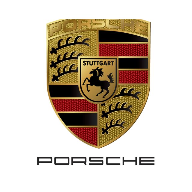
This logo is a mixture of German symbols. The Middle Horse is the symbol of Stuttgart, the old home of Germany's fastest horses and the new home of the country fast cars. The three stems of the plant are a symbol of the Württemberg region. The overall color scheme of the Porsche logo is also reminiscent of the colors of the German flag.
Combination logos:
Gucci is the most iconic brand of fashion industry. In the logo two Gs are stylish and timelessly interlocking and combined with brand name Gucci. Actually two Gs are fathers of brands Guccio and Gucci.
Dos VS Don'ts
| Dos | Don'ts |
|---|---|
| Start with a Concept - consider what you want to be perceived. | Don't Copy- Copying another logo may lead you in legal trouble. |
| Make it Simple- Try to use simple shapes, lines, and colors. | Avoid Stock Images- Stock images can make a logo look generic & unprofessional. |
| Use the Right Font--Use easy to read & appropriate font. | Don't Overdo It- Keep it simple and clear. |
| Consider Color- Choose colors that will help you stand out from the competition. | Don't Launch before Testing- Before you launch your logo test it. |
| Make it Unique- Avoid clichés and attempt to be original. | Avoid Unnecessary Changes- Don't be scared to make changes if you're unhappy with the design. |
| Pick any two (2) of the Logo types discussed and then practically demonstrate how to make them, showing your detailed process. |
|---|
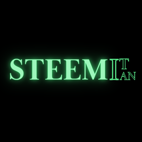
One of logo types I followed is Wordmark to produce the following logo. Here I have strictly followed simple colour typography text of the name. I have used neon effects on the text.
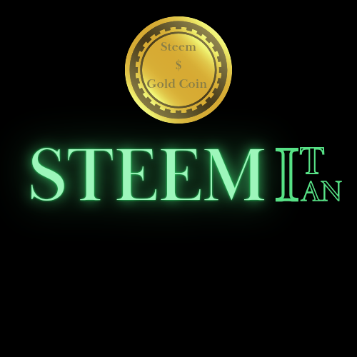
Now I have created a combination logo by adding a Steem gold Coin logo with the previous Wordmark Steem logo.
| Design a simple logo with the knowledge you have gotten from this lesson by assuming that a client gave you a job to design for his brand (business). |
|---|

Thank you for reading my post.
I would like to invite three fellow Steemians to participate in the contest
@chiagoziee
@eveetim
@georgitsachev