Programming Diary #6: A barebones browser extension for Steem curation
Creating a bare bones browser extension for Steem curation
Introduction
As you may have noticed, progress has stalled on my Steem Links posting tool. I hope to get back to it, but it has reached the point where progress comes slower, and real life started blocking my ability to really focus deeply on it.

Pixabay license, source
In the meantime, however, we have had an uptick of post promotion on the Steem blockchain, mainly through the use of @null beneficiary settings. As I explained, here, I think part of the reason that post promotion hasn't taken off in the past is that curators need to remember to visit a particular link, so post promoters have not been rewarded with increased visibility or upvotes. So, this weekend, I began an effort to address the problem of visibility - at least in my own browser.
The goal is to create a browser extension that can shine a virtual spotlight on a promoted post, no matter which feed I'm looking in. This way, post promoters get a benefit all over the site, not just in the #burnsteem25 and /promoted feeds.
The bad news is that, having never before written a browser extension, I had no idea of even where to begin. I broke it down into three major phases for getting started:
- Creating any sort of browser extension
- Finding promoted posts (via @null beneficiary settings or transfers to @null)
- Visually highlighting the posts
My first pass at each of these phases is discussed below.

Creating a plain-vanilla browser extension
For this phase, I took my instruction from the page: How to Write Your Own Browser Extension [Example Project Included]. In short, I created two files:
- manifest.json
- main.js
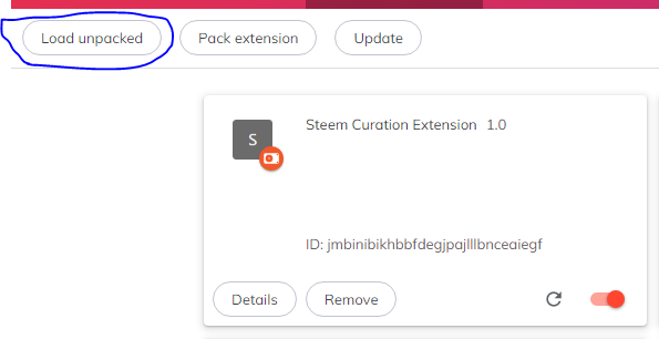
It seems the manifest.json file is a sort of configuration file that tells the browswer what to expect from the plugin, and the main.js file contains the javascript to be executed (In general, main.js could have other names, and there can be multiple javascript files). Those two files need to be located in a dedicated folder, or directory, and they need to be loaded in the browser by entering chrome://extensions in the URL bar, switching on the "Developer mode" toggle, and then clicking the button to "Load Unpacked".

When I loaded that manifest.json file, however, my Brave browser gave me a warning about manifest_version 2 being deprecated, so I switched it to version 3. Here is my manifest.json file, at the moment:
{
  "manifest_version":3,
  "version":"1.0",
  "name":"Steem Curation Extension",
  "content_scripts":[
    {
     "matches":["https://steemit.com/*"],
     "js":["main.js"]
    }
  ]
}
My first browser extension simply generated a pop-up message to tell me that it was executing. Next up was to recognize the promoted posts.

Recognizing promoted posts
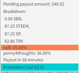
As discussed, here, there are two ways of promoting a post by burning tokens. I wanted to be able to visually highlight a post in any feed, regardless of which method is chosen. So what I learned is that I needed to look for text like the highlighted lines below:

By visually inspecting the page source, the way I found to do this was to look for the strings: "null: " or "Promotion Cost " in the website HTML. I was able to collect the sections of the page to be checked with this line of javascript:
const listItem = document.querySelectorAll('li')
This was a little bit tricky, because tags can be contained within tags. I want to eventually be able to tell what the exact promotion amount is, and for that I need the innermost tag, but I want to visually highlight the entire post, for which the outermost tag is needed. The way I found to accomplish this will be shown in the next section, which involves actually changing the display.

Highlighting promoted posts
The first way I found to change the highlighting is with the following simple instruction:
listItem[i].style['background-color'] = '#00CED1';
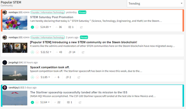
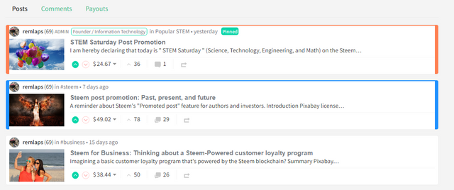
Where the list of color selections can be found, here. And that gave me all the tools I needed to come up with a barely functioning prototype. As shown here, I can now see posts with @null beneficiaries as orange, posts that have associated "Promotion Costs" as turquoise, and posts with both are a darker blue.


Of course, posts with no promotions applied retain their original look.
Here are the current contents of my main.js file
console.log("The extension is up and running");
const listItem = document.querySelectorAll('li');

for (let i=0; i< listItem.length; i++) {
    if ( listItem[i].textContent.match('^null:.*\%') ) {
        console.log("Found #burnsteem25");
        listItem[i].style['background-color'] = '#FF7F50';
    } else if ( listItem[i].textContent.match('^Promotion Cost .*\$$') ) {
        console.log("Found a /promoted post");
        listItem[i].style['background-color'] = '#00CED1';
    } else {
        if ( listItem[i].textContent.match('null: .*%' ) && listItem[i].textContent.match('Promotion Cost .*\$') ) {
            console.log("Found a /promoted post in #burnsteem25 (outer block)");
            listItem[i].style['background-color'] = '#1E90FF';
        } else if ( listItem[i].textContent.match('null: .*%' )) {
            console.log("#burnsteem25 outer match: ");
            listItem[i].style['background-color'] = '#FF7F50';
        } else if ( listItem[i].textContent.match('Promotion Cost .*\$') ) {
            console.log("Found a /promoted post (outer block)");
            listItem[i].style['background-color'] = '#00CED1';
        }
    }
}
The first two "if" branches handle the innermost cases and the third, nested "else -> if" branch handles the outermost cases. (or at least that's how it seems to this novice)

Conclusion
In this fashion, I now have a barely functional browser plugin that helps me see if people have promoted posts, regardless of what feed I am viewing. It also highlights the promotion amounts when I look at the payout details. It still has multiple known (and unknown) flaws, and I'm already thinking of other other enhancements that could be added in order to provide more information to the curator and save time needed to click into things. Here's a to-do list, when I revisit this in the future:
Quality checks and problems to be fixed
[ ] - Make sure that the search patterns are ignored if found in post bodies, titles, tags, etc...
[ ] - Figure out why I need to "reload" a page in order for the highlighting to take effect
[ ] - Figure out why highlighting doesn't get applied when I scroll further down in the feed
Enhancements
[ ] - Adjust shade of the coloring to reflect the promotion amount/percentage
[ ] - Add a word count/reading time display next to each post
What other things could be included in order to provide information to curators so that the curation process would be more accurate and efficient?
Thank you for your time and attention.
As a general rule, I up-vote comments that demonstrate "proof of reading".
Steve Palmer is an IT professional with three decades of professional experience in data communications and information systems. He holds a bachelor's degree in mathematics, a master's degree in computer science, and a master's degree in information systems and technology management. He has been awarded 3 US patents.


Very good idea!
I had already thought about integrating something similar into my site (https://moecki.online).
I have not yet programmed a browser extension either. This is a good option for users who trust the extension. But I think it would be better to integrate this signalling into the condenser.
For example, posts that are paid out 100% in SP will show this sign:
Such an icon could also be displayed for posts with a beneficiary to @null.
With infinite scrolling, the "new" posts are dynamically added to the page via javascript when a certain area of the page is reached. It may be that the extension then has to be triggered again so that the "new" posts are also detected.
Seems like this was it, basically:
I turned the whole thing into a function, then added an event listener to run it whenever a window scroll event is encountered, and now it's highlighting posts further down in the list.
Many things are possible with Javascript. :-)
I will have to learn a bit more about Javascript in the future, because some things cannot be done (reasonably) on the server side.
I started playing with javascript back in the '90s, but then my job changed an I didn't keep up with it. Missed opportunity there. ;-)
I'm only scratching the surface so far with this browser extension, but I think it's actually a pretty good learning project. If I keep learning, I'm sure I'll eventually want to throw it all away and redo it "the right way."
Who could have guessed back then that Javascript still had such potential? Since I used to do a lot with Java, I smiled a little at Javascript, but now Javascript has clearly overtaken Java in some aspects.
Me too! But that's not a bad thing from my point of view. As long as it's fun.
I'll probably be at that point when I've really got into CSS ;-)
I started playing with javascript back in the '90s, but then my job changed an I didn't keep up with it. Missed opportunity there. ;-)
I'm only scratching the surface so far with this browser extension, but I think it's actually a pretty good learning project. If I keep learning, I'm sure I'll eventually want to throw it all away and redo it "the right way."
I agree that the browser extension isn't the best way to do it. It's just the quickest way I could think of without needing to rely on someone else.
Long term, I think a separate curator's tool, or curation mode in Condenser would be ideal. The things that a curator wants to see aren't necessarily the same things that a casual reader would want to see.
@moecki
The web interface is very good. I don't know, I'm not a programmer, but I also want to learn how to make something like this.
Thank you! It's nice to see the page in foreign device :-)
As you see, there is still a lot to do. For example date and time are still in german and other things... That's why I haven't advertised it widely yet. Even if it already works with other communities...
I agree with @aafadjar. It does look like a nice interface. I was wishing I could speak German when I visited the link the other day!
You're welcome.
Although still in German, but it looks interesting.
Hopefully one day, it will also be available in an English version.
Apart from the date, only the posts are in german.
Look at https://moecki.online/hive-160342 for "your" community :-)
My newest version on the dev-server already has several improvements. Now the date-strings are in english... I will soon transfer it to the public server.
wow..
It makes it very easy for me when looking for the newest posts in the community.
I have also tried to see the display for the steem sea community
https://moecki.online/hive-103393.
Wow, that's also very interesting.
Thank you
...and the newest comments. :-)) nearby the reply count.
Soon it will look even better :-)
I think that the first thing I should do is analyze the way curators work, that is, what are the parameters they focus on.
I wish you a happy start of the week