Progress adding per-post metrics in the Steem Curation Extension
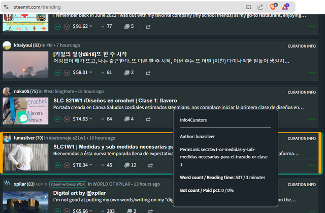
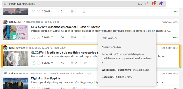
Getting the author and the URL from the condenser web page into the Steem Curation Extension overlay turned out to be harder than I had anticipated, but after that was done, adding a couple metrics to the overlay happened quickly. (the author and permlink will not be permanent inclusions, but it's helpful now for debugging.)
FTR, I really hate the cosmetic stuff😉, so I'm glad that the lion's share of that effort seems to be done. It works in light mode, too.
(yes, I noticed that the word count changed there. I suspect the post was edited, but I'll be checking that.)
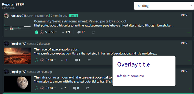
I'm happy and a little surprised to see this amount of movement in just 4 days. Here's what it looked like 4 days ago.
One thing I noticed is that React already has a lot of useful information in the browser that doesn't seem to be easily accessible from JavaScript in the browser extension. If I can ever figure out how to cross that barrier, some additional network calls could be eliminated. All of the information that I'm querying the API for is already visible in the browser developer tool (without any API queries), but since it's delivered by React, I couldn't find a way to access it from JavaScript (and the AIs weren't much help).
So far, performance isn't bad (with high speed Internet). I haven't noticed any slowdowns. All of the metrics that I've added so far can be collected with a single network call (per post). I guess I'll mine the condenser_api.get_content call as much as possible before trying to add any more network i/o.
If you have any thoughts on the kind of information that you'd eventually like to see in this tool, please join the discussion in this thread.
Thank you for your time and attention.
As a general rule, I up-vote comments that demonstrate "proof of reading".
Steve Palmer is an IT professional with three decades of professional experience in data communications and information systems. He holds a bachelor's degree in mathematics, a master's degree in computer science, and a master's degree in information systems and technology management. He has been awarded 3 US patents.

Pixabay license, source
Reminder
Visit the /promoted page and #burnsteem25 to support the inflation-fighters who are helping to enable decentralized regulation of Steem token supply growth.


The emoji confuses me a little. I don't like the design development ( too?) at all. Inspired by your VP display, I ventured to create a VP progress bar... and am only semi-satisfied. ChatGPT couldn't really help me either.

This is how it looks like:
Unfortunately, you can't really see how full the bar is. The display shows 95 %.
That's right. Unfortunately, you can't access it from the rendered page. I have regretted that many times. I haven't found a way either. Although the React toolkits can do that.
I just meant to soften the severity of my whining about it.... I'm almost always confused by emojis. I basically ignore them when reading. I should probably just leave them out of my own writing.
In general, it seems to me that claude.ai is better than ChatGPT with JavaScript. The free daily quota runs out fast, though.
I can see it, but just barely. Ironically, it's easier to see it on my cell phone than on my desktop. I really like the concept, though!
Claude found one way that seemed like it might have worked, but it was blocked by the website's content security policy, so it was a dead-end anyway. If I can see it with my eyes, I've got to believe there's a way to get to it with a program, but it's sure not easy.
I have to admit that I haven't tried any other ChatBot yet. I also only use ChatGPT in the free version. Maybe it has something to do with that. I also wanted to draw a semicircle around the profile picture as a voting power bar, but it failed completely. The result was a semicircle, but with the opening at the bottom... Even after several requests for the opening to appear upwards so that the semicircle is below the picture and encloses it, he couldn't get it right.
Unfortunately, my design skills can't make up for that :-)
Yes, it's a bit visible, but I would have liked it to be clearer.
Thanks. On the mobile phone, the picture in the comment is displayed larger. I can see it better there.
As another alternative, I had thought of an additional small box in which you can read the VP directly. Similar to the display of the number of notifications.
I also hate the cosmetic stuff and prefer light mood more than the dark mood. You always come with awesome programming stuff and your contribution to burn steem deserve appreciation and praise. Thanks for sharing steem talk!
It does look good. Left click the post or something?
Ultimately, to see a rating on a post for content type might be good.
G, PG, PG-17, R, NSFW, Or whatever international content rating there might be.
Right now, you just have to mouse-over the "CURATION INFO" text. I might change that to clicking on it, in order to avoid accidental network traffic. Not sure. Mouse-over feels a lot more convenient.
Interesting. Sentiment analysis might be nice, too, but I think both are beyond my skill-level at the moment.
I like that Idea, the mouse over.